I’ve started this project with a promise of expanding my creative field. I promised my self that I will stay away from horror or occult genres however I have officially cracked. It’s week 4 and I have done two posts both which don’t include any of my work, just research. I found myself bored and uninterested with this project and have no motivation to complete it. I keep dancing around the idea of incorporating body horror and mystical wooden carvings of a haunted forest. All ideas that pop to my head are to do with horror. I feel that perhaps I already have established myself within a specific area that caters for a specific audience. I think of this as a good thing because I already possess a deep understanding of this audience and the genre therefore it wouldn’t be appropriate to ignore this. I will continue my project with the theme of texture and ornament however the lettering design will be produced with a specific audience and purpose in mind giving me a clearer direction to guide me through this project. So to start off my new concept here are a few horror movie and game posters.
According to Rafael Van Winkel, Art Director at Art Machine, Trajan is a go to typeface for horror movie poster because ‘the sharp edges of thin serif typefaces convey that creepy feeling, specially when you make it bloody red and add some texture to it’. (Winkel, 2015) Nowadays Trajan has become associated with horror and therefore it’s heavily used for poster design. Trajan is a serif typeface designed by Carol Twombly and released in 1989 by Adobe Systems Inc. It has it’s origins in Rome and is named after the 13th Emperor of Rome who was interested in architecture. The Trajan’s Column is dedicated to him. It has an inscription in a distinctive style of Roman square capitals. A Roman-Catholic priest and a calligrapher, Edward Caitch, found that instead of that inscription being a product of chiseling techniques it was in fact a product of painted calligraphy and was then chiseled in. Carol Twombly later turn this inscription into a typeface we know today, Trajan. More information – http://www.fonts.com/font/adobe/trajan

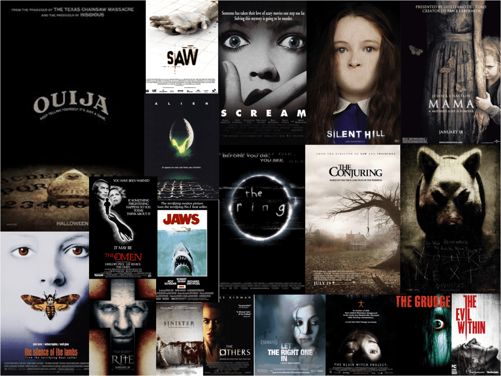
Personally I find this boring and lazy. There are some posters however which are more creative with their typeface choice. For example The Ring uses an ambiguous typeface with a white glowing outline. The letters are unevenly spread apart and the shapes of the letters are vaguely irregular. This is typically associated with static or messages being transmitted in static causing the message to become bend out of shape. Another example is the You’re Next poster which uses typeface which has been scratched into the metal.

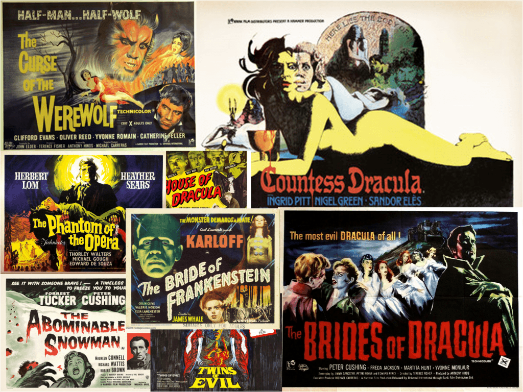
Hammer Horror Film posters are a further example of more creative uses of typography to convey the genre of a film. The typeface is usually bold and big in order to catch the audiences’ attention, it’s use is purely commercial. The Phantom of the Opera poster features a typeface which seems to be curving, reminiscent of the movement of a ghostly figure or smoke. The typeface has clear edges and uses serifs which connotes elegance of the opera however the bent lettering and bright yellow block colour of it dilutes this. On the other hand The Bride of Frankenstein is a sans serif typeface which implies modernity and development. Both of these are associated with science. The lettering is also glowing and ridged at the outlines which infers electricity therefore referring to the Frankenstein’s monster being brought to life with the use of it. Finally the Countess Dracula poster uses a very different letter type than the two previous posters. This one isn’t curved and is positioned on a straight baseline making this movie appear more sophisticated than the other two which were advertised as fun spinoffs. The typeface is mimicking old, ornate lettering used for writing manuscripts. This in turn pays homage to Bram Stoker’s Dracula. The choice of red for the typeface represents blood, heavily associated with vampirism. The lettering is embedded within the image as the blood dripping off of the chalice is forming the letters. I like the concept of combining images and lettering and I’m keen on developing my final design around this idea along with the themes of ornament and texture. I think these three aspects of design combined would merge into a visually intriguing and unique typeface.
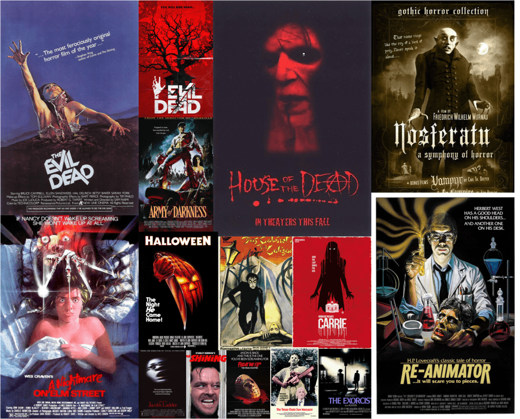
I have noticed that a lot of horror poster designs use occult symbols incorporated into the letter type design such as the House of the dead or Rite. These symbols further reinforce the ambience of the typeface. I like the concept of images or symbols being incorporated into the typeface it self.
From the research I’ve conducted for this post I’ve been inspired to create a letter form which incorporates images into the letters themselves. So far I’m thinking about real life design, using objects to create letters and then photographing them. I’m also going to make a collage out of cut out magazines to experiment with form and texture.
Bibliography:
Winkel, R. (2015) Building on Typography Trends in Movie Poster Design. [online] Print Mag. Available from:http://www.printmag.com/typography/typography-movie-poster-design/ [Accessed 05/10/2015]


