Brief 1: Typography
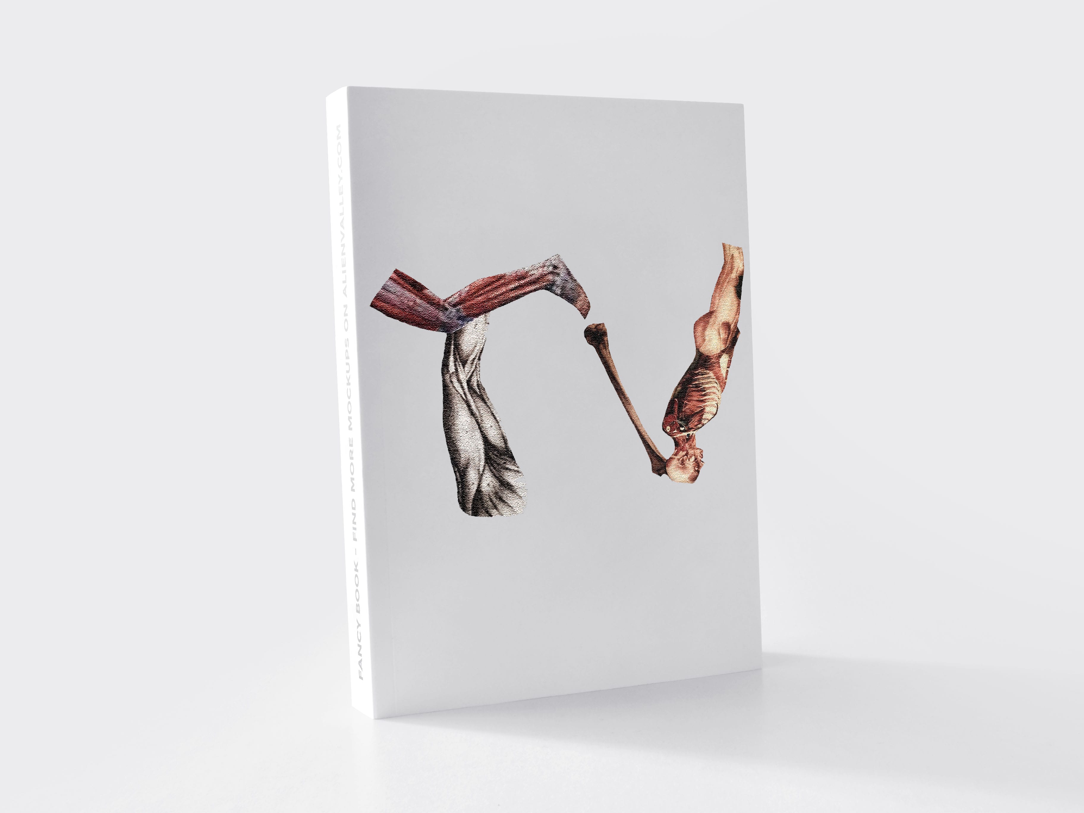
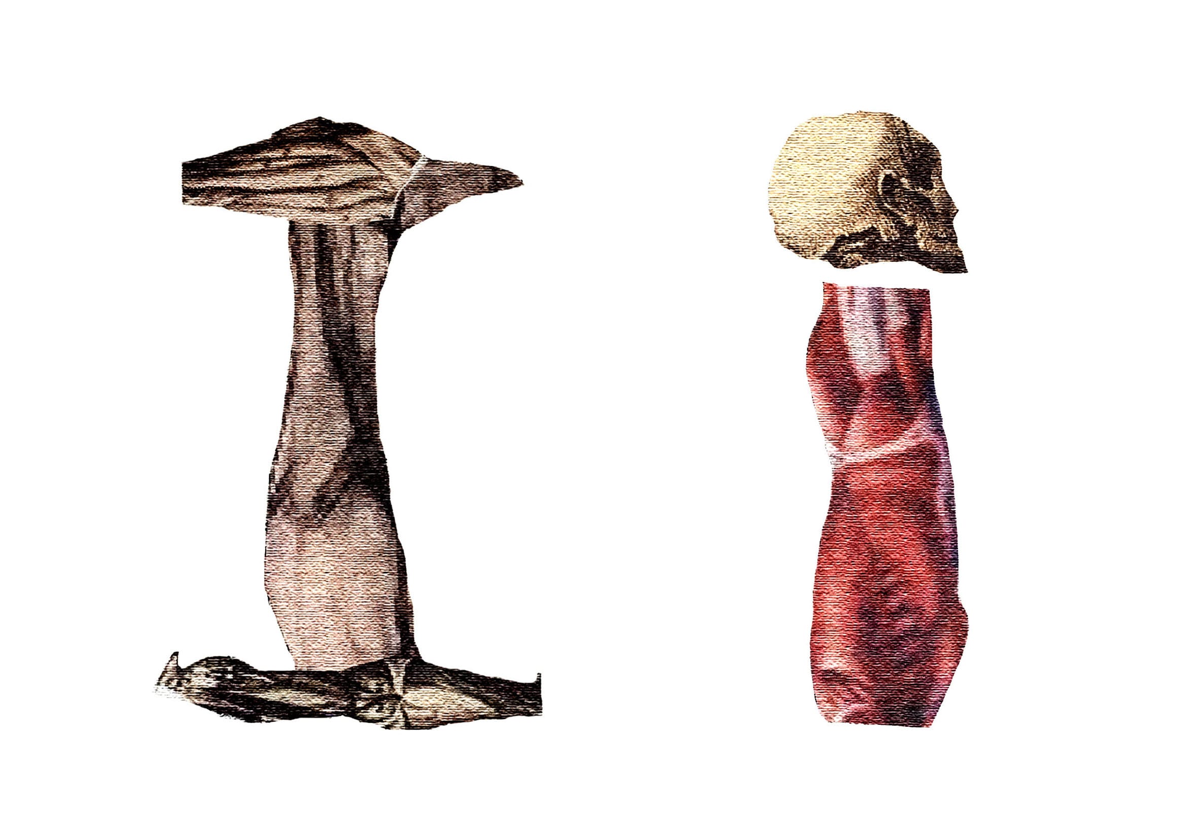
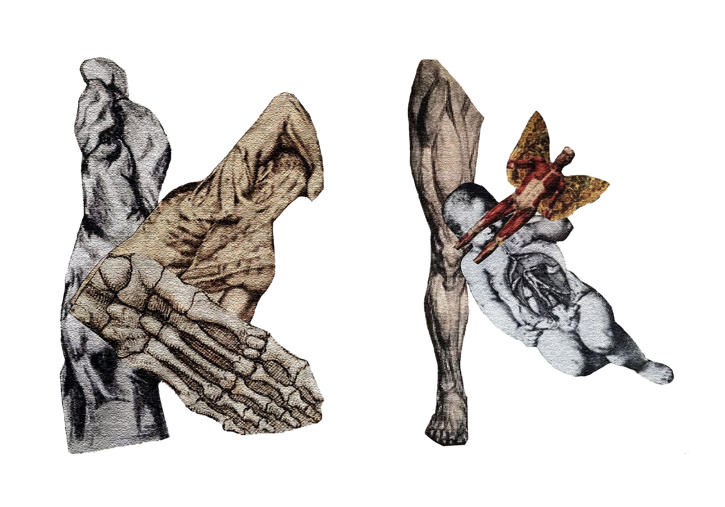
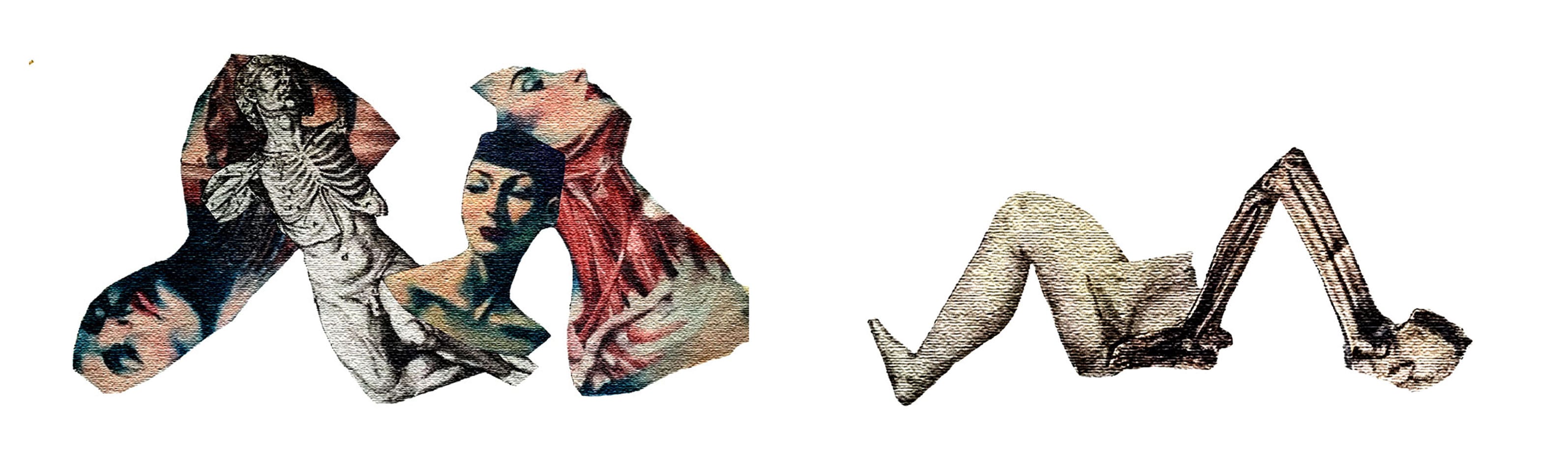
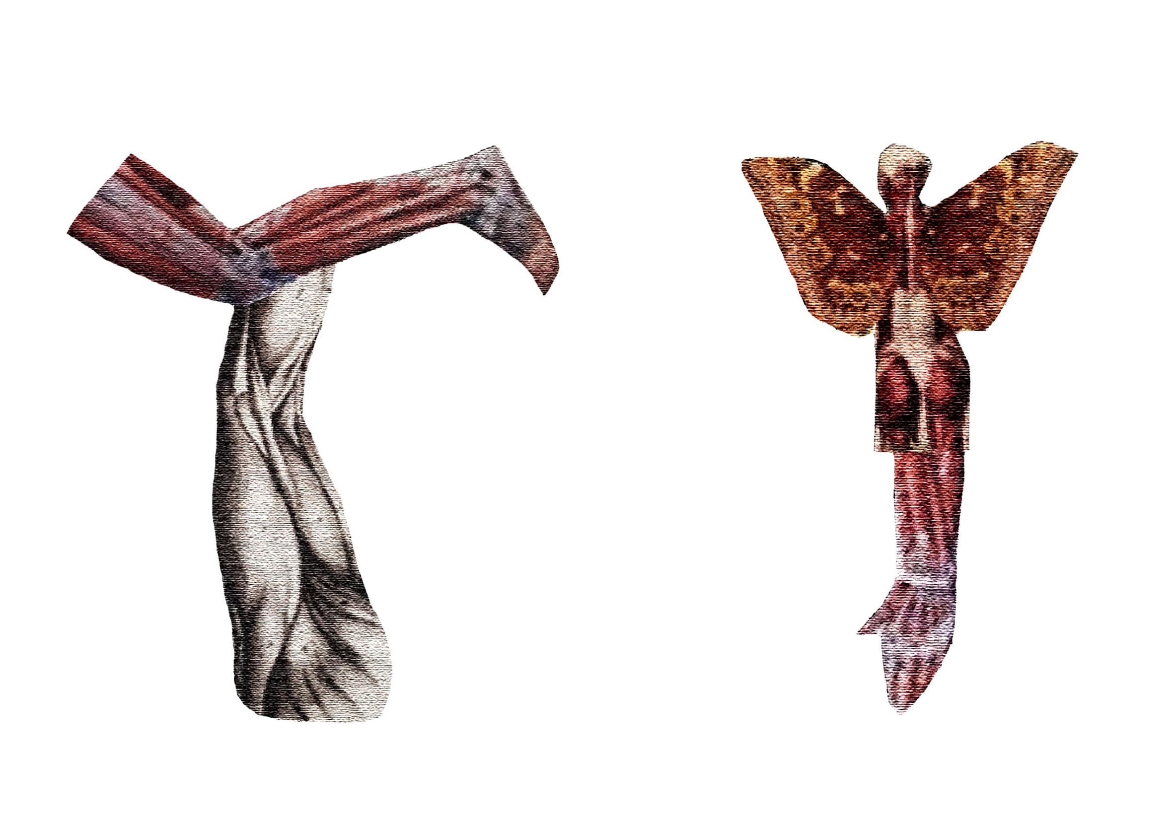
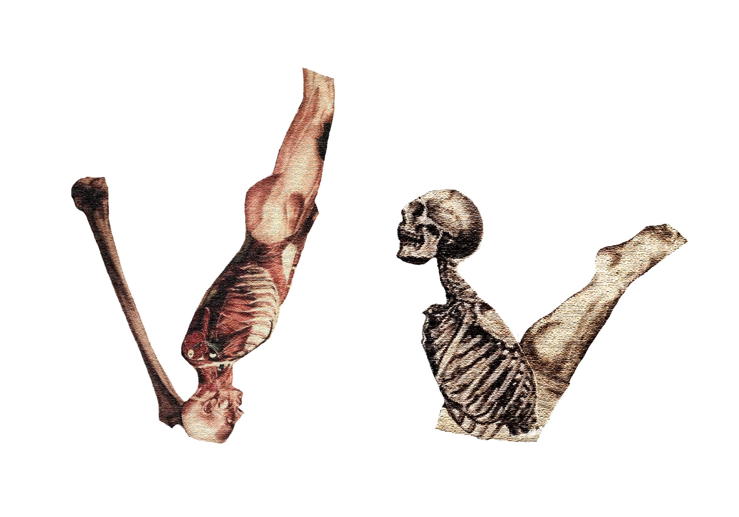
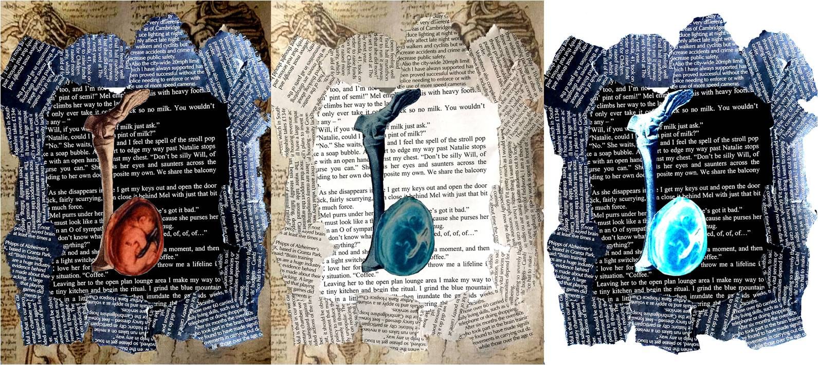
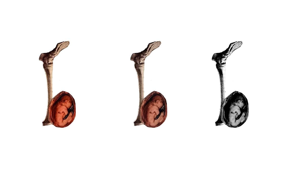
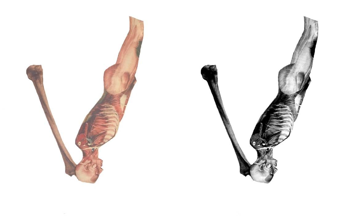
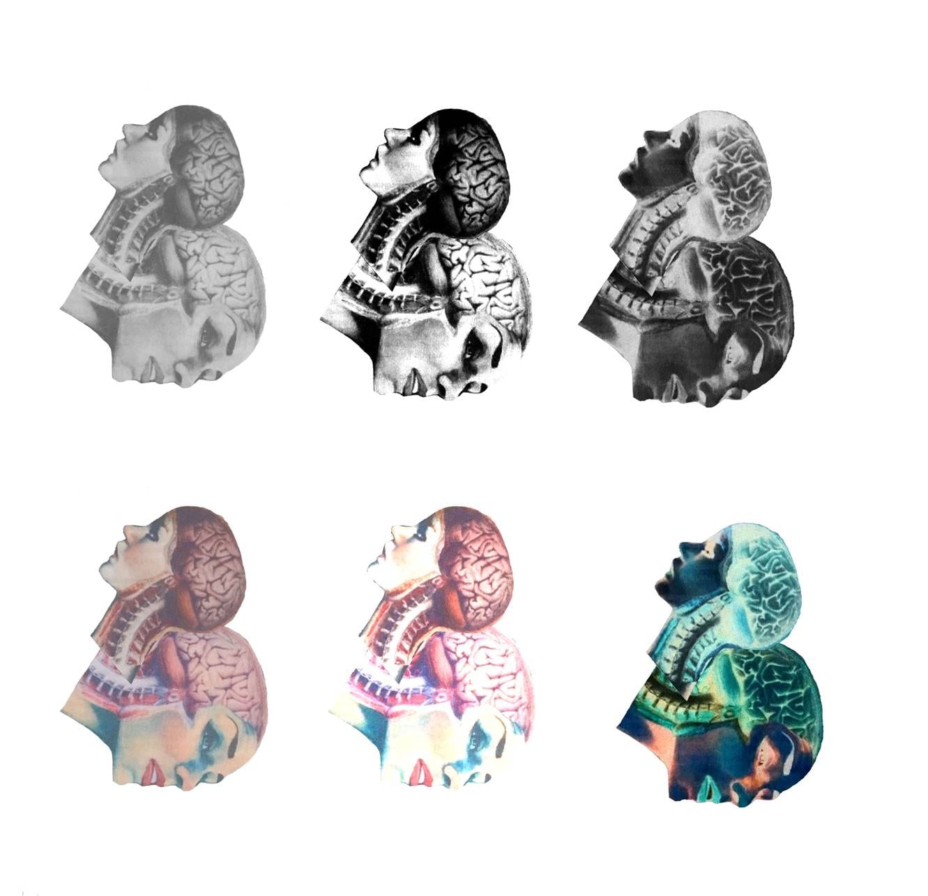
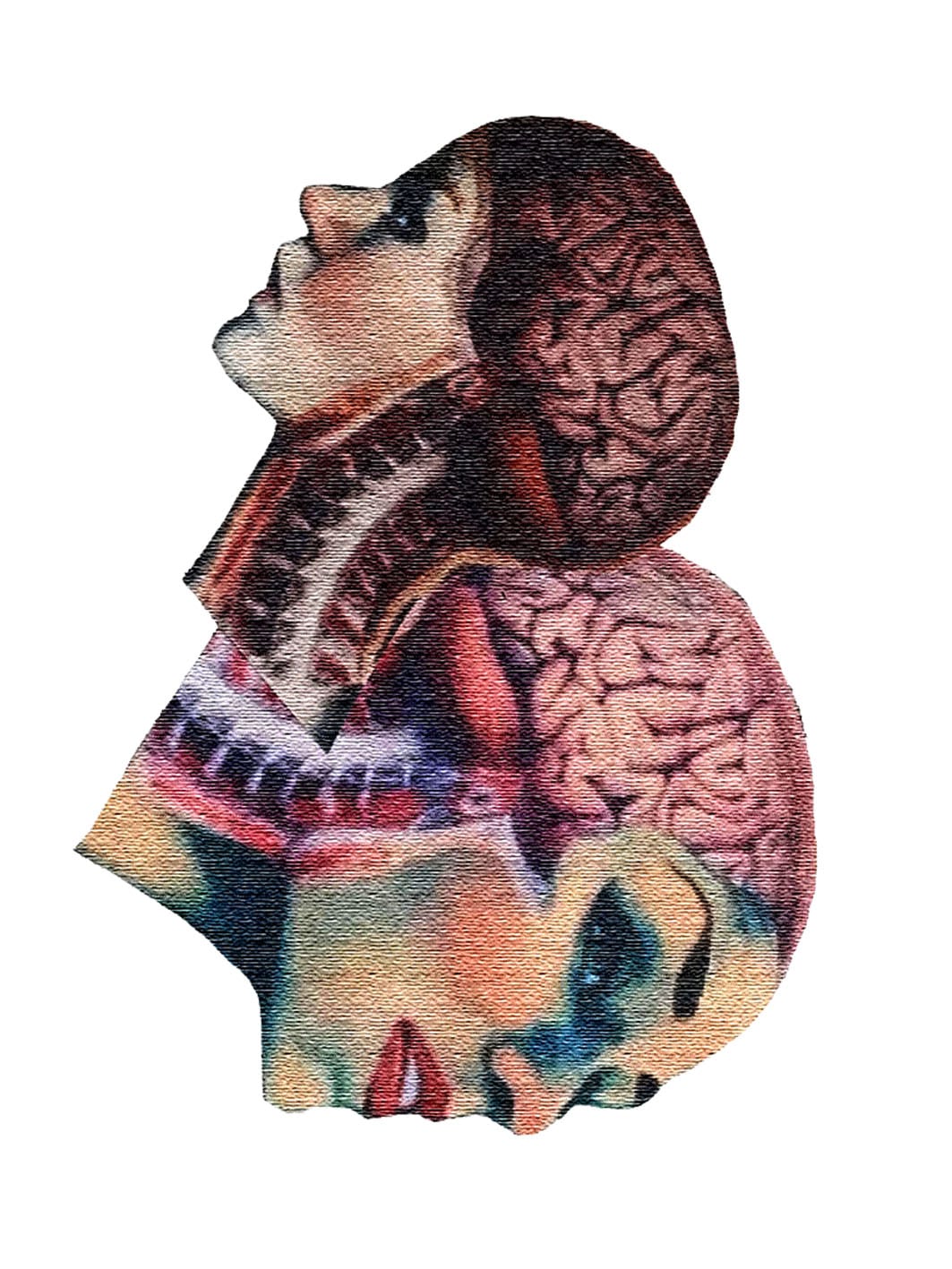
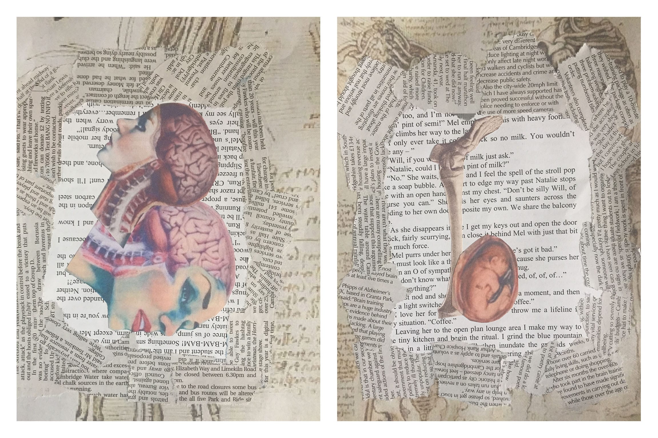
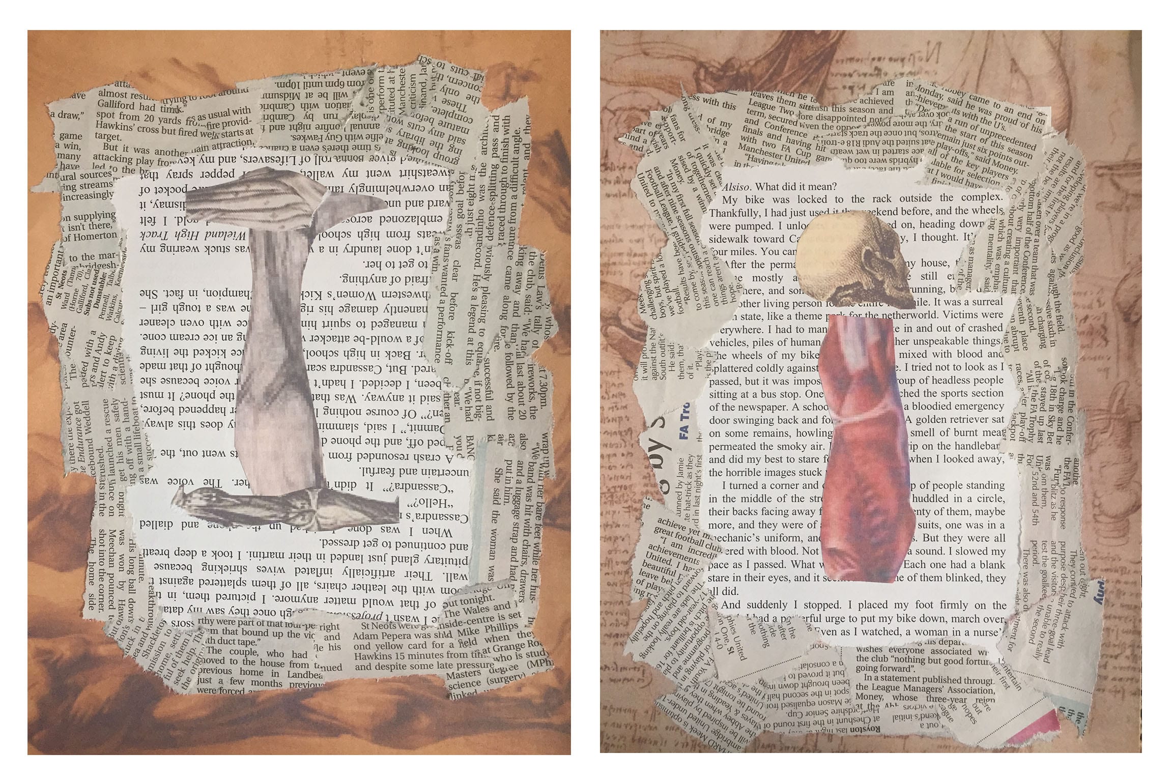
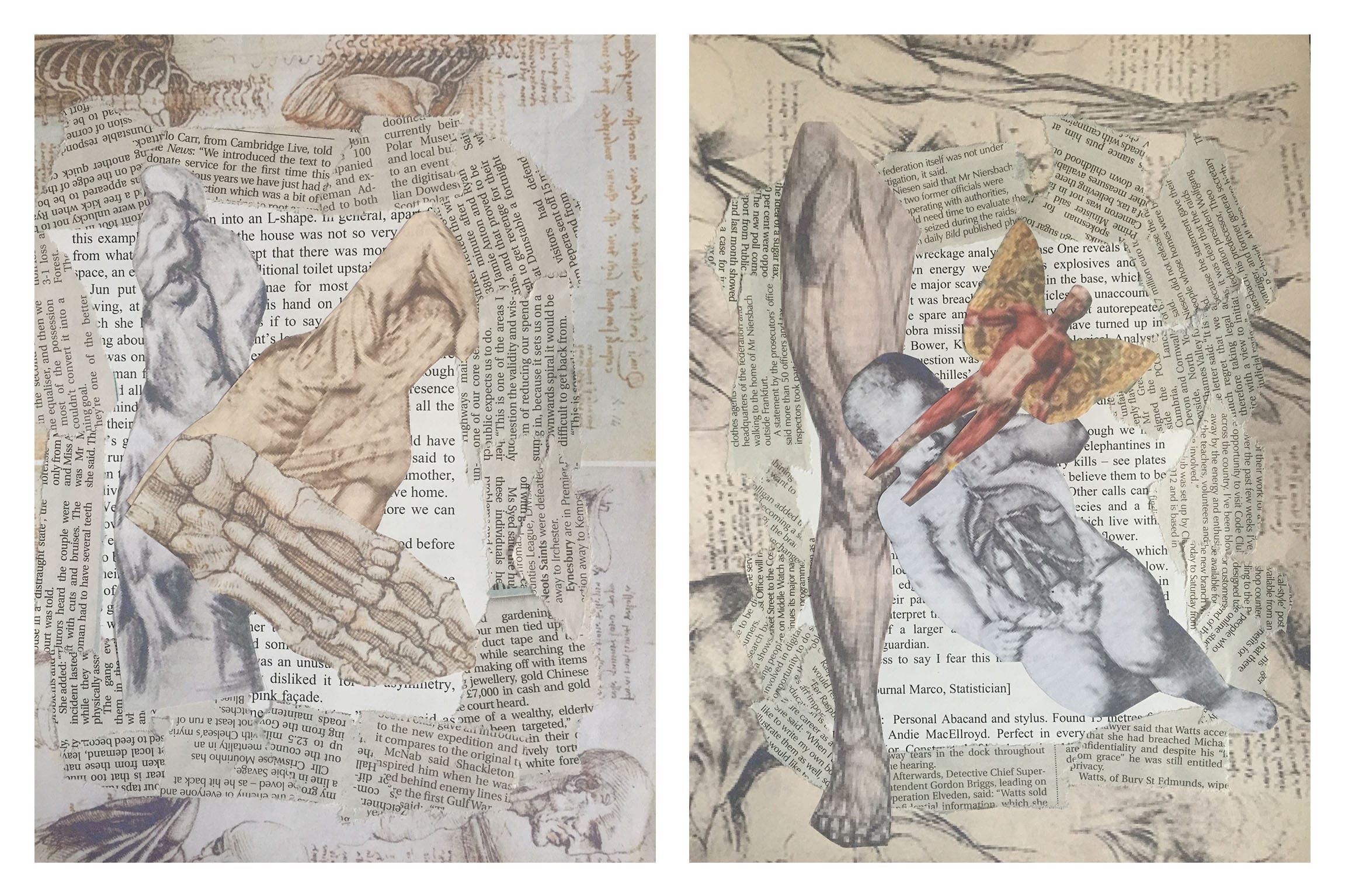
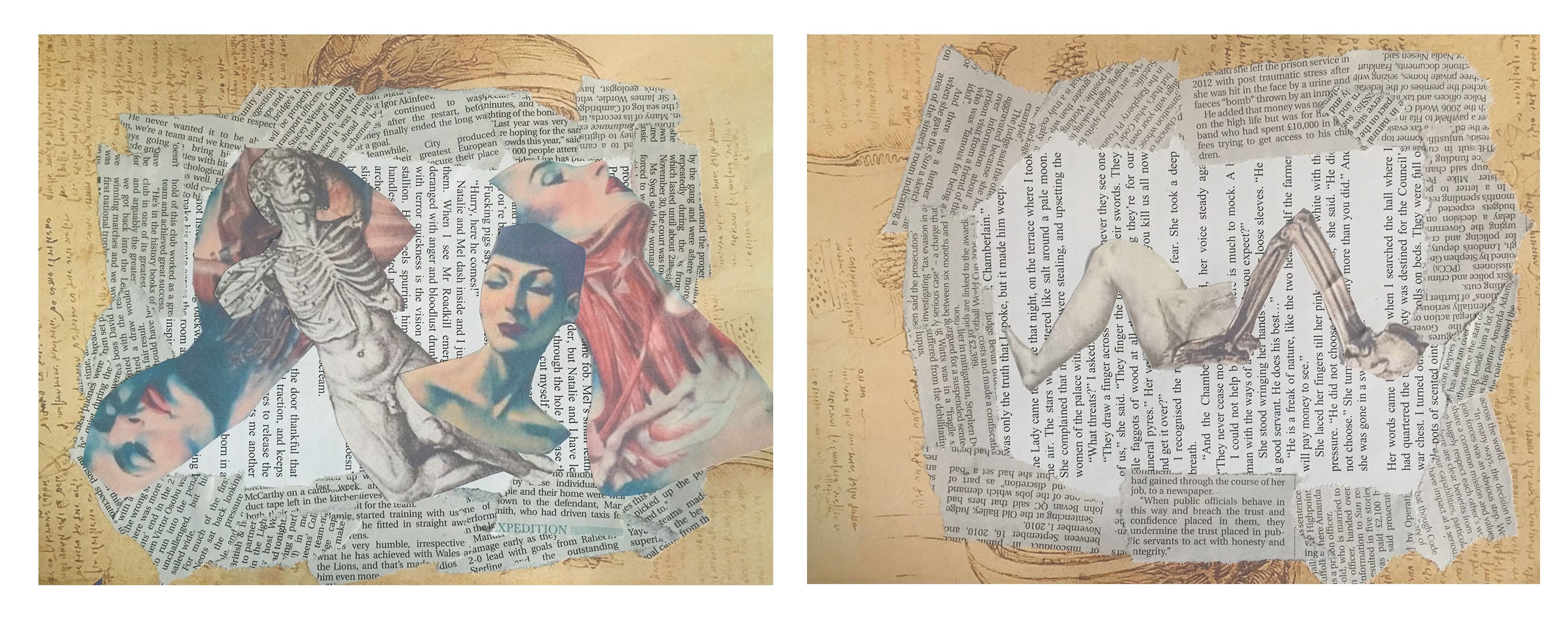
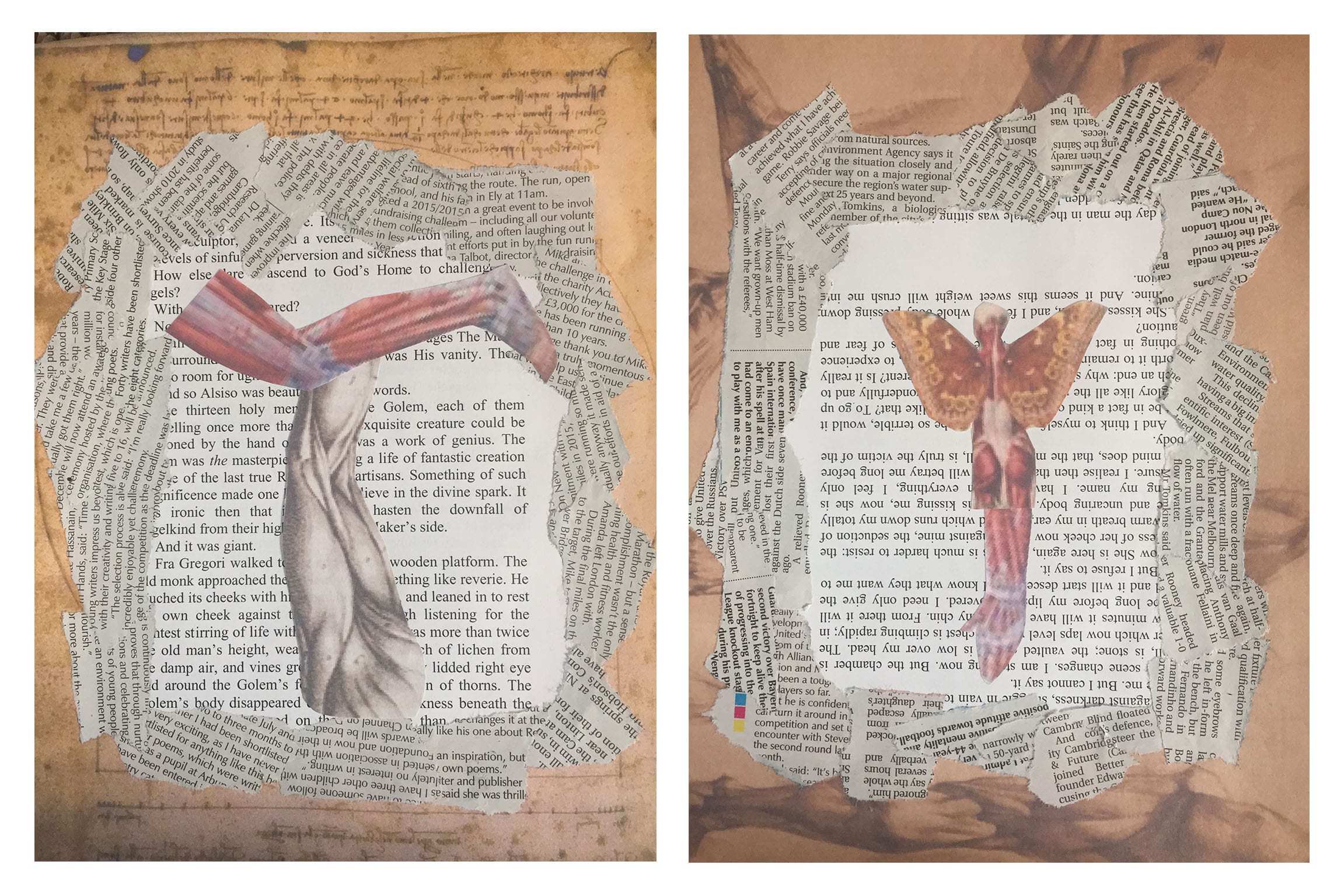
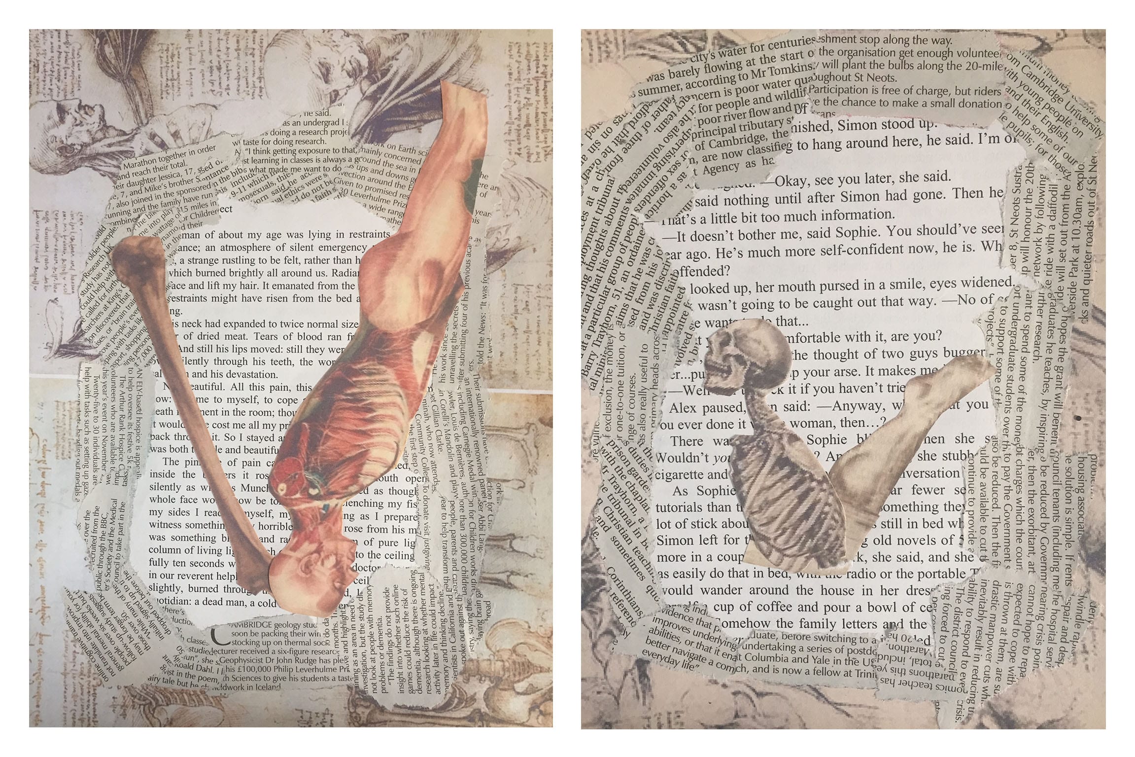
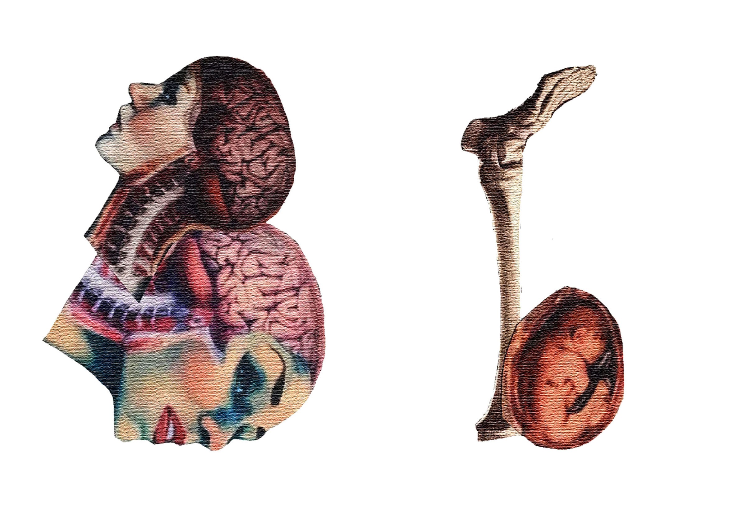
The underlying themes of my project were texture and ornament. Few weeks into the project I realized that I’ve already established myself within the horror genre and so I deiced to pursue this theme as well as the already mentioned texture and ornament. I developed two ideas. One focused on ornament and was produced using calligraphy techniques and the other focused on texture and was a collage. Both of these were inspired by various horror texts such as the TV series Hannibal which made me think about how bodies can be used to form letters. I called the first idea Dismembered Letters and the other Anatomy Collage. Dismembered Letters’s design was heavily inspired by Hammer Horror Film’s poster design for Countess Dracula. It inspired me to incorporate the lettering into images. Anatomy Collage was more heavily influenced by the idea of rearranging dismembered letters and this is why I decided to make the letters in a form of a collage. Here is a link to my Ideas post: https://patrycjareimusdesign.blogs.lincoln.ac.uk/2015/11/15/ideas-2/. In the end I decided to further develop the Anatomy Collage because the idea of using old anatomy sketches in combination with some modern artwork appealed to me. After I made my collages I decided to manipulate my letter forms in Photoshop. Some of the images I printed out where pixelated. I added a texture in Photoshop in order to hide the pixelations and to reinforce the fact that this project was influenced by texture. I feel that my typeface is reflecting all of the themes because it has both texture made by hand during the collage process and texture added digitally. The horror element is reflected through the use of naked bodies which were rearranged into letters. During the development stages I realized that the background look quite amateurish which is precisely why I decided to get rid of it. Instead I decided to present my letter forms on a plain white background which in my opinion looked far more professional and, unlike the highly cluttered background, allows the letters to be appreciated indepth. This letter form design was created with a specific audience in mind, these would be psychology/horror fans, and I think it would appeal to them due to it’s captivating details. The images used for the collages were rigorously selected to reflect a form of sophisticated body horror which when combined together create thought provoking collages. This allows the audience to look closely and explore different elements of the letter form design. Because of the low readability of my letter form it’s most appropriate use would be as a modern drop cap or for a cover of a magazine, comic etc. Here is a link to my Audience & Purpose post: https://patrycjareimusdesign.blogs.lincoln.ac.uk/2015/11/10/audience-purpose/ . I might sound a bit big headed, however I honestly wouldn’t change anything about my final design. I think it turned out to be an elaborated design made to a professional standard. I do however wish that I cold have presented my letters in a better mock up or perhaps a magazine which I designed myself so that they could be fully appreciated. If I had more time I would’ve also made the whole alphabet which I regret that I couldn’t do.
Brief 2: Multi Format Data Visualisation
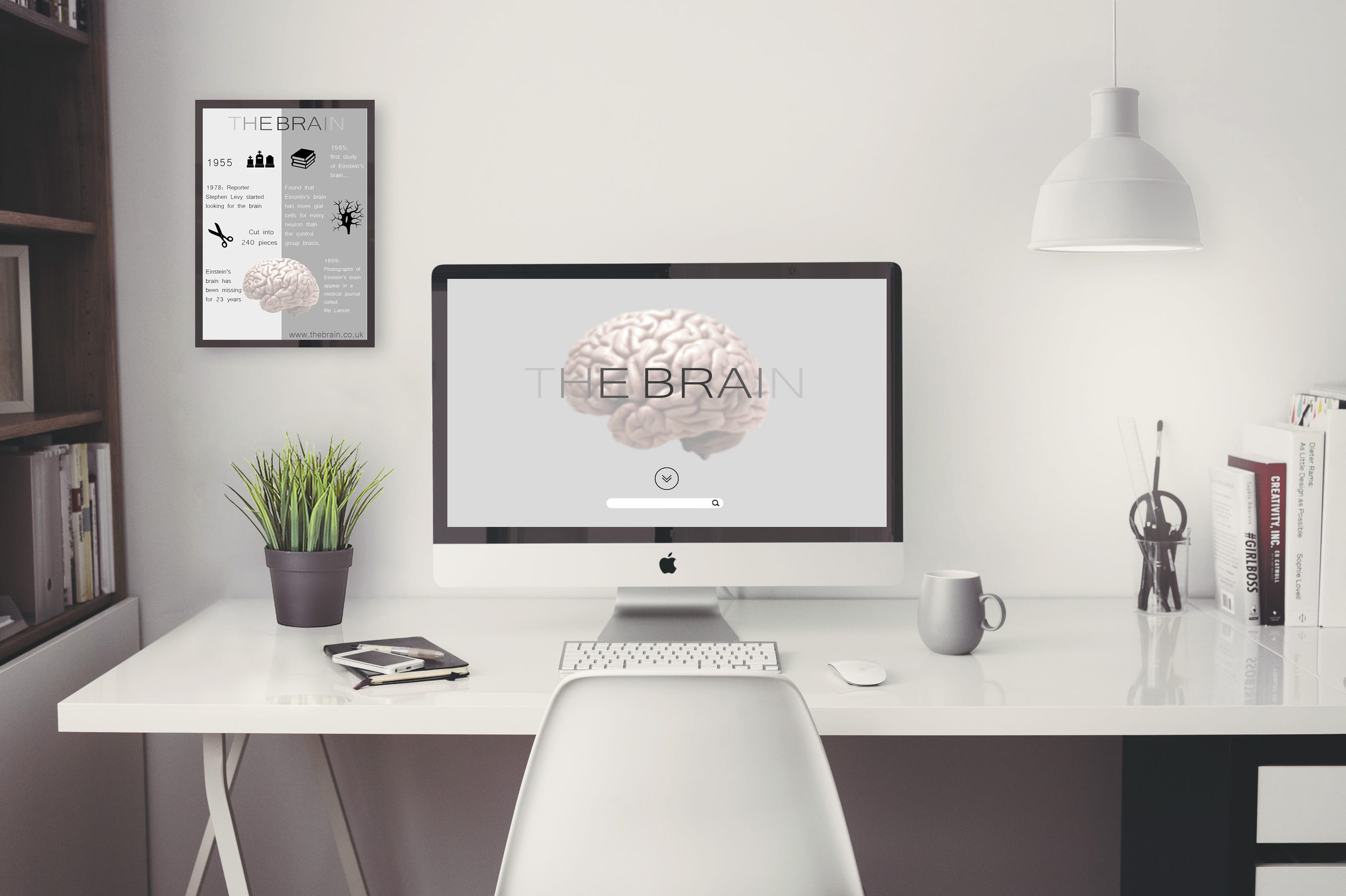
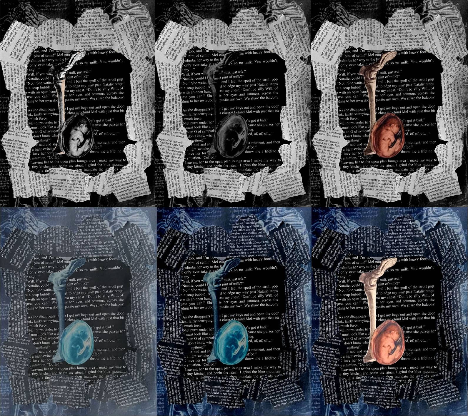
I started off this brief by researching Albert Einstein’s theory of relativity since this is what the brief was expecting of us, or what I though it did. However I later on found out that we were aloud to do pretty much whatever we wanted so long as it was to do with Albert Einstein. This is where I decided to conduct more research into Einstein’s life. I found out that after his death the pathologist who was responsible for his autopsy stole his brain in order to conduct research. This story intrigued me and actually got me excited about this project because it was creepy and weird, areas which I already established myself within as a designer. Another part of my research which heavily influenced the development of my infographics was movement. Before I started researching infographic I had no idea what they were or the creative ways in which they can be designed in. I’m not only talking about static images providing the viewer with information about a certain topic. I found out that infographics have different sub-genres such as animated infographics and responsive infographics. These two aspects of infographic type is what inspired me to create my final app and website designs. My app was supposed to be an animated infographic, the website a responsive infographic and the poster a static A4 print. Transmedia was another intriguing form of spreading information. It dictates that different types of media add more information to the overall story being told. In this design’s case the A4 poster infographic is the first media text which promotes my project and introduces the audience to the story of Einstein’s brain. It achieved it by providing some basic information to intrigue the audience and the website’s address. The app is the next stop on the journey. It’s interactive and animated to grasp younger audience’s attention. Finally the website provides the most information about Einstein’s brain almost like a huge responsive database. The actual appearance of these was inspired by a few websites and apps I researched. I wanted a clean and uniformed look in order to bring some credibility to my project which I ended up naming THE BRAIN. The website operates by either searching something about the brain or clicking on a part of the brain which would light up, the rest of the brain will go lighter and blurry to further separate that section of the brain. At that point a box with information would appear. The A4 poster, the app and the website were design with a 16+ aged audience in mind which is why they’re so simplistic; to make them easy to navigate. Here is a link to my Audience & Purpose post:
https://patrycjareimusdesign.blogs.lincoln.ac.uk/2015/12/13/audience-purpose-2/.
Before this year I never used InDesign or Illustrator before nor worked with mock-ups this is why this project proved very difficult. In the end however I manged to create a basic and minimalist design which I am very proud of. Obviously the design of the infographic can be improved and I think in the future after gaining more skills with working with the software I could create something of a high professional standard.