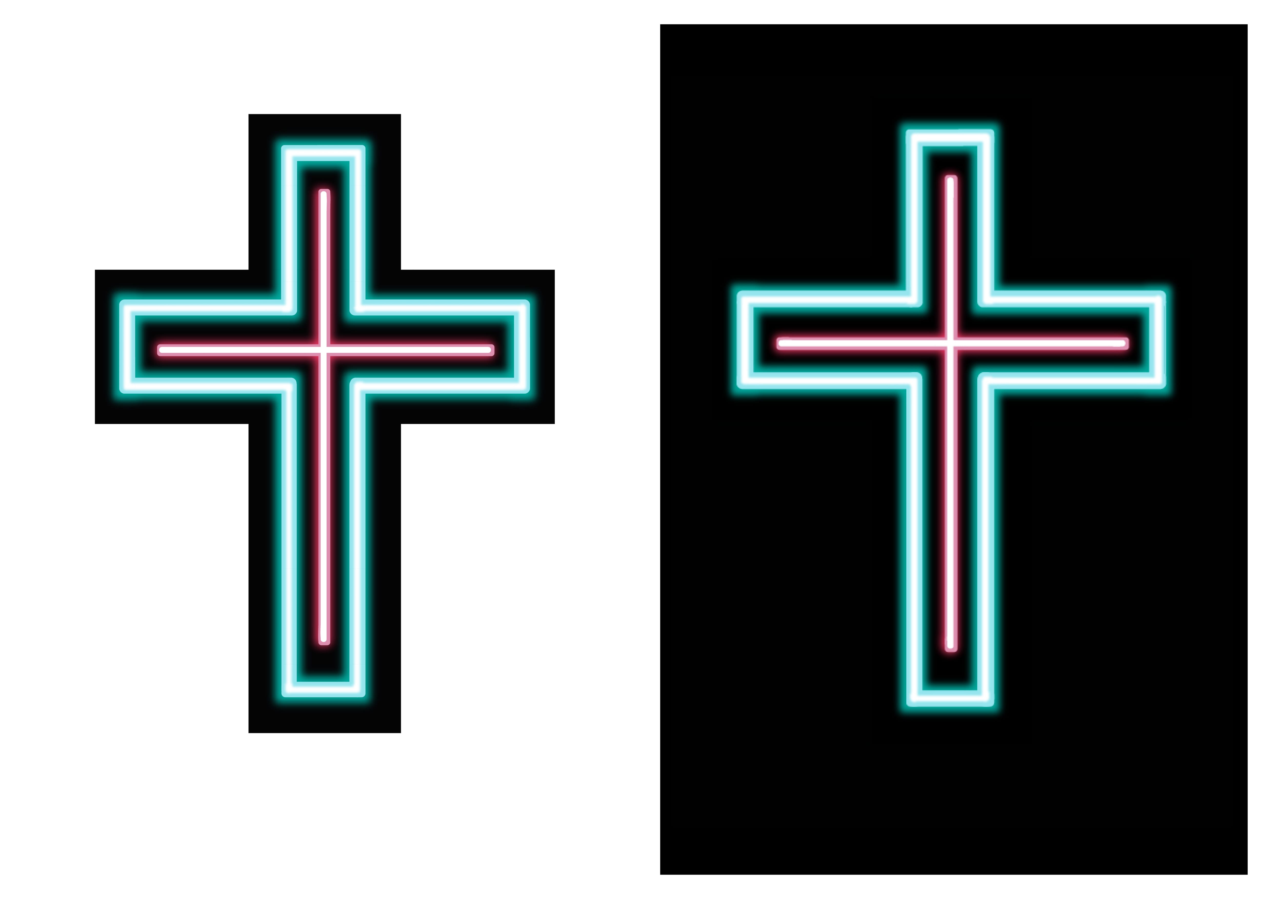
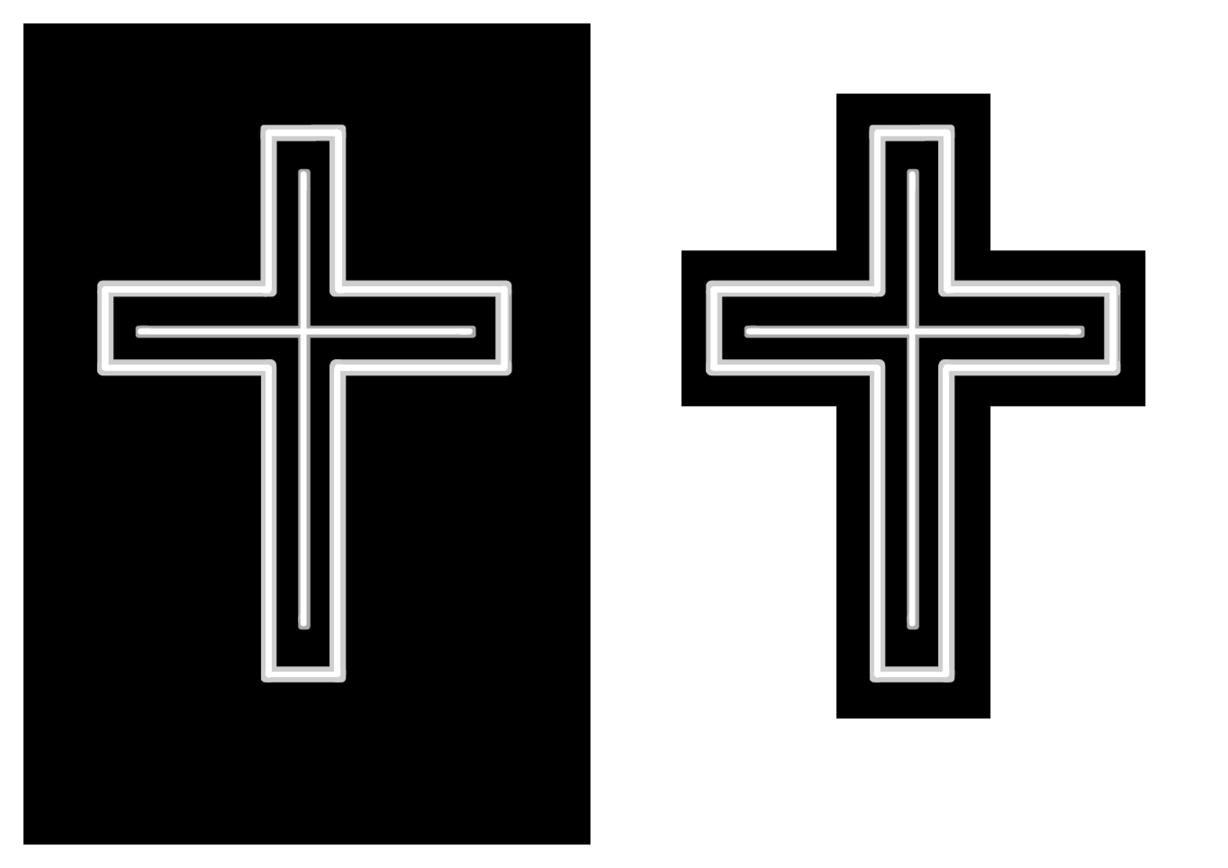
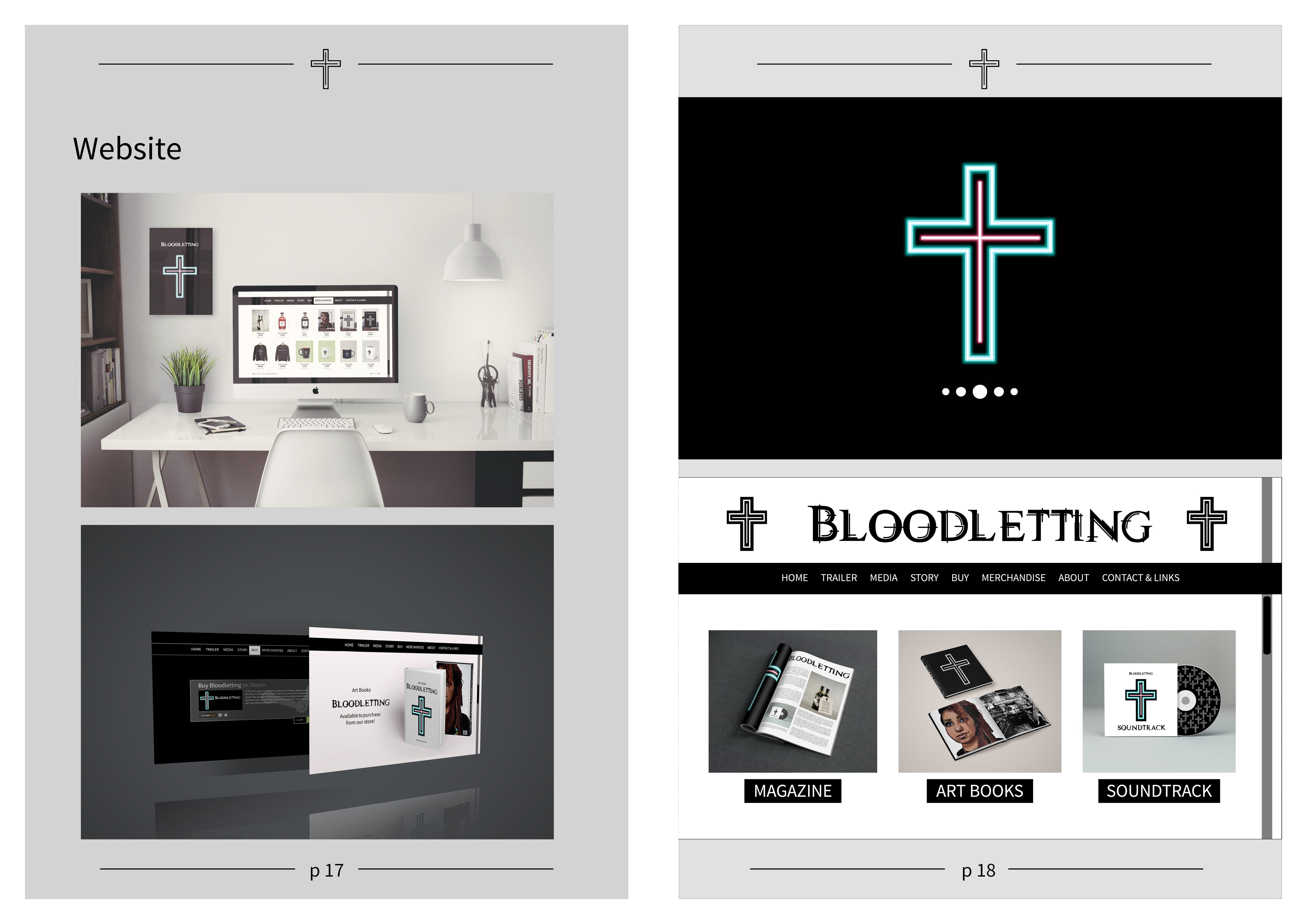
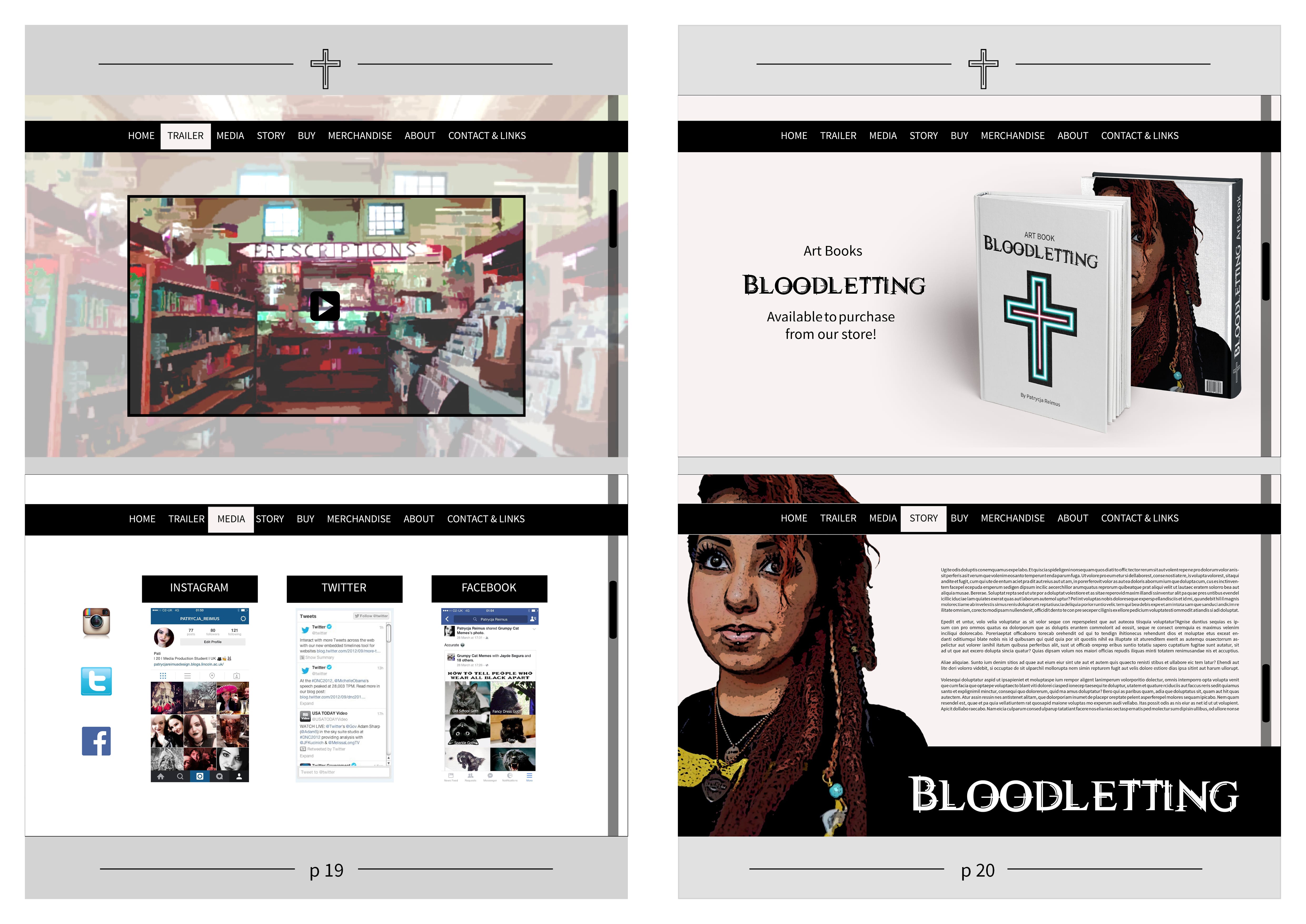
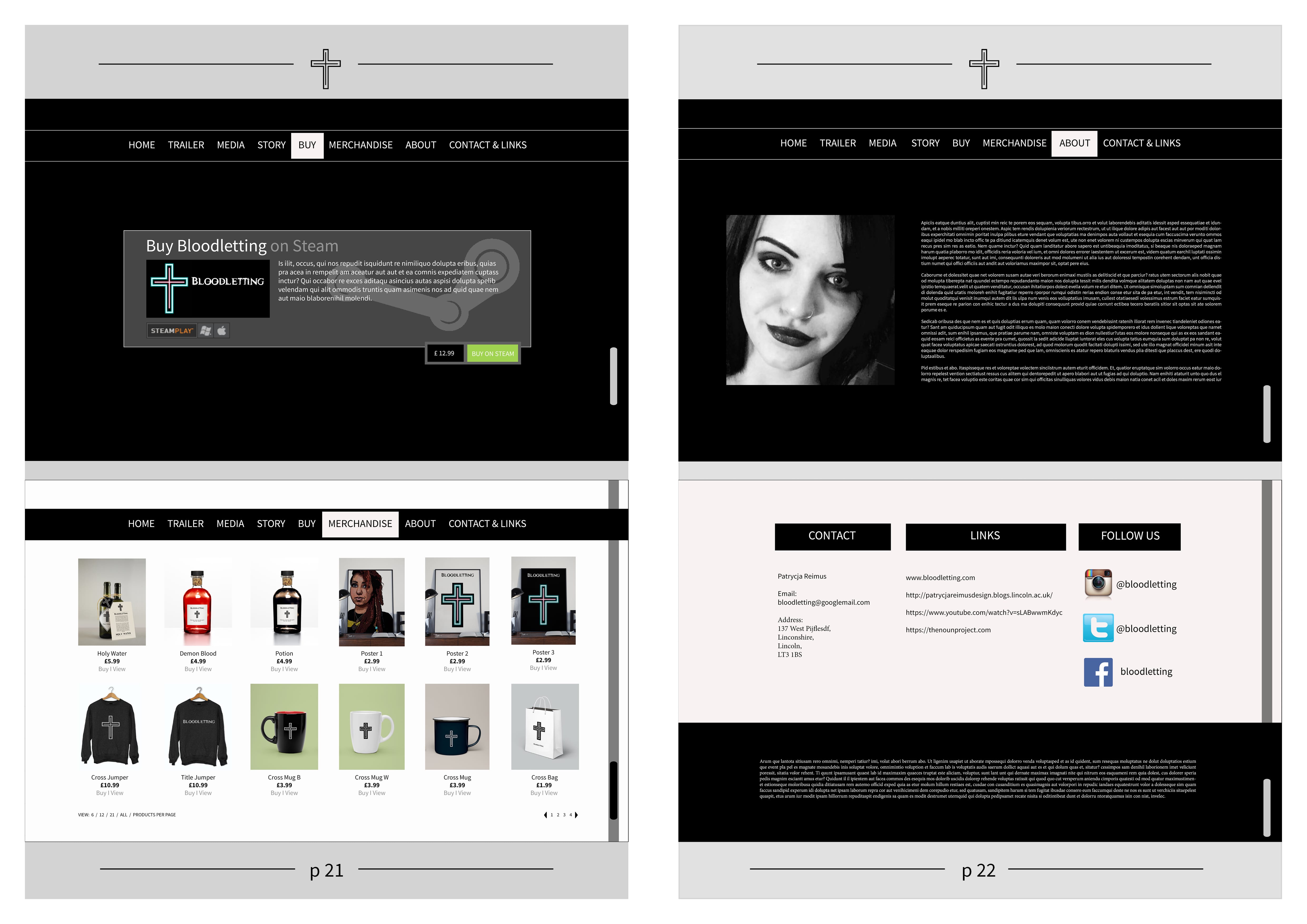
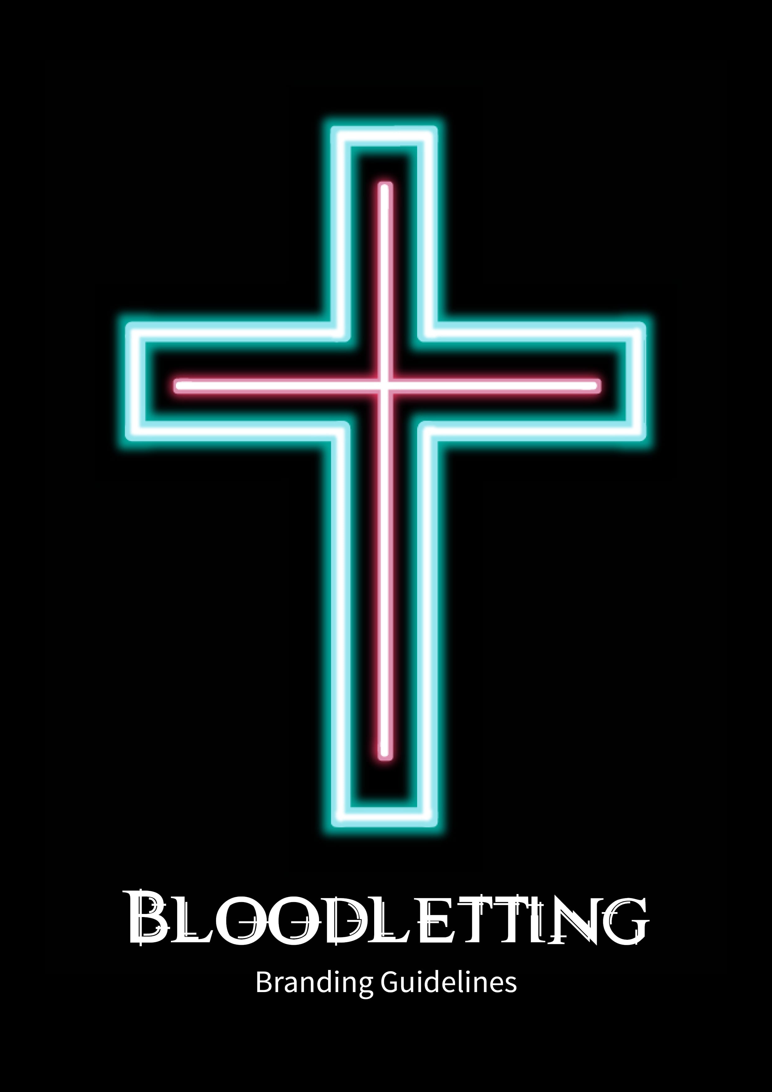
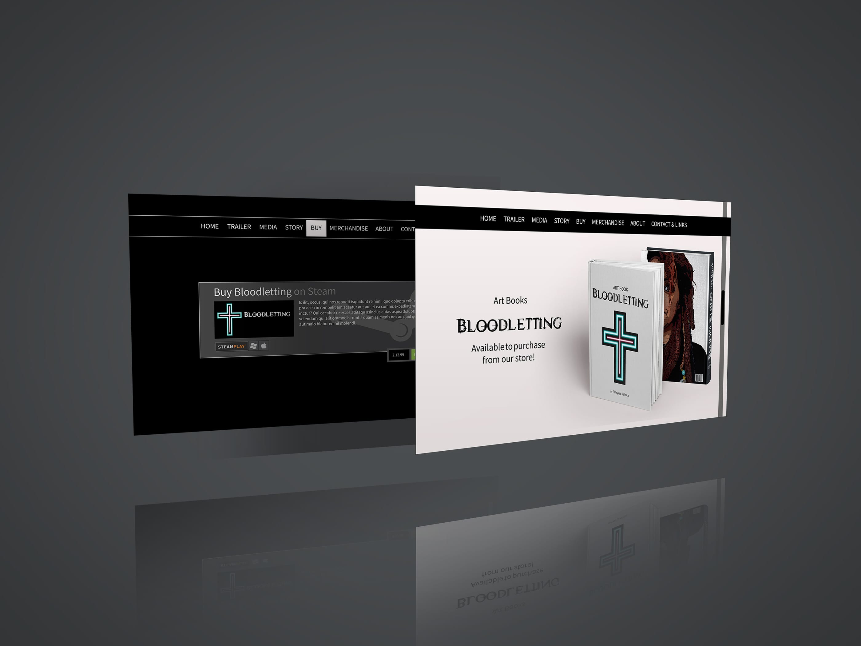
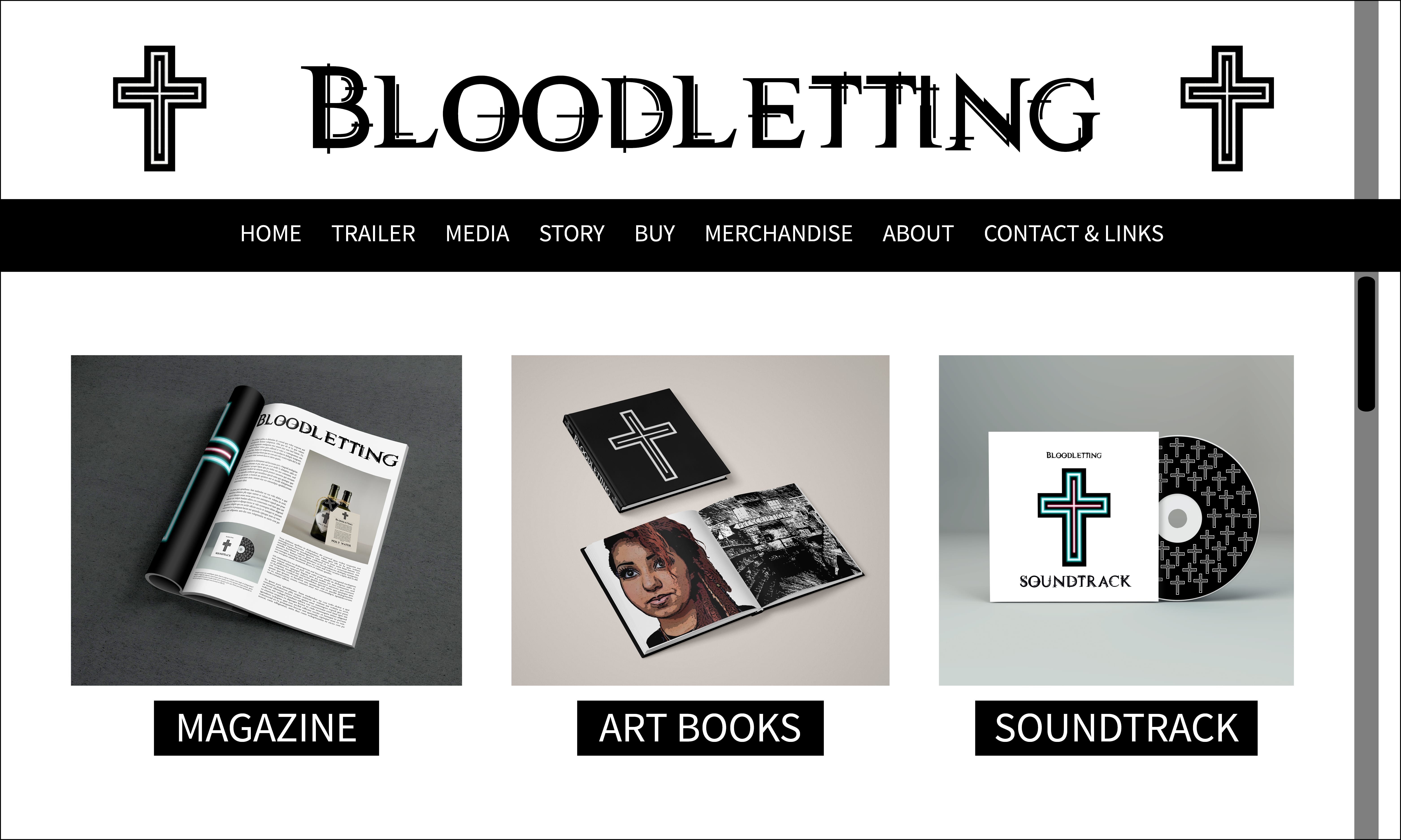
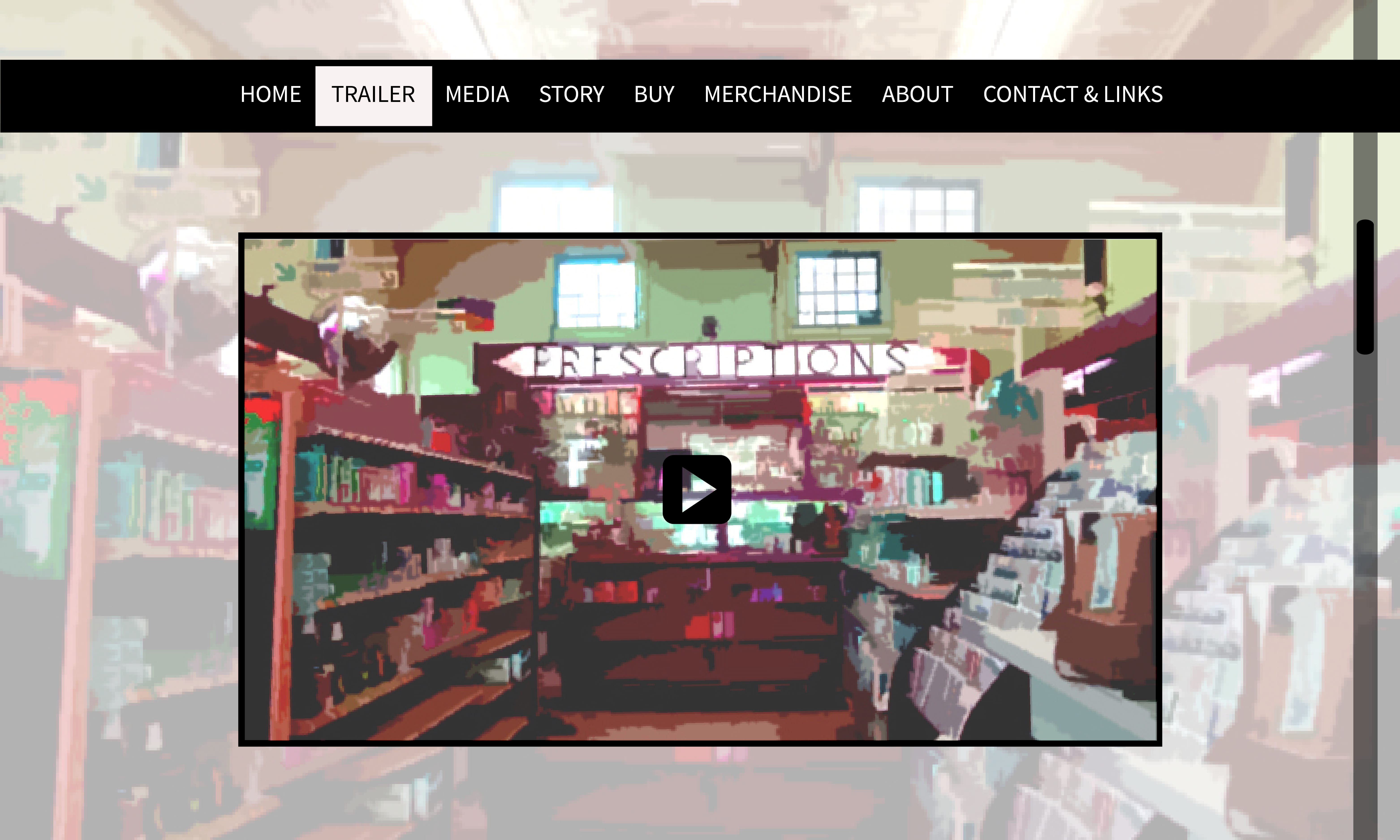
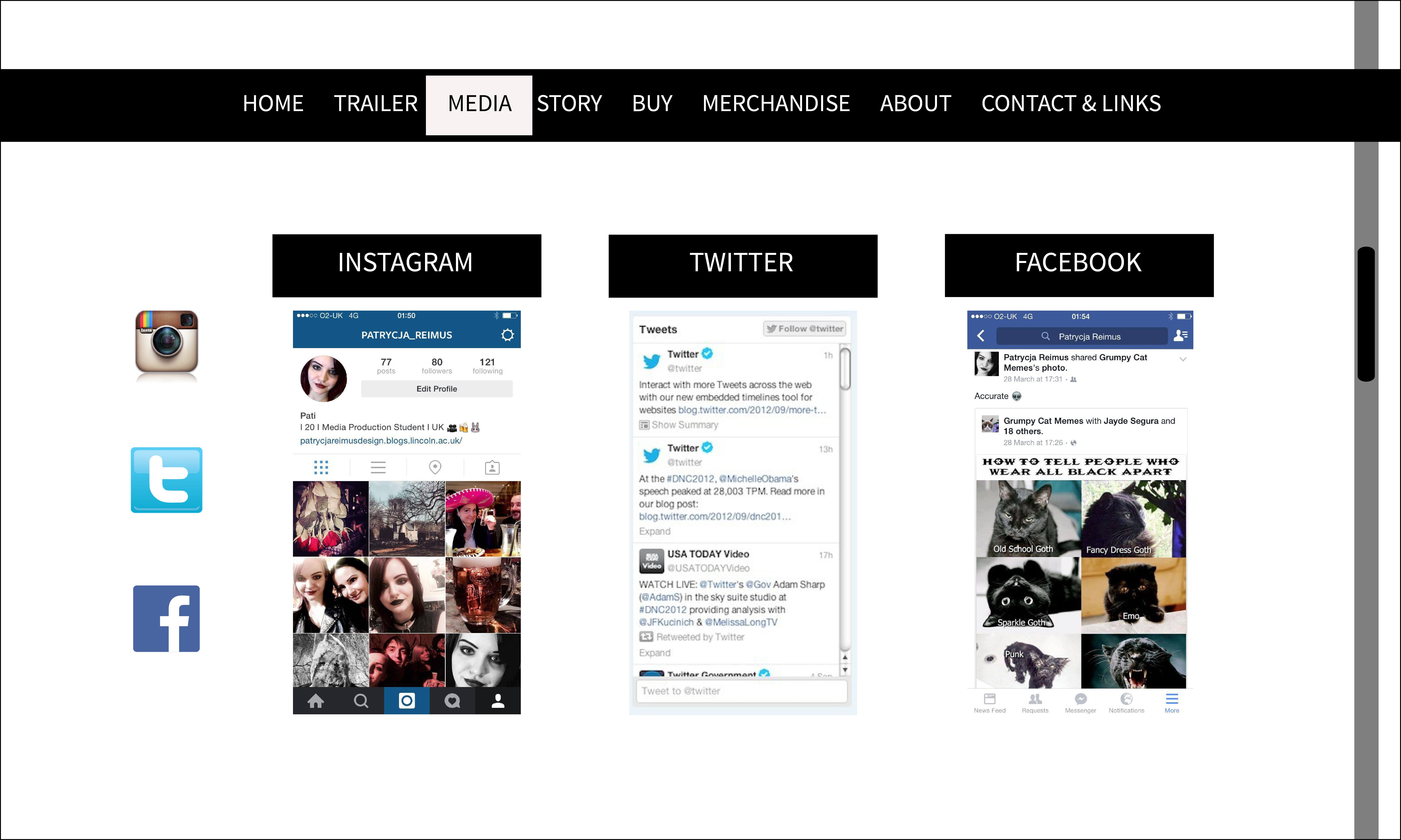
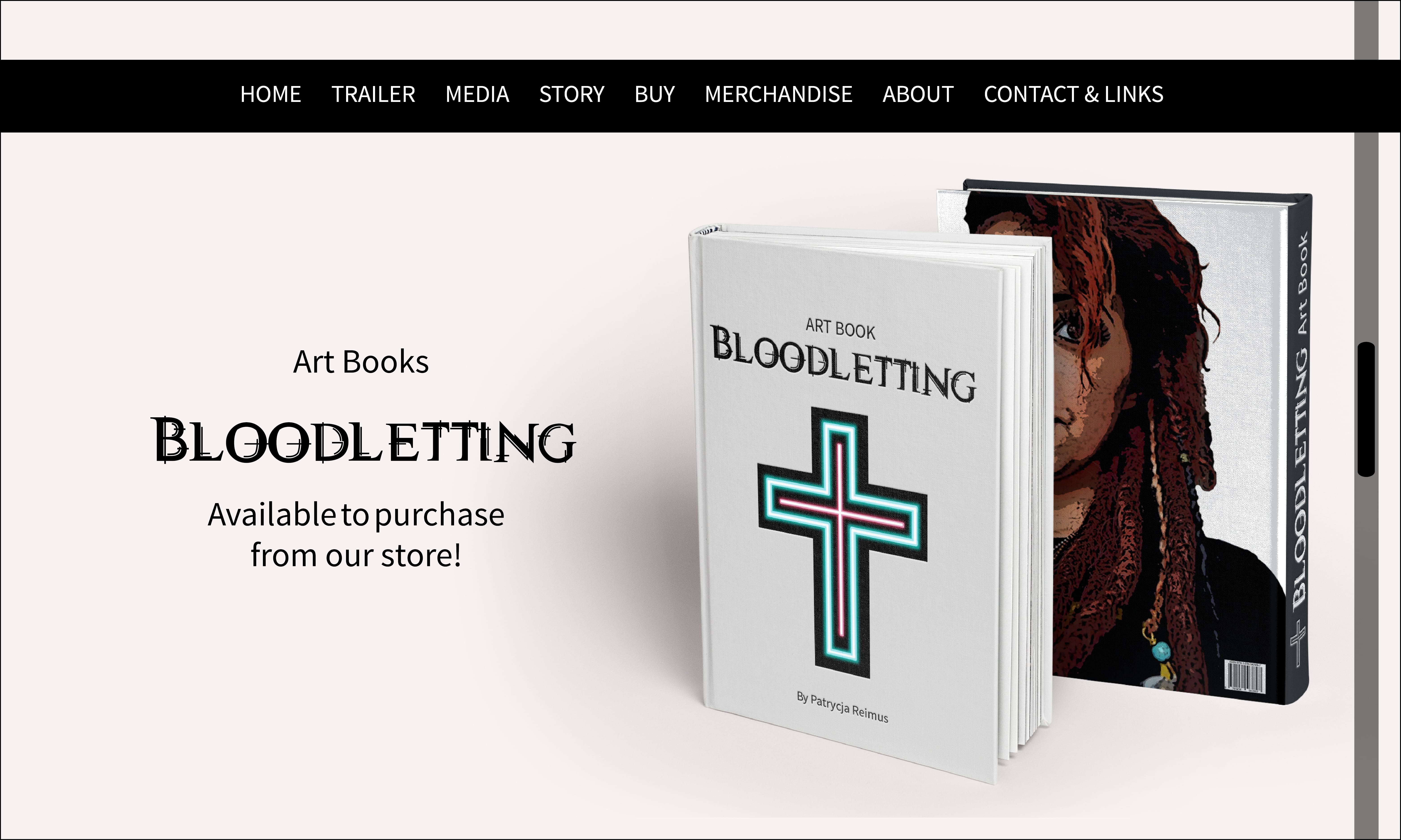
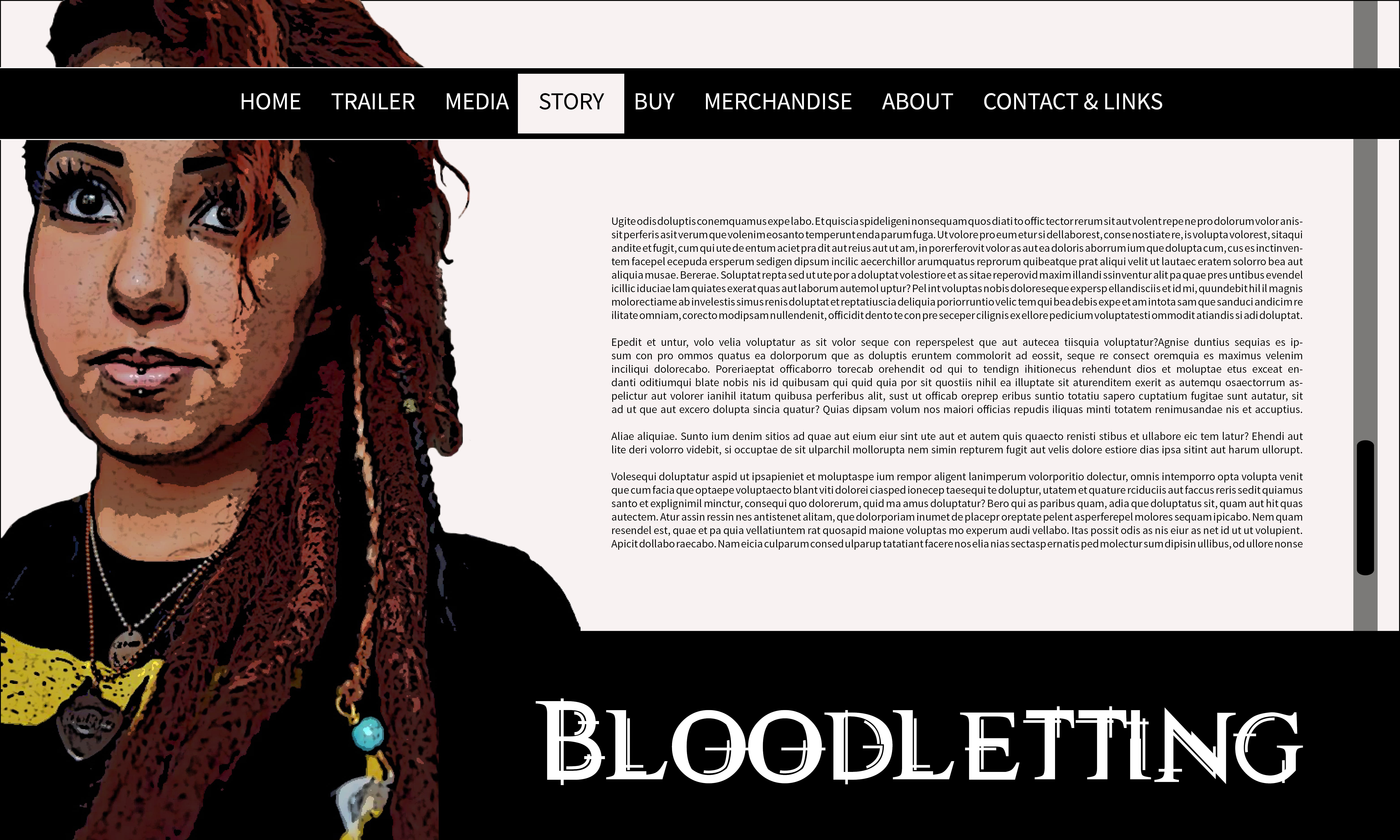
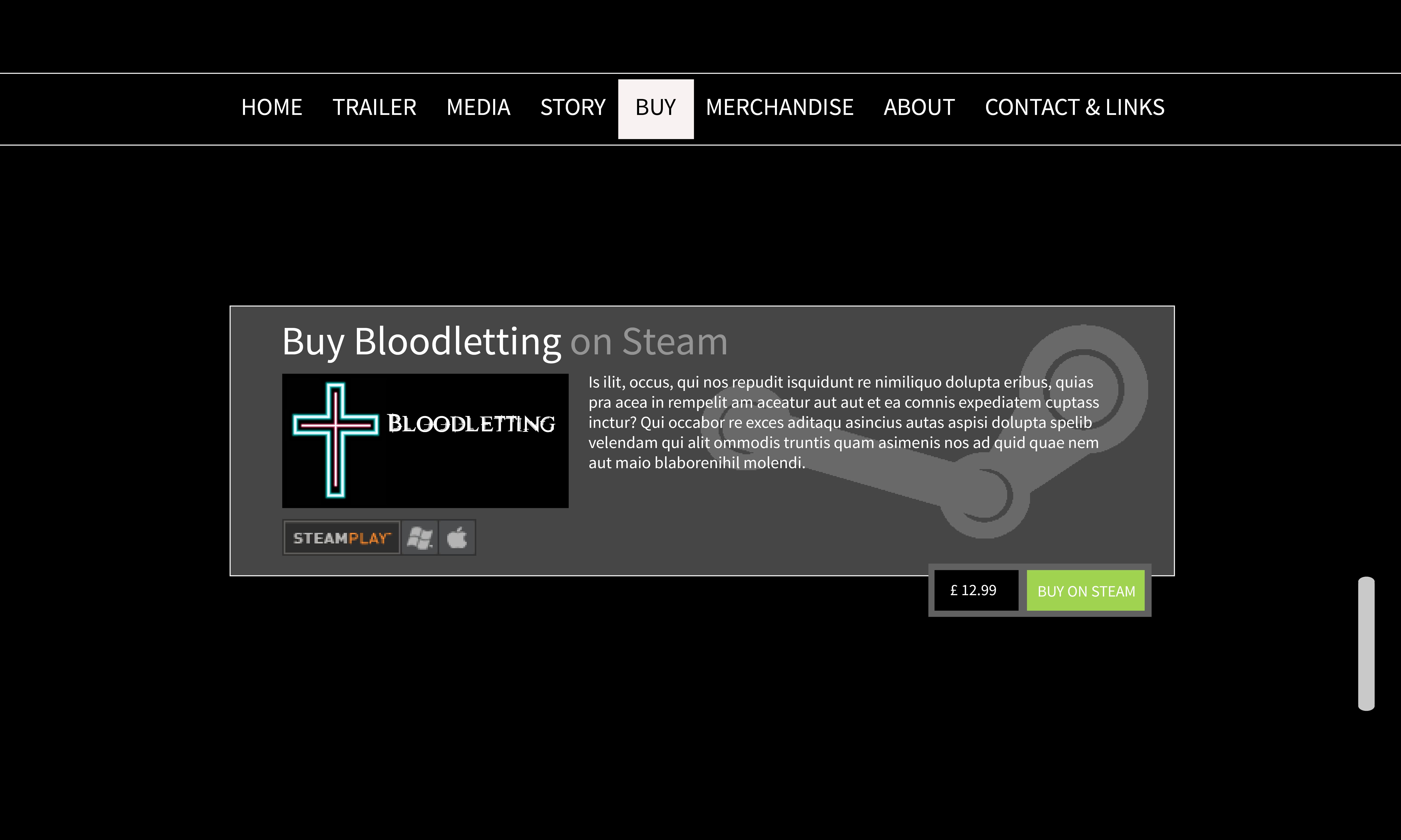
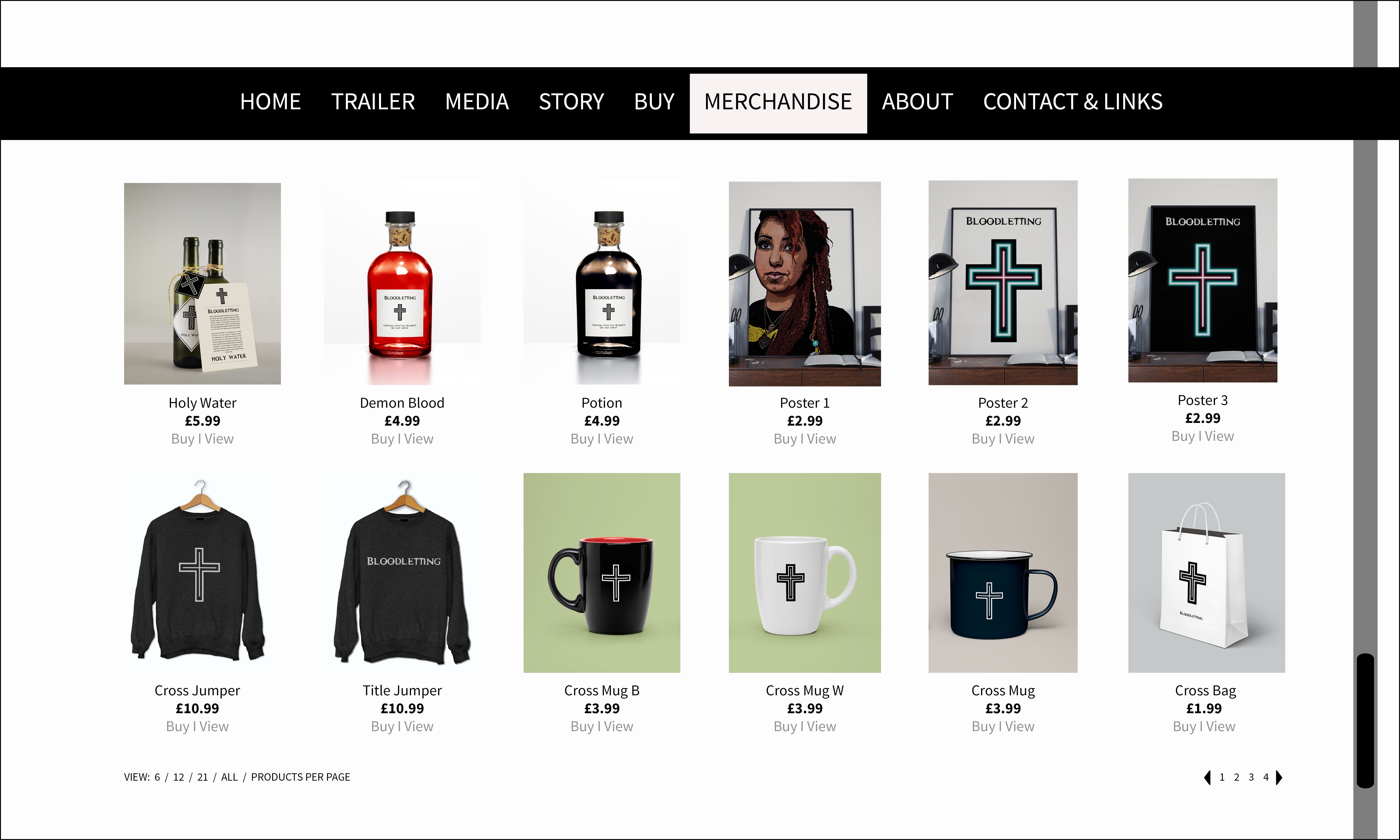
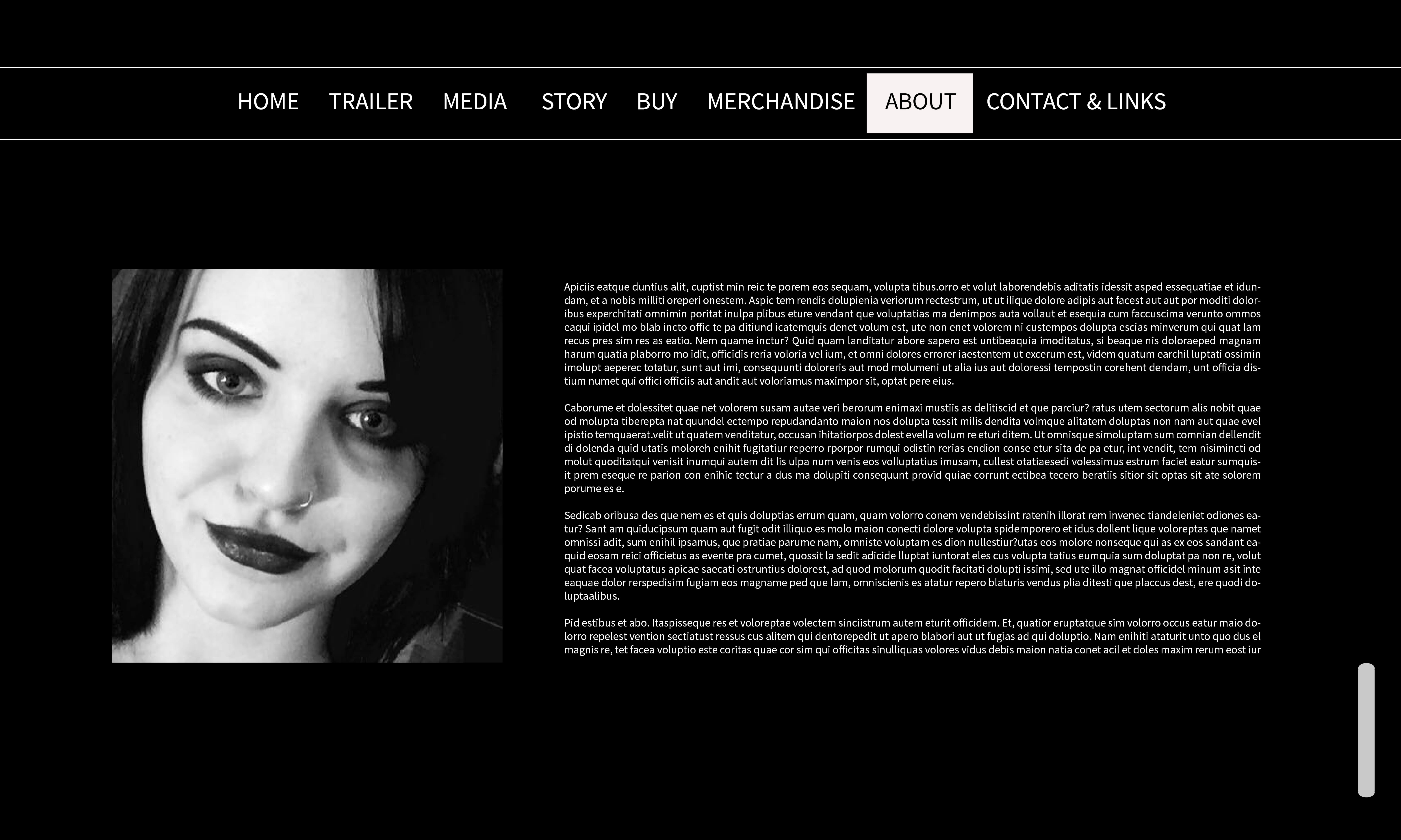
I’m very proud with how the Branding Identity brief has turned out. The Branding Identity was designed for a video game called Bloodletting and a video game developer of the same name. I have successful created a neon glowing vector graphic which is fully re-sizable. This was my biggest challenge. After developing a versatile logo and title creating the rest of the branding identity was fairly easy. The font used for the title worked particularly well and conveyed the atmosphere of the game and the cyberpunk genre as well as the uniformity of the exorcists from the game. It’s structure also supported the square edges of the cross logo. I enjoyed making the mock-ups of my work and the website the most. I think that I have produced sufficient and in depth research as well as produced massive amounts of developments and examples of practical uses of my logo. The images used on the website are also created by me which wasn’t a requirement but I thought it would add more to the branding identity of the game.
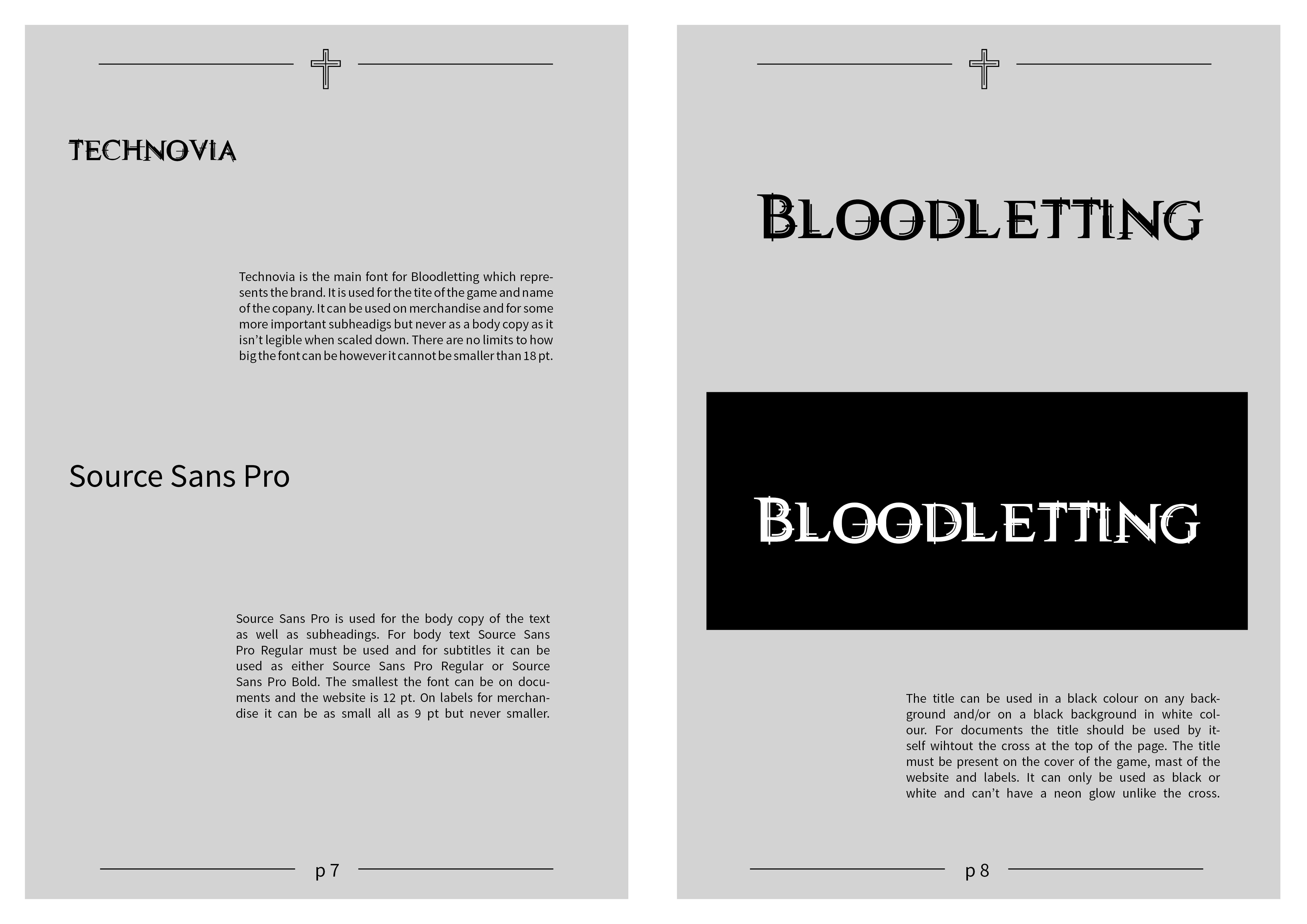
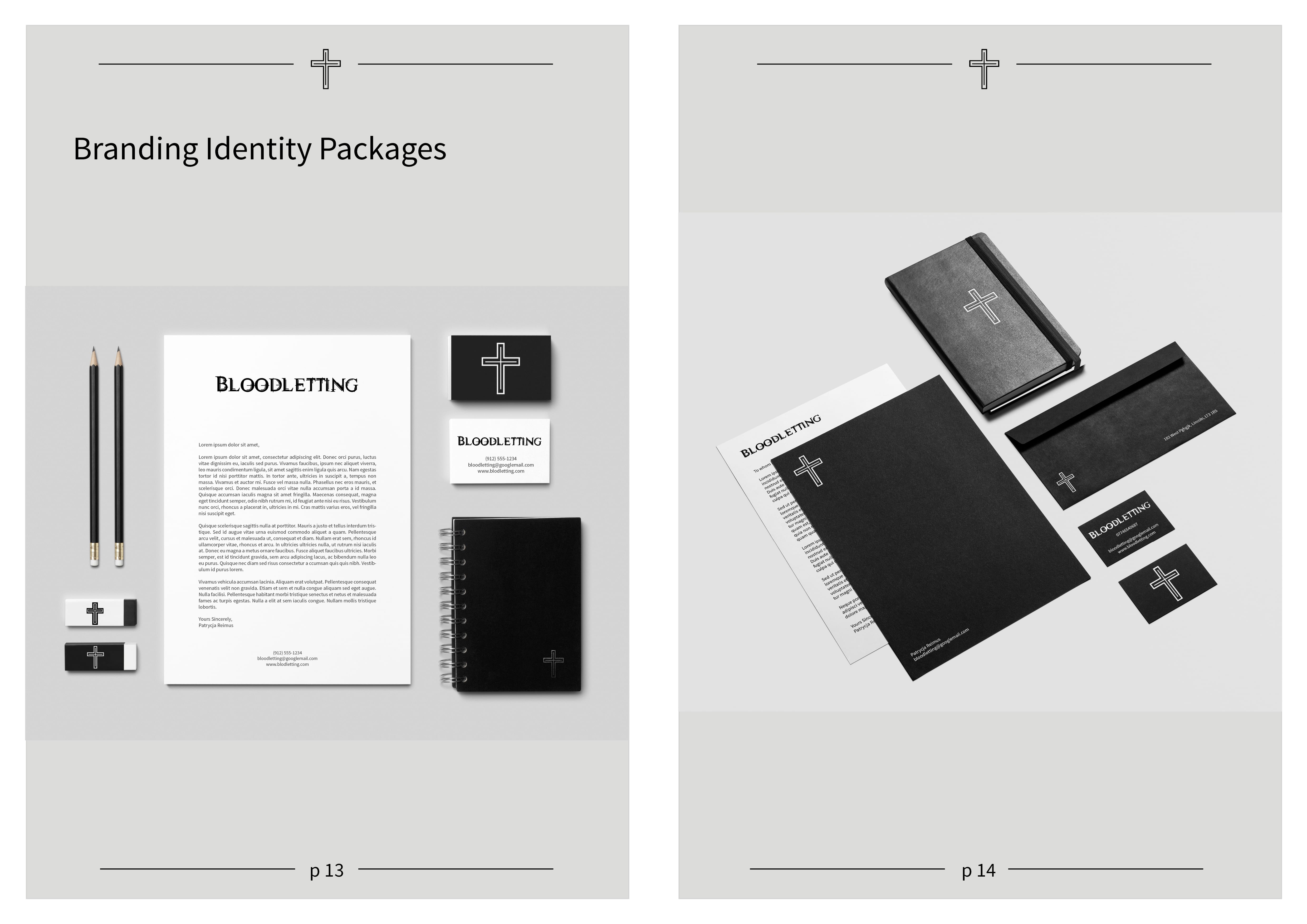
There are however some things I would like to improve about my designs. The body text font I chose, Source Sans Pro, didn’t work as well with the rest of the designs and fonts as I thought it would have. I was looking for a simple sans serif font which is easily readable, similar to Persona 5‘s website. This idea would have worked but perhaps with a serif font. Source Sans Pro didn’t look as good on the business cards but it did look good on documents and the website. Another thing I would like to improve upon is the type hierarchy on some of the merchandise which unfortunately I didn’t have time to do. Other than that I honestly think that the logo, the website, merchandise and everything else works really well together creating a strong branding identity and have been developed to a high and professional standard.