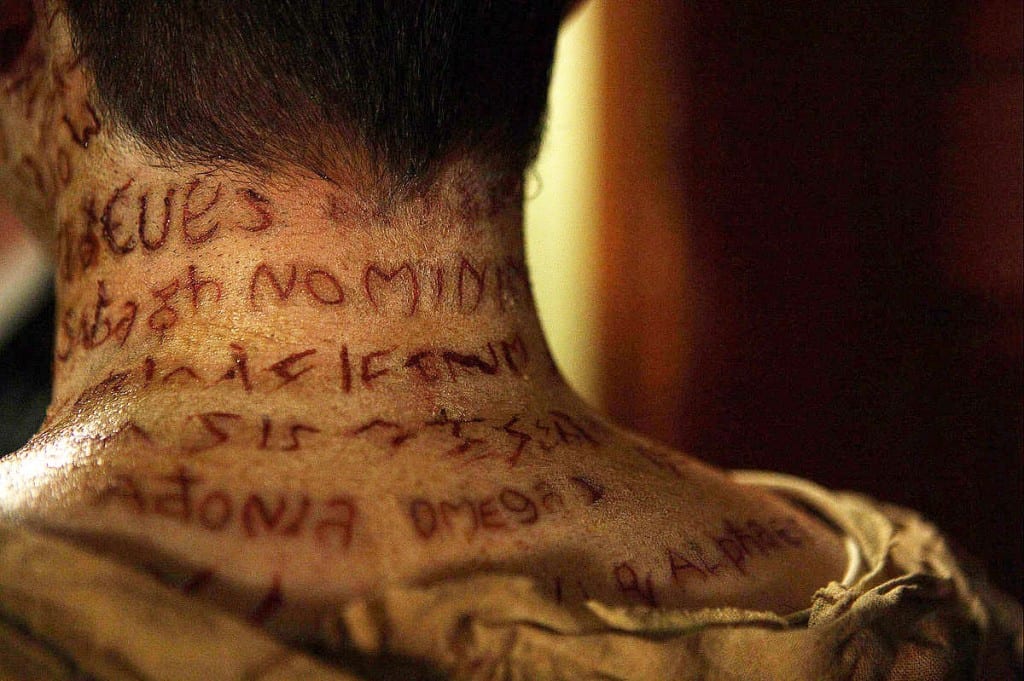
Recently I have watched The Haunting in Connecticut which made me think about different canvases I could use to create my letter form on. The right canvas can bring more texture to my design. In the film the corpses have letters cut into their skin which I thought was an interesting and unique way to create a letter form.
Here is the screen shot from the film which I used as inspiration for my first FX typography design:
Design 1:

My first design was directly influenced by the letters cut into the corpses’ bodies. In the film the letters were being cut in with a scalpel therefore in the above screenshot they look like a clean cut. With this design however I went with a different type of a cut, one that has been scratched onto the skin rather than cut into it. That’s why I also decided that the skin around the cut should look irritated or infected even. I wanted the design to look fairly realistic. I started with painting the basic design onto my model’s skin with a very thin brush. Then I went in with a darker brownish color to add shadows. With a red watercolor diluted generously with water I painted on light irregular lines which emphasize the idea of the letters being scratched onto the skin. Using a cotton pad I gently dabbed the skin to create an irritated skin effect. Finally with the same cotton pad I dabbed dirty yellow water color onto the skin to make it look infected and then after the paint has dried used the back of my paintbrush to scratch away some of the paint to achieve the dry blood effect.
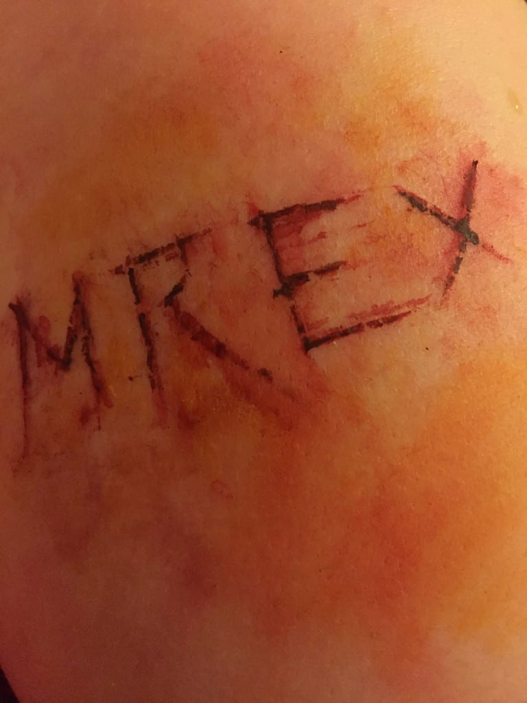
Overall I’m happy with how the design turned out. I’m not an expert at using FX makeup therefore I’m quite pleased with the outcome as I was able to achieve a bloody, rough letter form reminiscent of a cut. I do however have one criticism. I think that I added too much yellow to the design which ruined the realism aspect of it. If I had to do it again I much prefer the before design which only features red paint.
Design 2:

For this design I decided to move away from creating letter forms reminiscent of cuts and instead thought about using FX to create a more zombiefied or tree-like look. I started off by mixing a few different greens from my water color palette to achieve rustic or rotten green. Then I applied it with a cotton pad and proceeded to add very diluted brown tone to the design. With a cotton pad soaked in water I created three areas lighter than the rest of the design. Using water colors is good for this because you can easily bled it out with water without destroying the surrounding design. Then with a fine brush I applied brown acrylic paint to refine the edges. I followed this with adding dark acrylic paint with a cotton pad onto the model’s skin to create a rotten effect. With a flat brush I painted on shadows on the inside of the edges to add dimension. Going back to the finer brush I traced out the letters in brown paint. Then I started to add small branches coming out of the letters to create a more tree-like effect. Finally I went over the design with a wet cotton pad to make the design look old as though it’s close to disintegration which linked in nicely with the theme of zombies and nature. The very last step was to add very tiny drops of red paint to the design in order to make it seem to grow out of someone’s flesh.
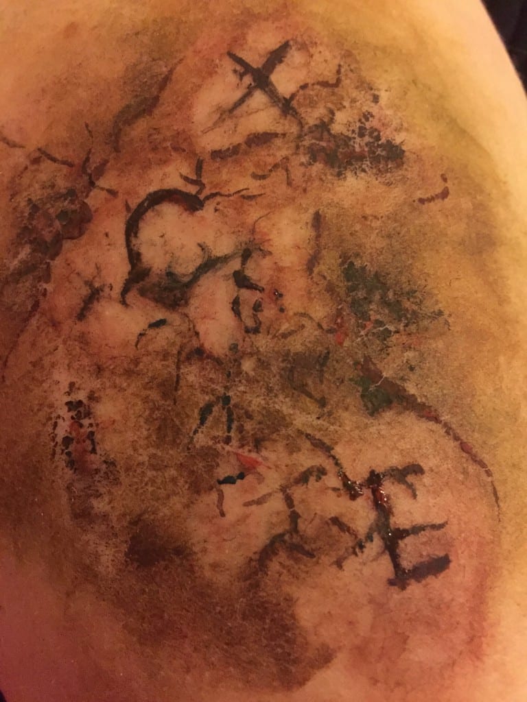
I’m very happy with this design. I definitely prefer it to the first one because it’s more original and imaginative. I like how the lettering is embedded in the skin, becoming a part of it and as the skin rots away so do the letters.
Design 3:
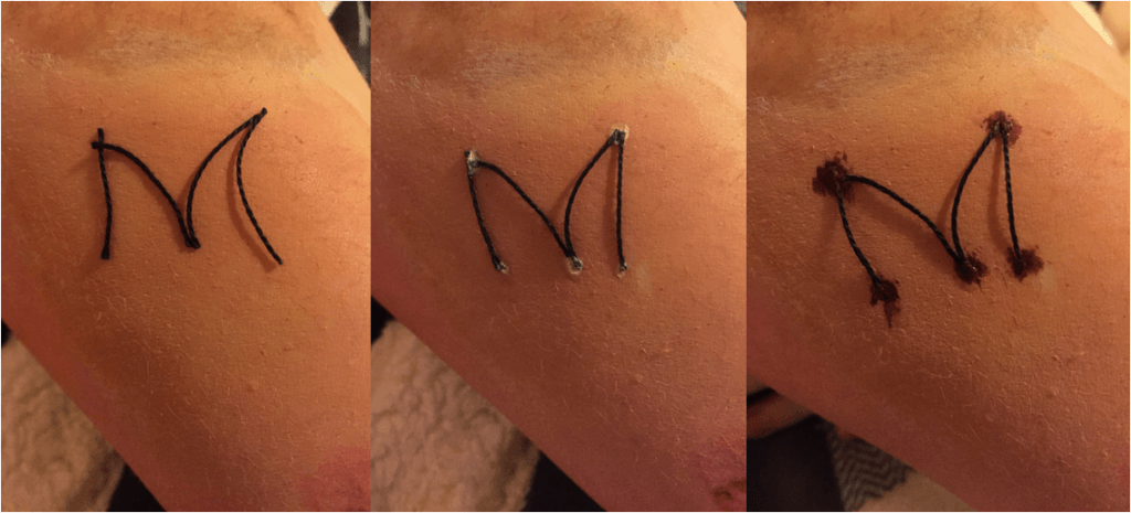
This is another example of my experimentation with FX and skin as a canvas. From all the FX make-up tutorials I’ve seen on YouTube the ‘sewn lips’ appeared to be very popular so I decided to see if I can make a typeface with this technique. First I cut pieces of thread and lay them out to see if they’re the desired length. I didn’t want them to be too perfect however because I wanted to keep the illusion of sewn flesh which I imagine would turn out irregular. Then I used liquid latex to keep the threads in place. After the latex dried I applied red paint to make it seem like dried blood from the woulds where the needle came through.
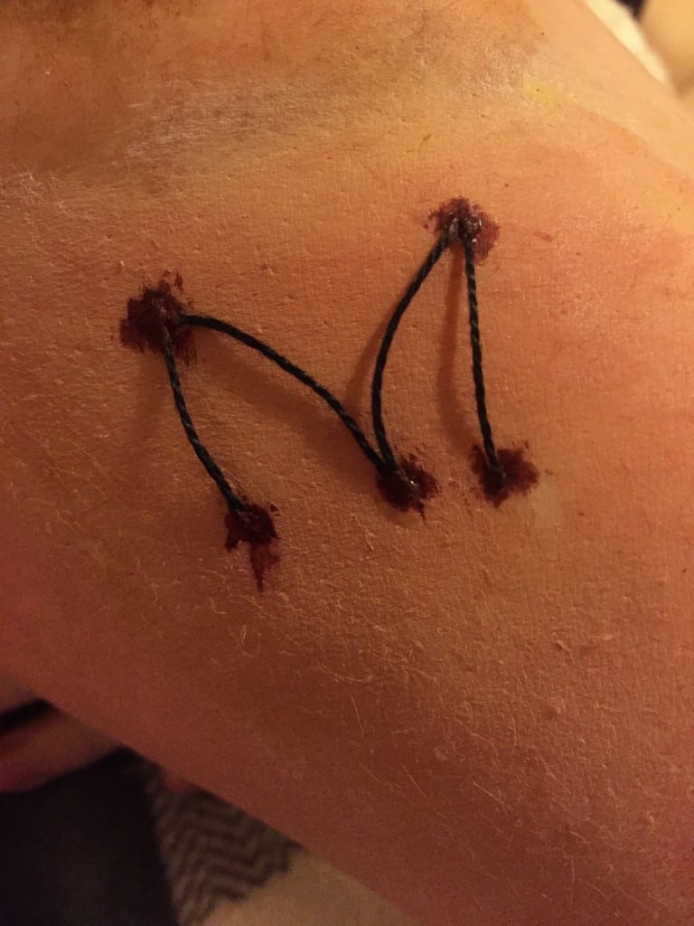
Same as with the previous design I like this letter form because it’s unique however I find it too simplistic as it is now. I could create a more ornate design with more threads if I chose to continue working with this technique.
Design 4:

This letter form was inspired by scarification which is a form of body modification. I wanted this typeface to look more precise and pretty because unlike the other 3 designs scarification is a form of deliberate body ornamentation. First I painted the basic shape of the letter onto my model’s skin with a fine brush. Then I added a darker red color on the edges of the letter to create depth. Finally I added white paint on the inside of the letter in order to make it seem as though the scar has started to heal.
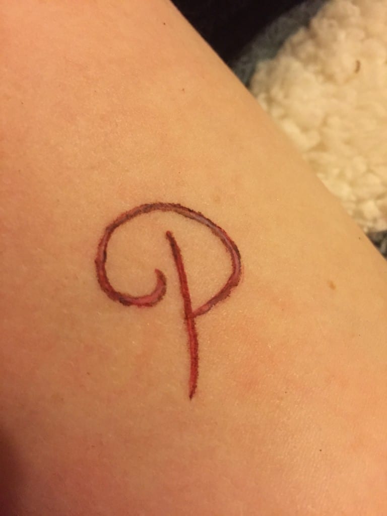
Although this letter form is similar to the first design this one is ‘prettier’. I like the idea of having a fancy typeface, like a handwritten posh letter form, but appearing to be carved into skin which contrasts common associations with the definition of ‘pretty’. I find representing horrid things in a beautiful way intriguing.
Design 5:

This letter form design was based on experimentation with latex. First of all I took pieces of tissue and rolled them to create long strips which I later soaked in liquid latex and placed on the model’s skin. I continued with this technique to achieve a rectangle and then painted the inside of it with dark red color. Then I used latex to attach more pieces of tissue to the inside of the would and painted these in the same color as the skin to make it blend in. This was done to create texture. With black paint I went over the edges of the inside of the rectangle to create dimension. I also painted under the loose pieces of tissue with dark brown and a fine brush. Then with a cotton pad I added white watercolor in the areas without the tissue. I also generously painted over the tissue with red water color hoping that it would imitate blood. With a bigger paint brush I painted over and around the latex to make the skin look irritated. Finally with water color I roughly painted letters on the inside of the rectangle.
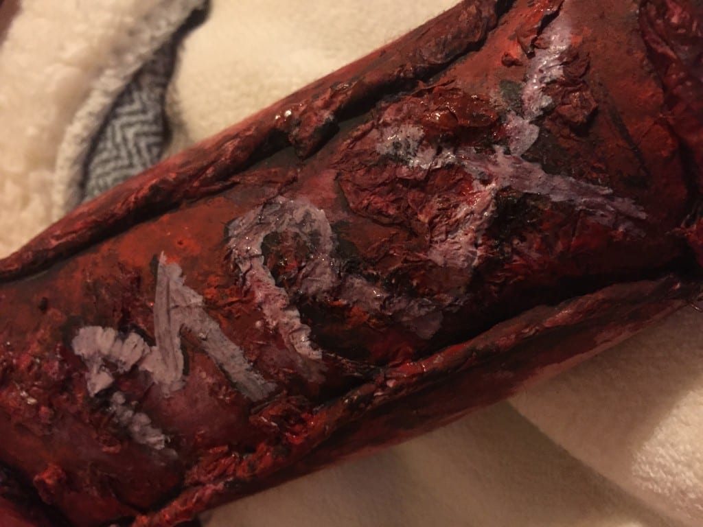
When I first started this design I had no idea how it would end up looking because it was purely experimental. It looks like a robot’s arm or trash growing out of someone’s skin. I like the texture of the letters however I don’t like the overall design. One good thing that came out of this experimentation is that I learned that it’s better to start with the texture and then add the design on top of it.
From experimenting with FX make-up on skin to create letter forms I got inspired to design a typeface based around body horror genre. The next step would be to continue my research to broaden my understanding of the topic and proceed to create letter forms of my own which are influenced by that very research. I don’t think I’m going settle on using FX techniques to create my final typeface because I want to find more techniques to experiment with.
