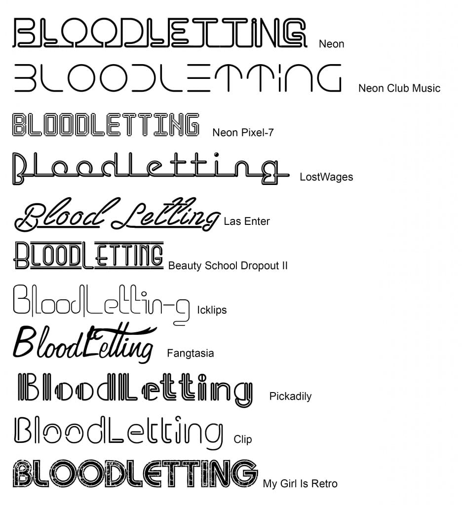
I decided to experiment with a few different typefaces which will be used throughout the branding package for Bloodletting. The neon fonts which aren’t used for the logo will be considered for headings, subheadings and the menu. This will help to unify the branding identity of Bloodletting.

From the above typefaces my favorites are Neon, Las Enter, Fangtasia and Beauty School Dropout II. This is because they look club like but are still readable. The menu is going to be in a small size and therefore these fonts are more practical. I’m still not sure which font I’m going to use for what aspect of the branding identity however.
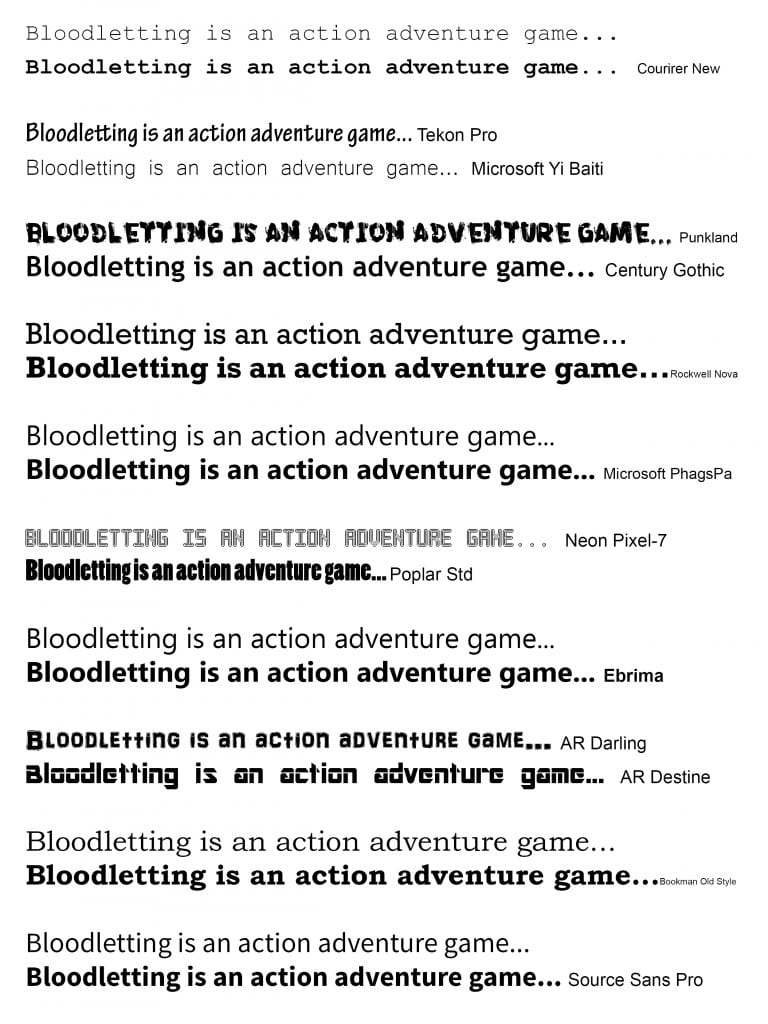
Below are potential fonts for the body text both on the website and the company’s documents and/or business cards. These are a lot plainer and readable than the fonts used for headings and subtitles.

From the above typefaces my favorites are Century Gothic, Microsoft PhagsPa, Neon Pixel-7, AR Darling and Source Sans Pro. For Bloodletting‘s branding identity I’m going to use Source Sans Pro for body text, AR Darling and Neon Pixel-7 for either the menu and/or subheadings. This is because these two fonts stand out from the rest and match the feel of the game especially since AR Darling has crosses as Ts.