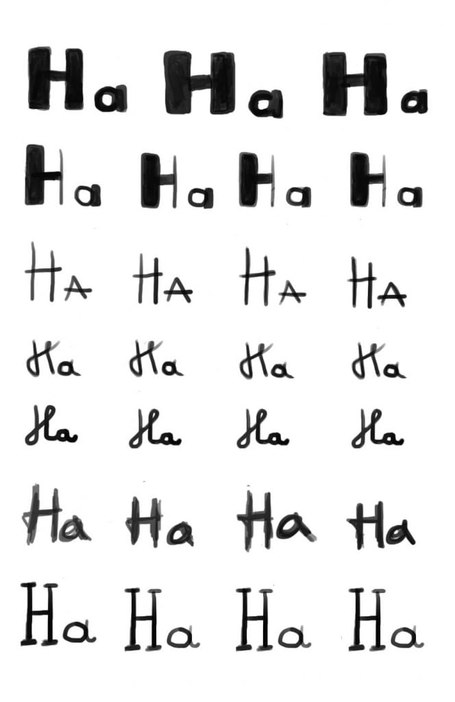
To create these typefaces I used Intuos drawing tablet & Photoshop. I wanted these typefaces to have a hand drawn feel to them because most of the children’s picture books I have researched used this type of designs. I also think that these types of lettering appeal to children more and have a more playful side to them. This style of lettering goes well with the style of my illustrations which will be line based and hand drawn. Below are the seven typefaces I designed.

From the above typefaces my favorites are the three first ones and the last one. I think the most applicable typeface for my picture book is either the first one or the third one. This is because of their simplicity and readability. From these two I think I’m going to use the first one in my picture book because I prefer it aesthetically. There are going to be pages which only include text and a chunkier typeface will fill up the space better.