The big part of this brief is the website we have to design this is why I decided to look into a few game websites to draw inspiration from. I was looking for websites which didn’t follow a template and were rather unique. I was also trying to look for websites with a punk/cyberpunk feel to them and in the end Persona 5 and Void & Meddler websites fulfilled those criteria. The other website designs are also interesting and I will definitely use them as points of reference for my own website design. Images below are screenshots of these websites. Some of these are cropped differently because I had to zoom out to show more of the website designs.
Persona 5 Website
http://atlus.com/persona5/home.html
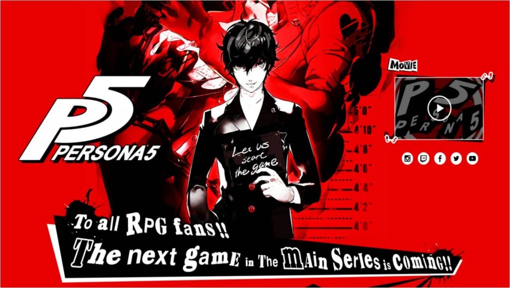
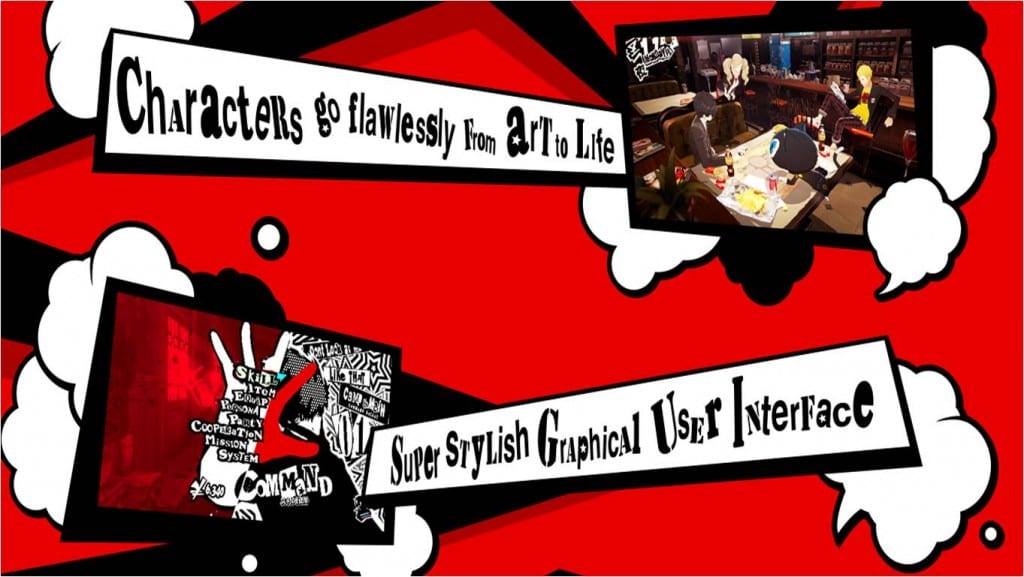
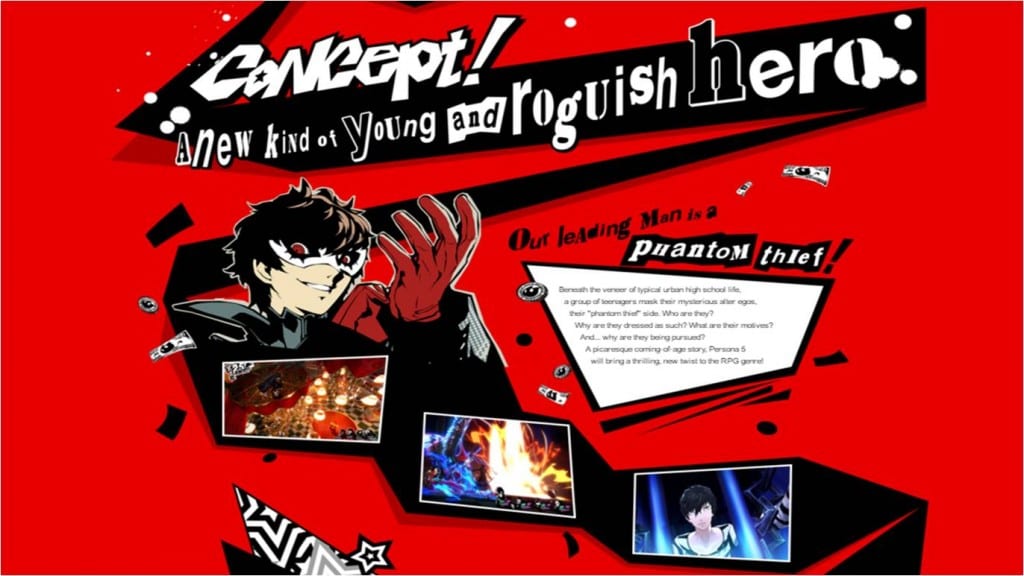
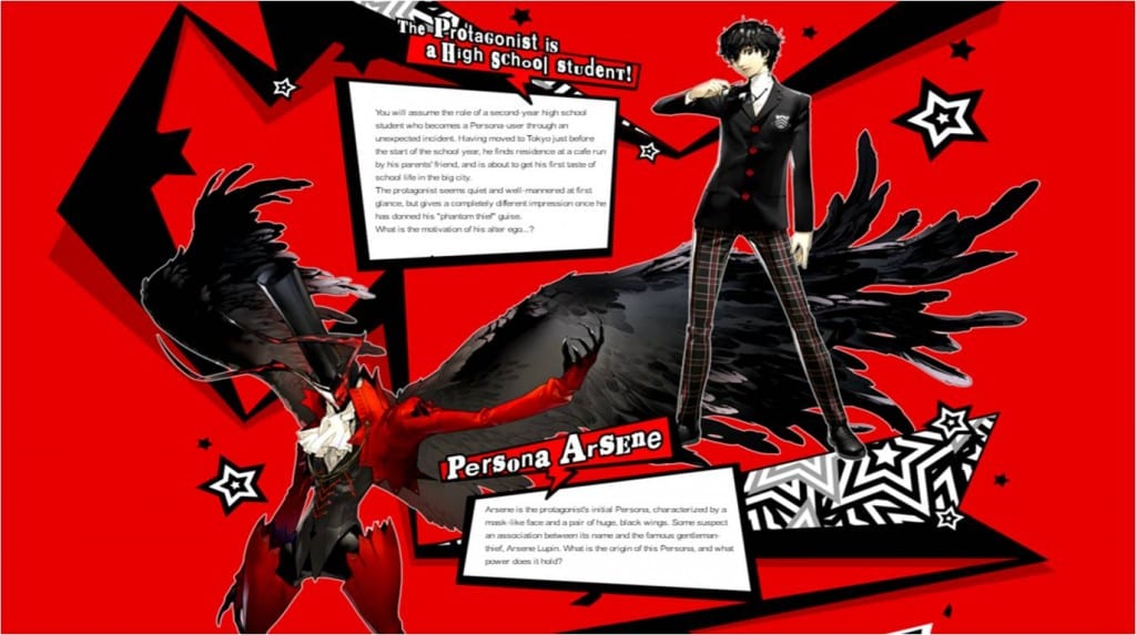
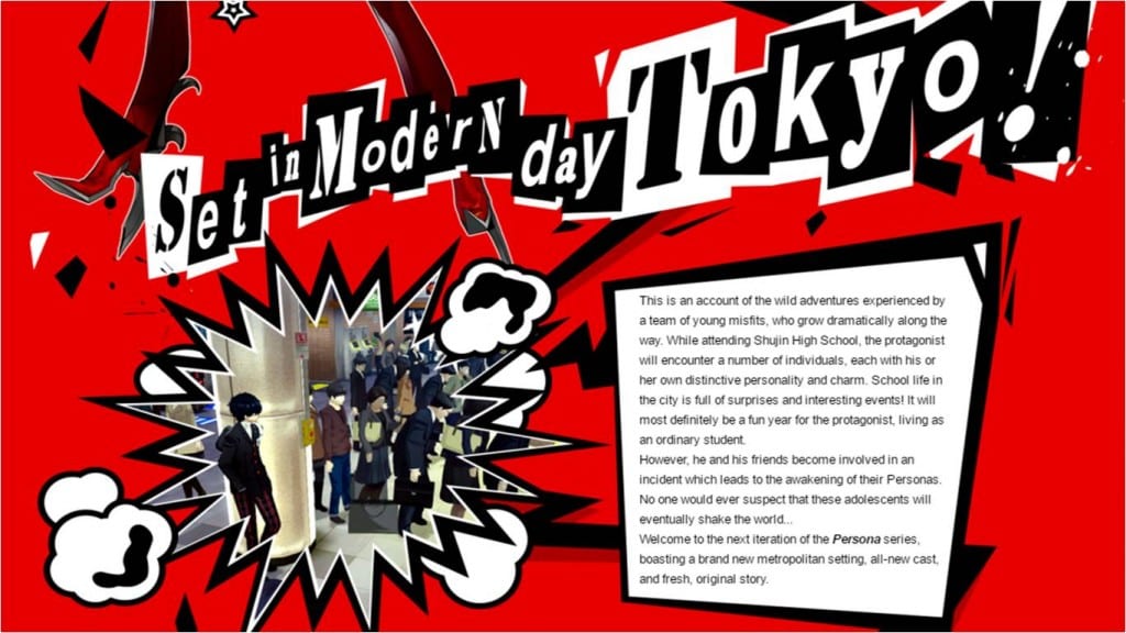
Persona 5‘s website stood out a lot from the other websites I research because of it’s unique layout and design style. Rather than having a menu it’s a scroll through website which is another thing I like about it. It’s reminiscent of a graphic novel therefore the navigation of the website reflects the anime art style of the game. The website follows an arrow which bends along the way down. Along the arrow different elements of the game are revealed which again is a very different approach to website navigation. Even though the website has a very punk/ visual kei feel to it and is cluttered thanks to the arrow the information is still easily readable. I also like the typography style of the headings. They’re reminiscent of letters being cut out from newspapers again bring the element of punk to it’s design. Finally I also like the 2D background design of the website which is very striking and loud. The layout and shapes used to frame the images and text reinforces it. It reflects the atmosphere of the game.
Void & Meddler Website
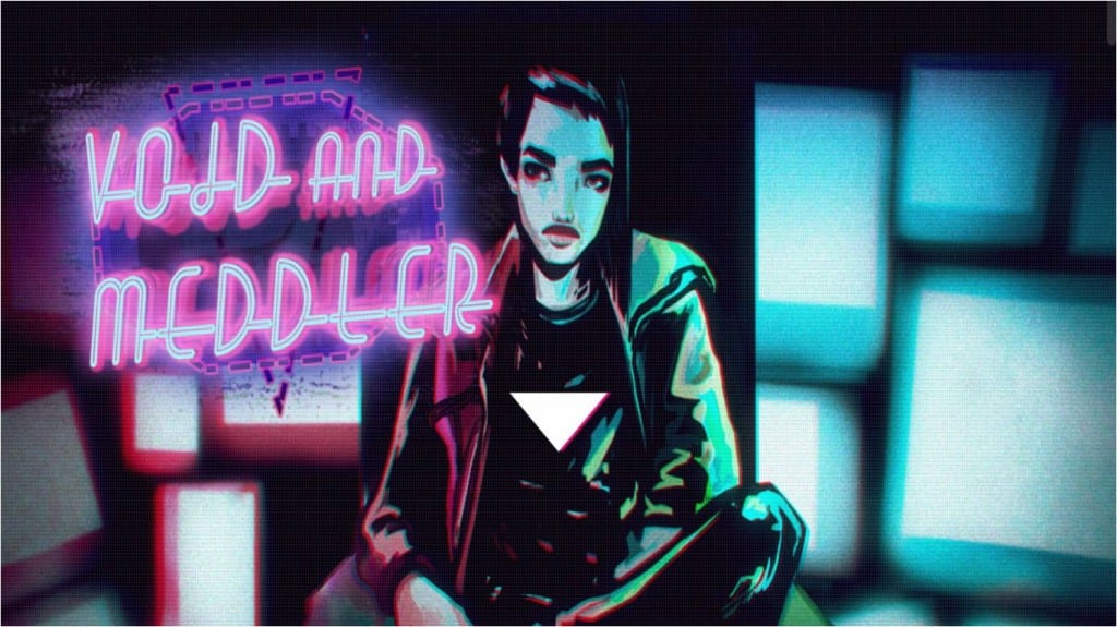
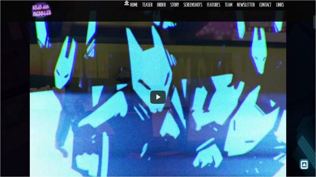
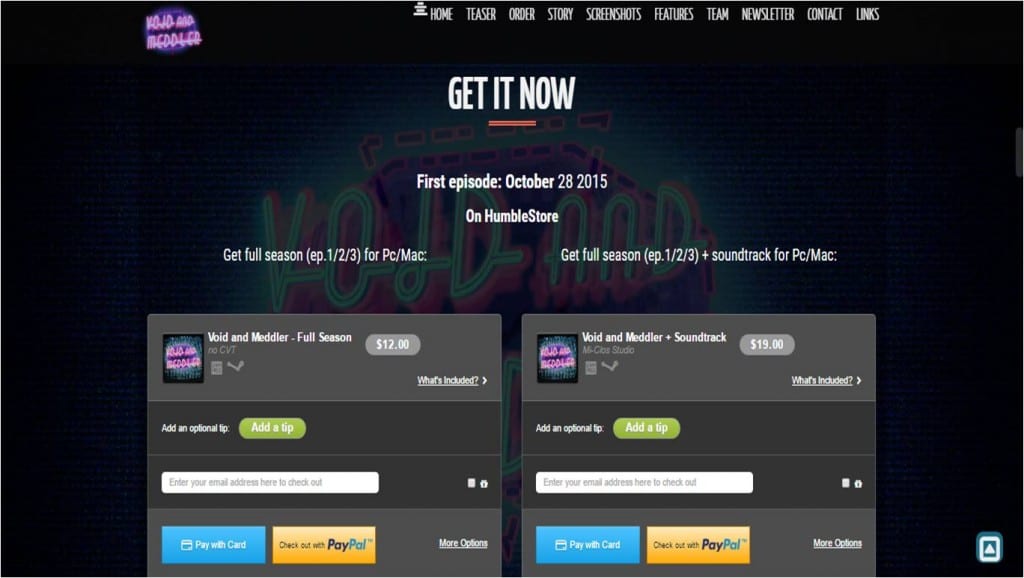
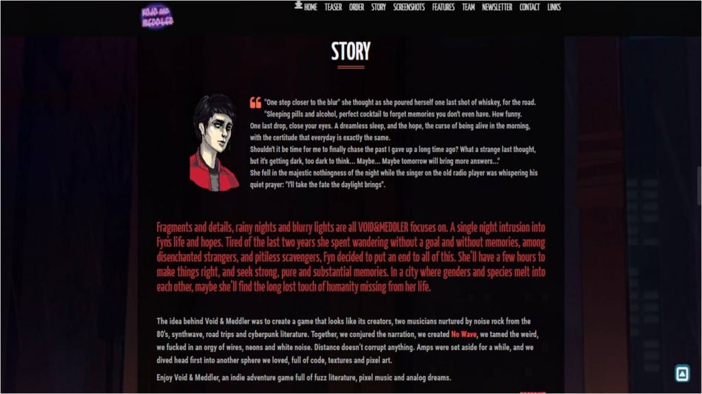
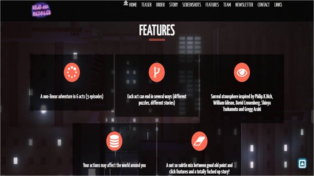
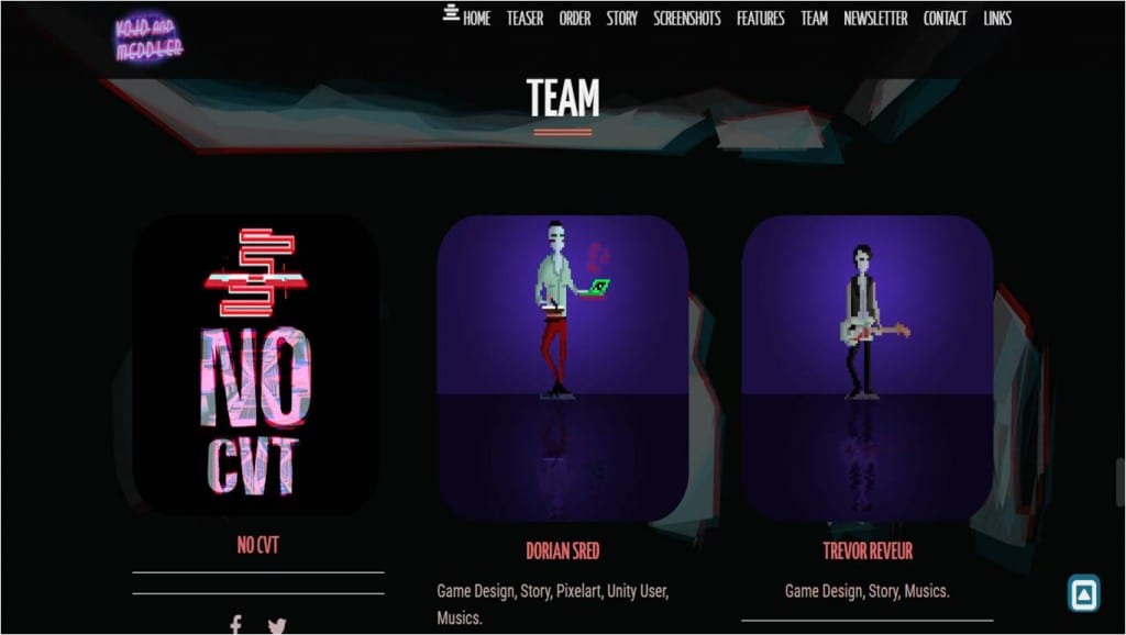
Void & Meddler‘s opening screen is my favorite from all the websites I’ve visited because of it’s graphic novel like artwork and bright colors. It gives a very cyberpunk feel to it off the bat. I like how the arrow moves up and down switching colors with a pink arrow. The way it moves is also reminiscent of the old school gaming style of the game. This website uses a grid system same as the other websites I have researched. It’s a good way to present information clearly on a chaotic/ cluttered background I like how dark it is which is representing night and the bright colors representing the lights of the streets and clubs. It’s very atmospheric which makes this website more interesting to some of the others I have looked at. It’s a scroll through website but it also has a menu which makes it even easier to navigate the page. I really like that style of website navigation because it gives it a Graphic Novel feel but one can get to information quickly. I like how the trailer was simply presented on it’s own. I’ve noticed bigger game franchises have a lot of videos at once with small thumbnails. I’m making designs for only one game so it makes more sense to adapt Void & Meddler‘s way of presenting a trailer.
Fallout 4 Website
https://www.fallout4.com/
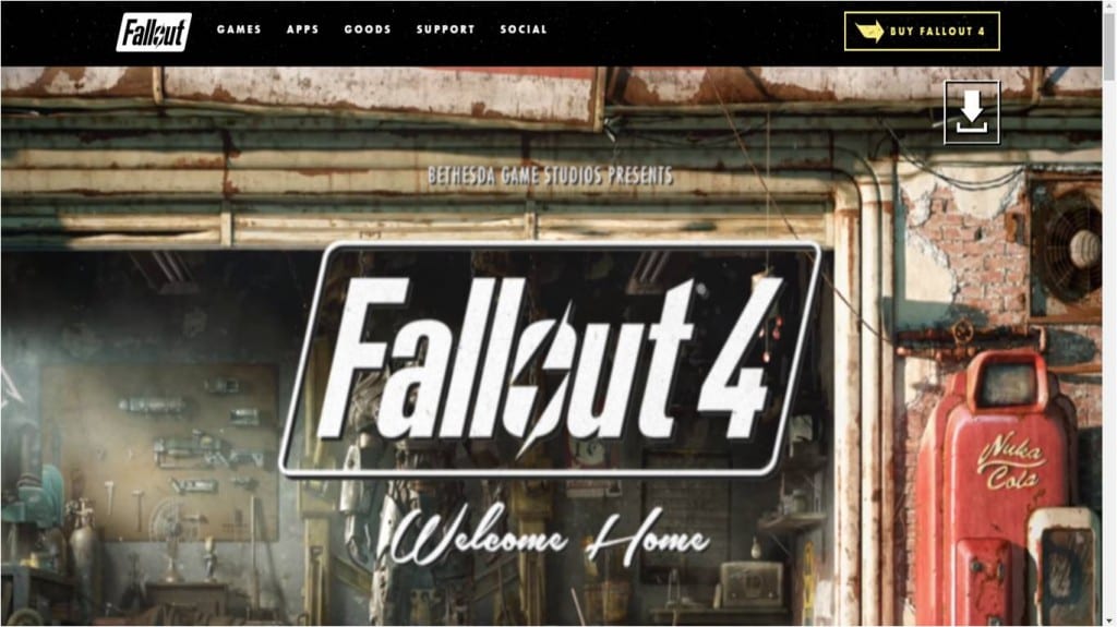
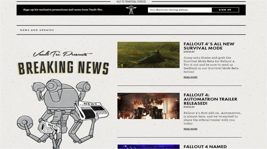
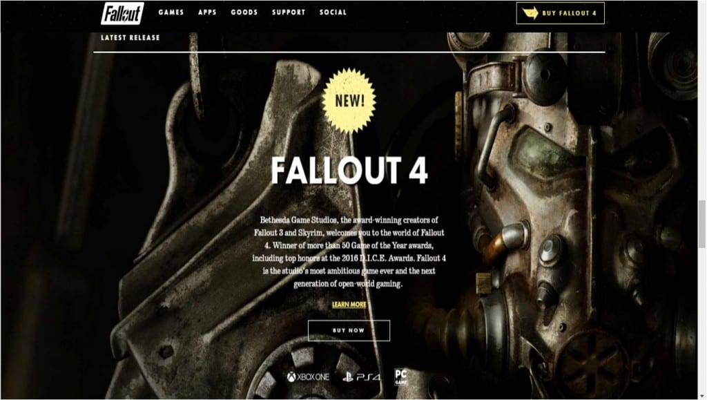
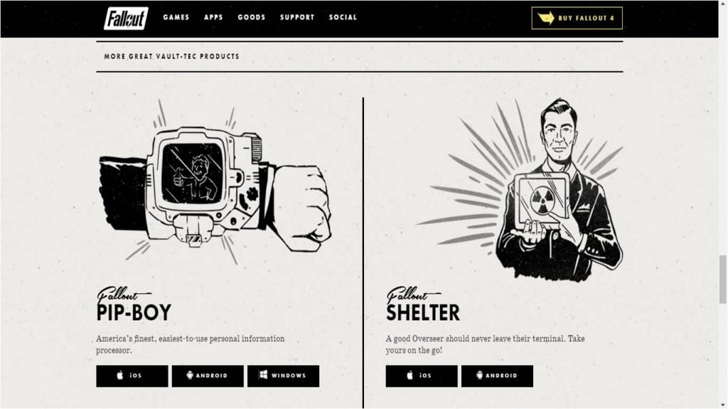
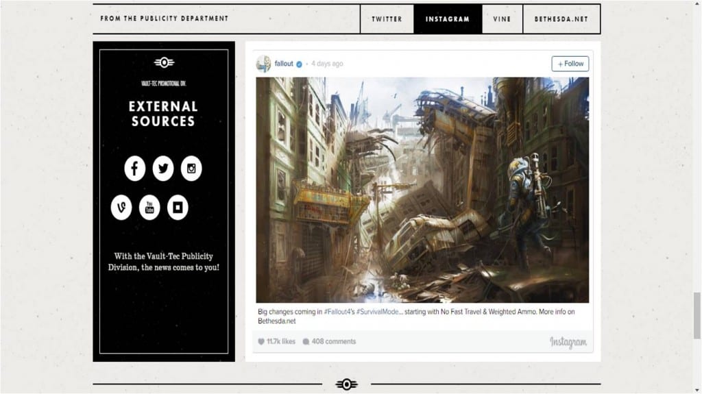
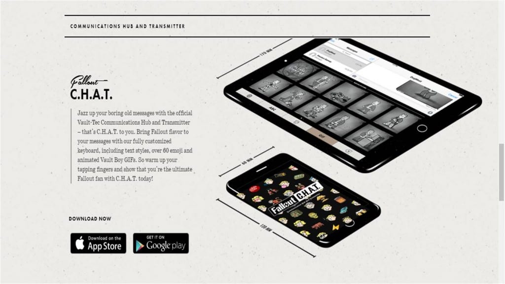
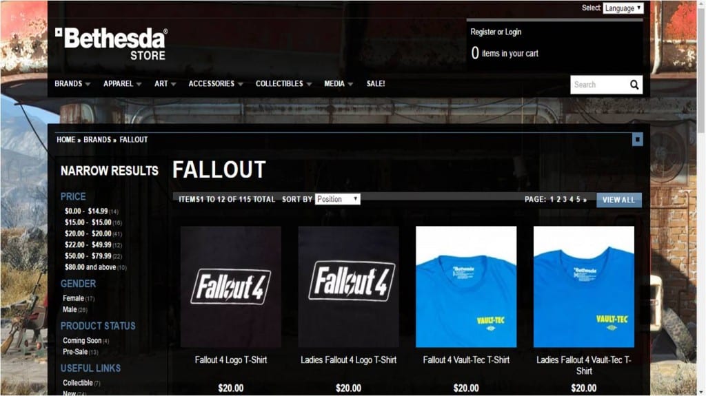
The thing that I love about this website is it’s use of vintage american advertising design and it’s integration with contemporary website design. This website uses a lot of images from the game to break the website into sections without making it boring. Simple lines and small heading also serves this purpose which makes for a clear design. I like that new images have been created just for the website and are made in the same style as items in the game which brings an element of transmedia into the franchise. I included the franchise’s shop to have a point of reference when designing my little merchandise page. Stand alone games didn’t have a shop section so I used this one. It has a standard grid design which I will probably end up using myself. I like the idea of an opening screen to be a moving image from the game or at least a picture with a large logo same as with the Void & Meddler opening screen. The menu sometimes disappears when you scroll through the website but because it’s on a black strip it matches with the rest of the framing of the website. I will most likely include a menu on my website unlike Persona 5. This seems like a readable and visually pleasing way of designing a menu. I also like how the game’s logo is present in the corner of the menu at all times and so it the buy now hyperlink. The body text is the same throughout making the website look uniformed even though the headings do change their typography style.
The Wolf Among Us Website
https://www.telltalegames.com/thewolfamongus
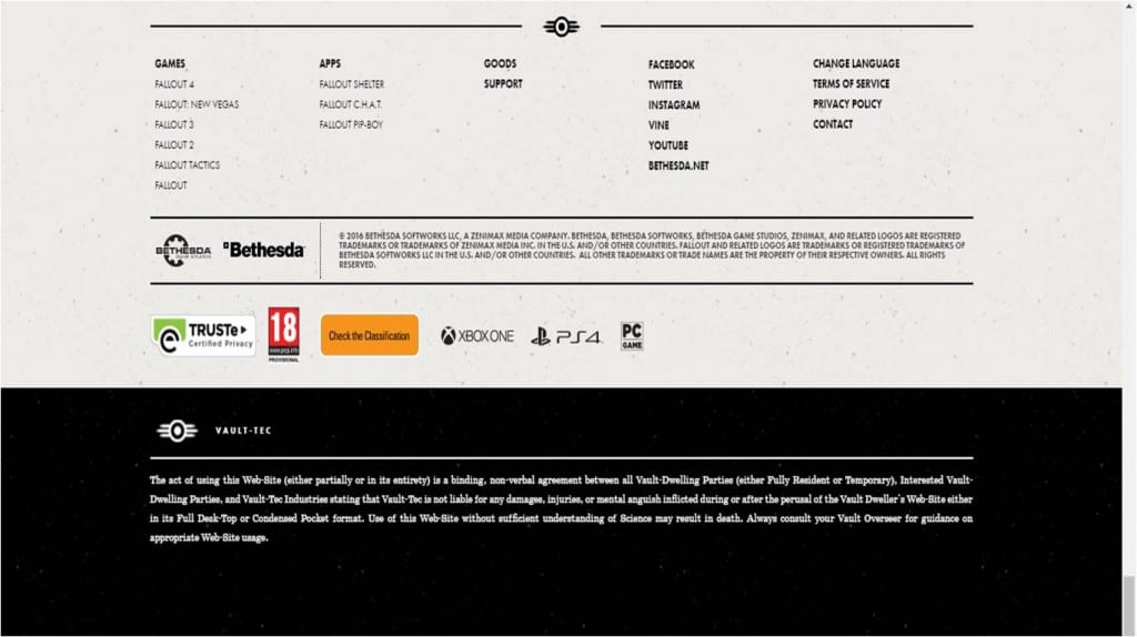
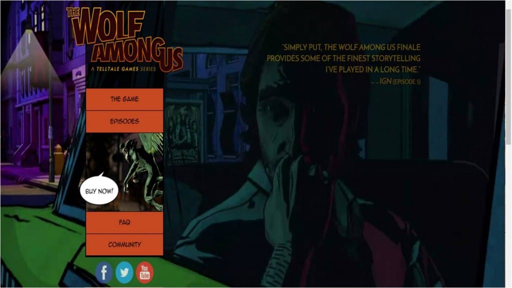
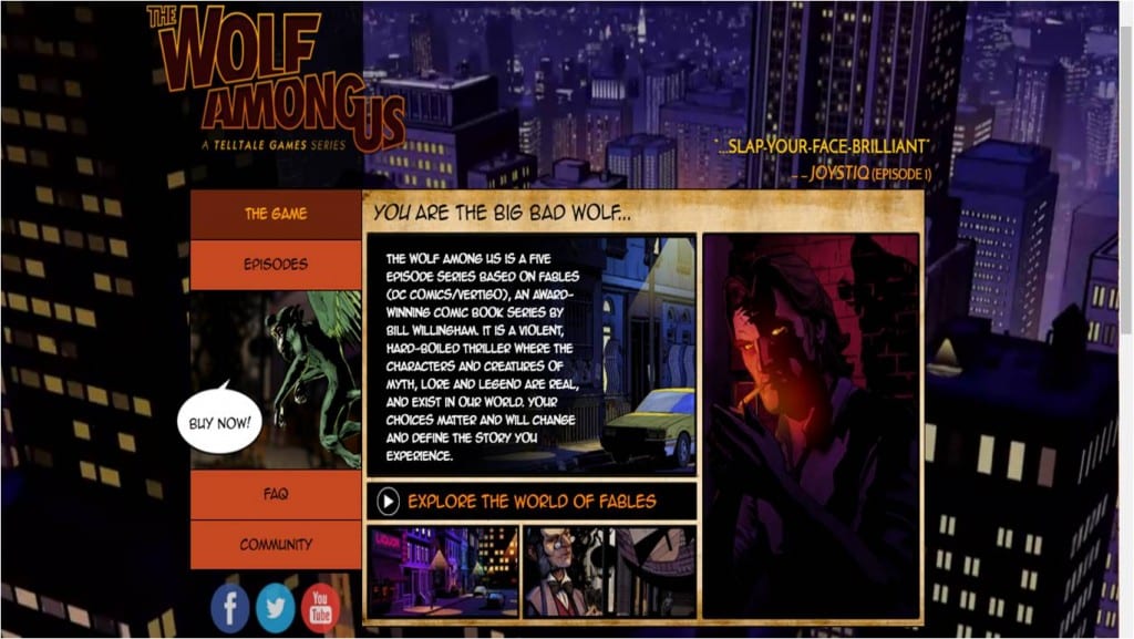
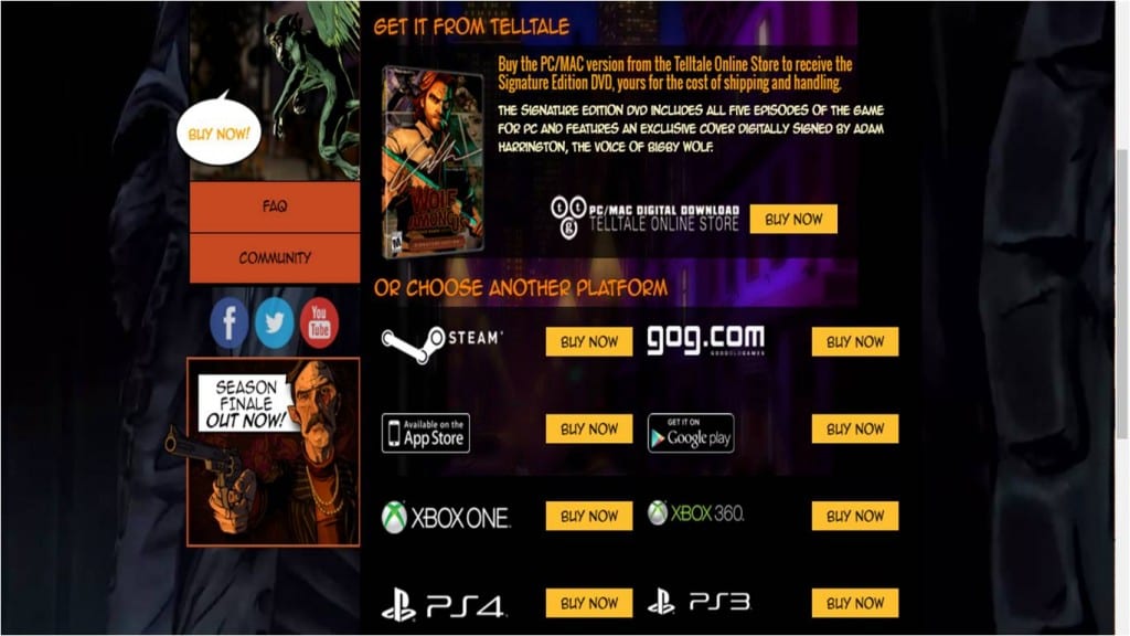
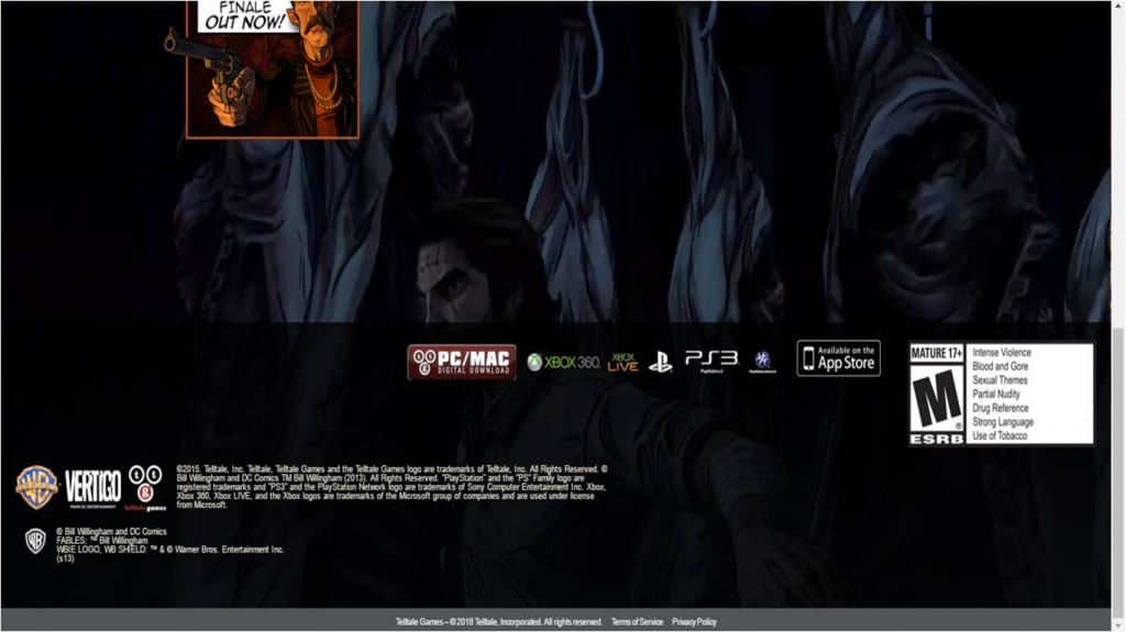
I find the opening of this website quite boring and amateur looking. Mainly because of the typeface on the menu being on a block colored square which before one clicks on the hyperlinks looks out of place. Also the muted image from the game makes the website look like it’s missing something. However the website improves massively once a hyperlink is clicked on. I like the comic book style of the layout which reflects the style of the game itself. The choice of the typeface makes more sense once the comic book window is open. I like the changing background which shows off more of the stills from the game. The shop page also uses a grid system which is the clearest to read and gives off an impression of being legitimate and trust worthy which is important when you’re trying to make people pay online. I will most likely end up using a grid system as well. I don’t think I can use logos of these websites however so I will most likely do a similar page as the one here ‘buy it from telltale’. Finally I included the bottom of the website as a point of reference to where everything usually is placed when it comes to the legal bits. I might not include that in my website design seeing as it is a made up game.
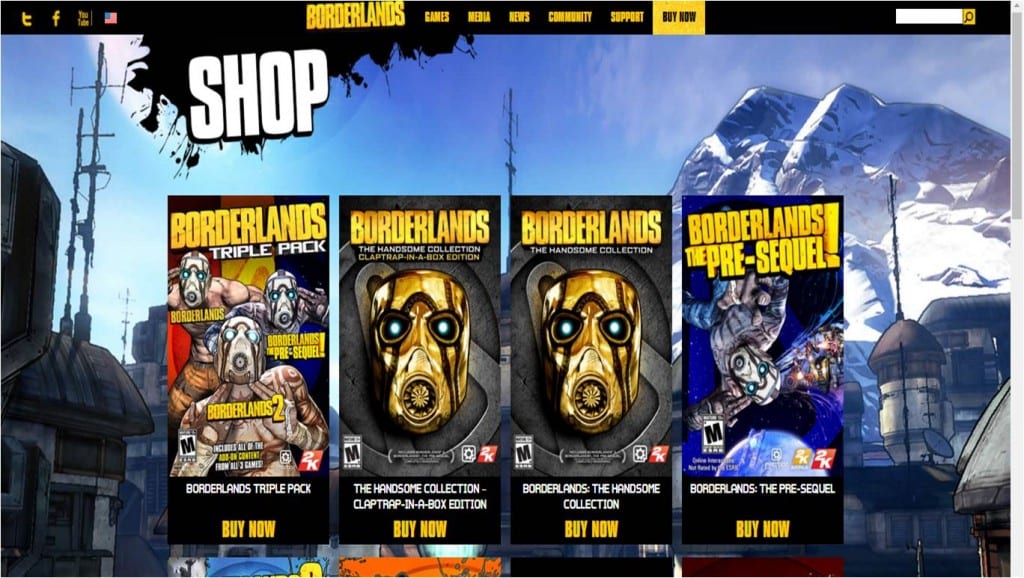
Borderlands Website
http://borderlandsthegame.com/index.php/news-main
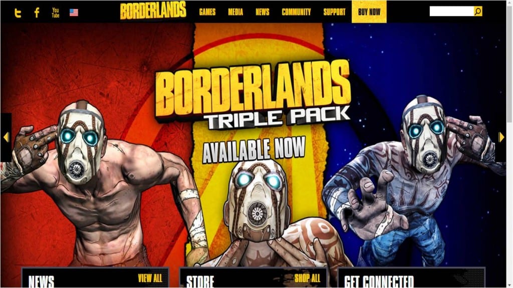
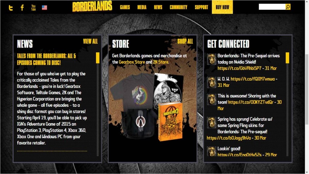
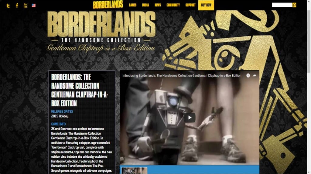
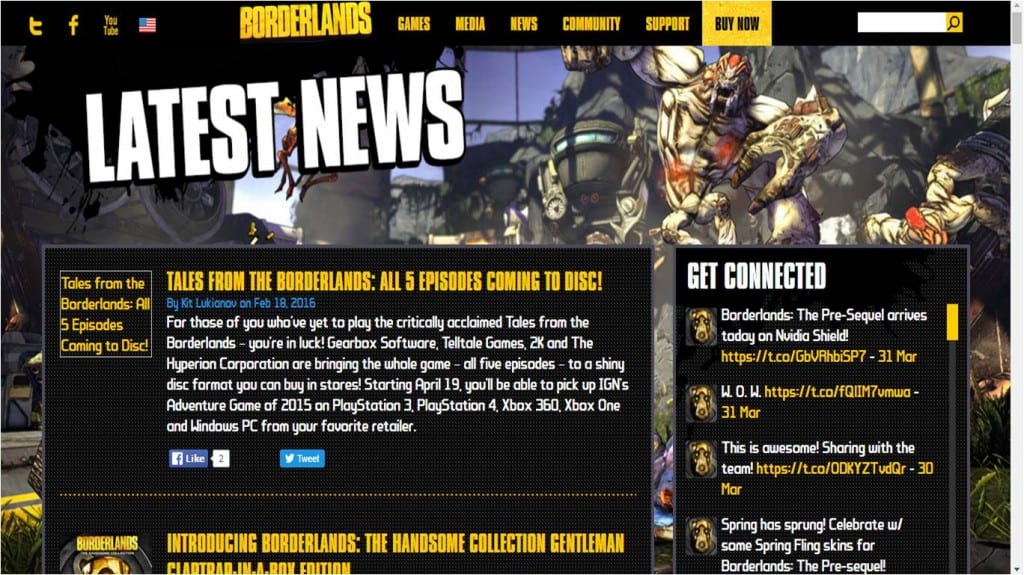
This website also uses a large image from the game with it’s logo as an opening screen. This one scrolls though a couple of different game release from the franchise. It has a similar menu to Fallout’s website which I do like a lot. I personally don’t like the yellow but it does go with the franchise’s design. The main thing I don’t like about this website or most websites I’ve researched is the scrolling bar on the side. It’s usually grey and it stands out too much whereas the Void & Meddler‘s website has it integrated into it’s design. I will aim to produce something similar. I like how this website uses stills from the game as background and every page has a different image. This website also uses a grid system which I don’t normally like but here it is useful to make the information more readable since the website is quite cluttered with colorful imagery. The typeface also reflects the style of the artwork for the game. I like how the headings are at an angle giving the website even more of a dynamic feel. Finally I really like how the website design changes for different game releases to represents it’s unique feel although it’s layout stays the same in order to keep the website uniformed. This is something that I might adopt when designing pages to represent the conflict between the church and the barbers.
