Below are step by step screenshots of how I created my website:


Below are step by step screenshots of how I created my website:
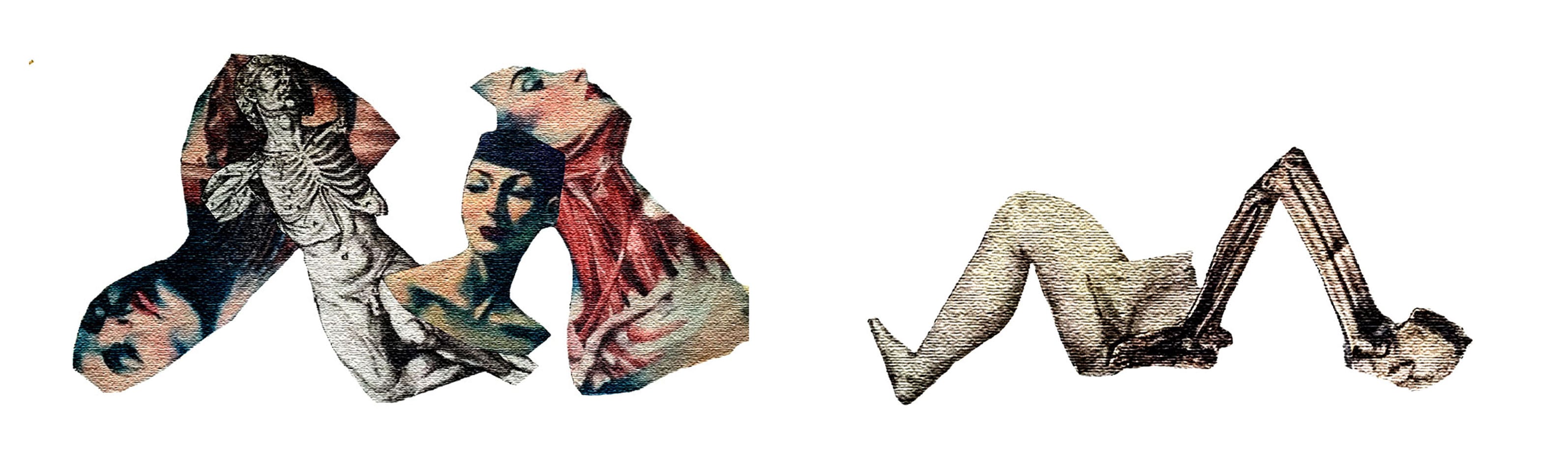
I started to manipulate my collages in Photoshop by changing the levels, hue and saturation of the whole collages. I also inverted some of these just to see what effect it would create. Then I decided to separate the actual letters and manipulate them on a different layer to the background. Then I combined these together again to see what would happen. Below is the result of this experimentation:
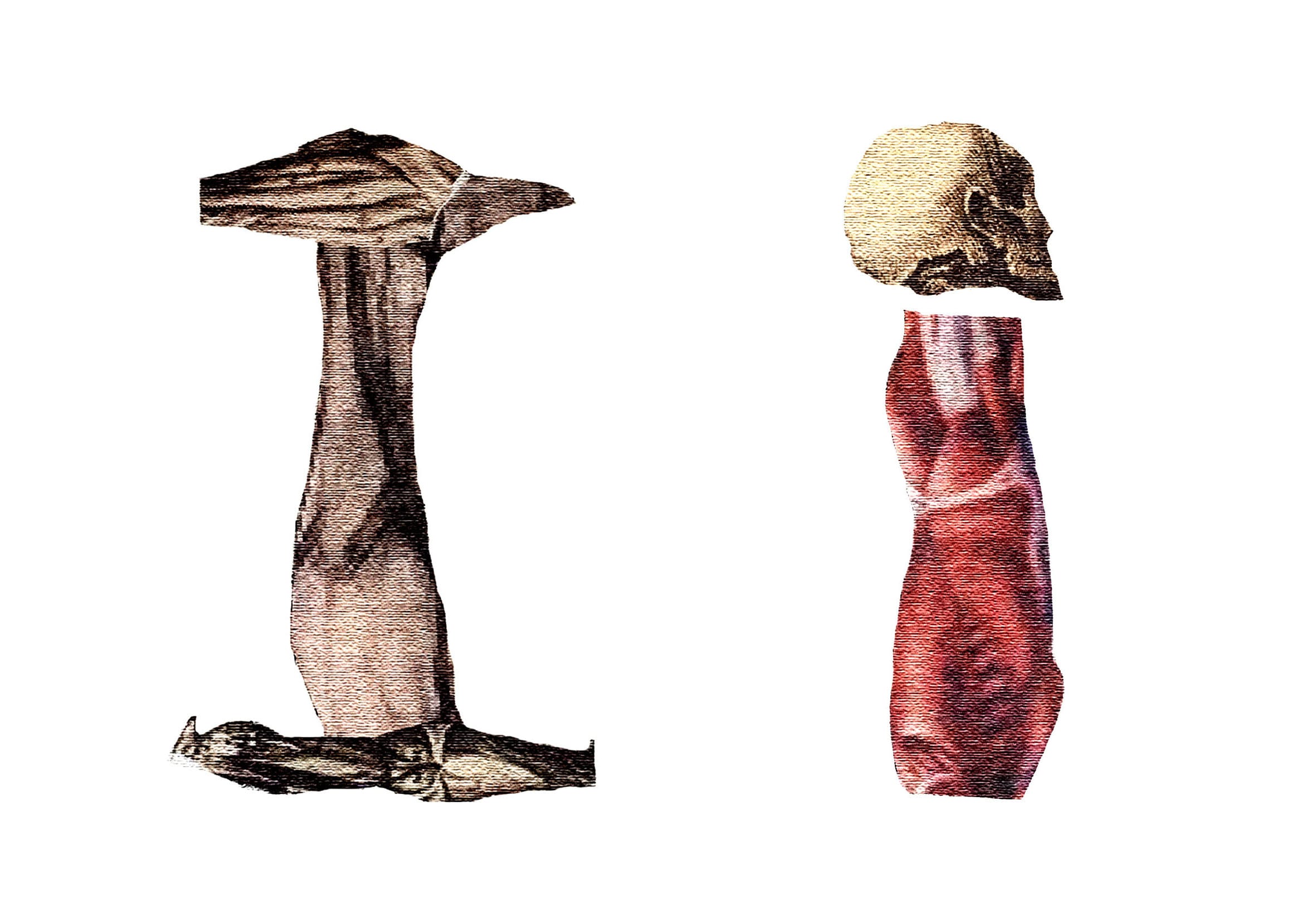
I wasn’t happy with any of the above edits and decided that I wanted to see how the letters would look on their own without the background. I think without Photoshop the background looked good however I felt that it diverted attention from the actual letters. Below is the result of this experimentation:
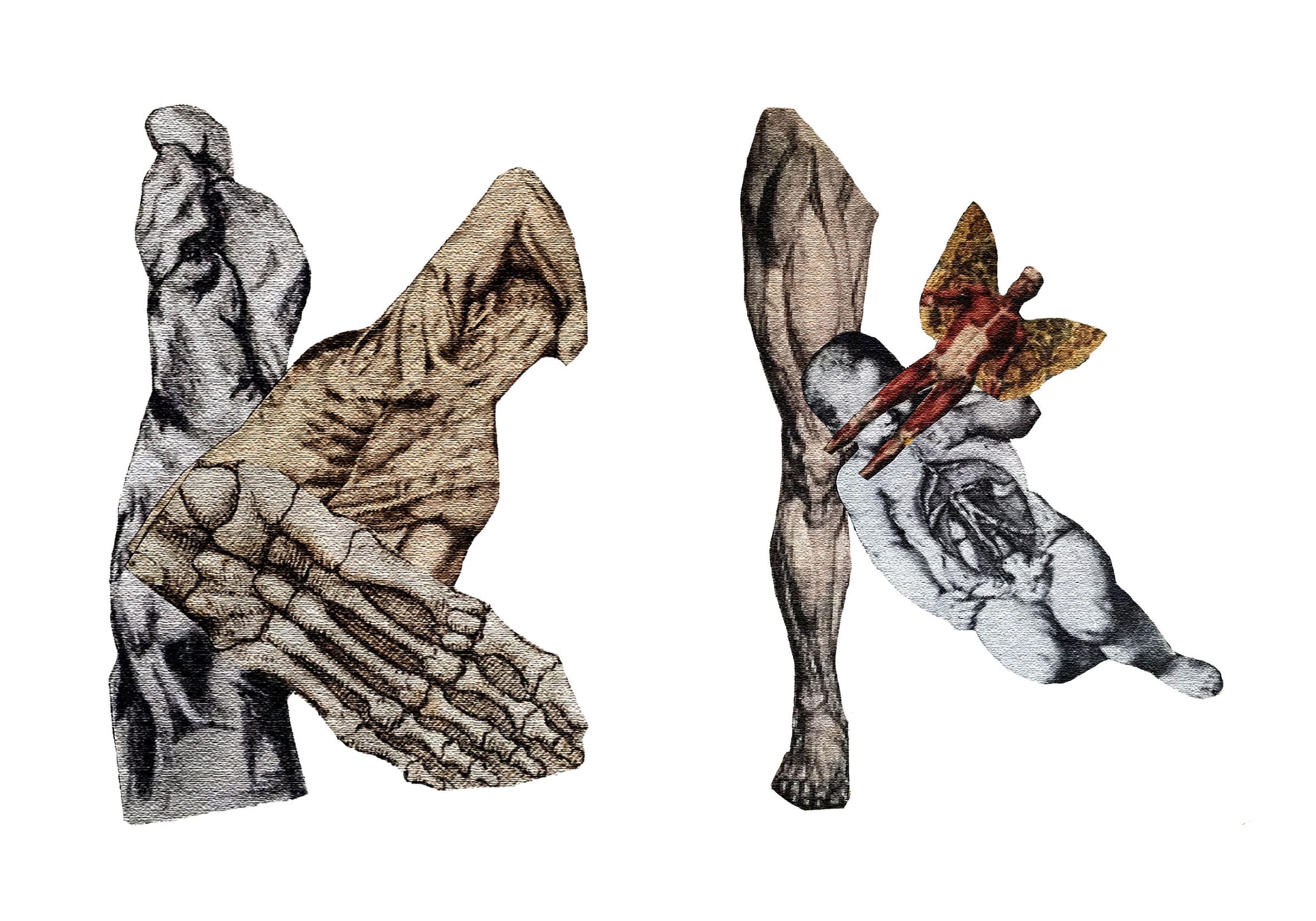
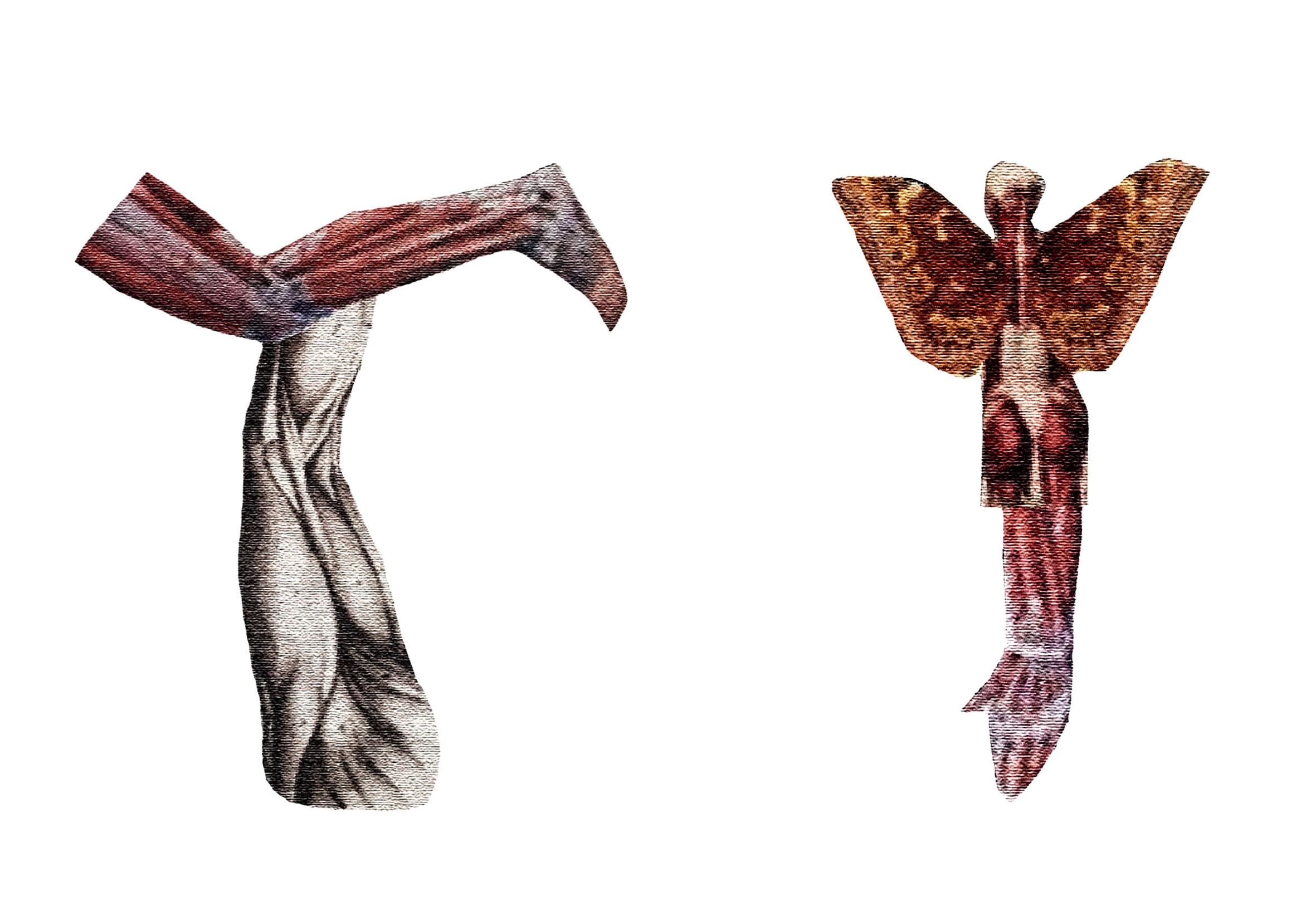
I prefer my letters to be presented on their own because they look neat and more professional. I dropped the saturation of the image and increased the levels which I think is quite effective. The black and white letter also looks good but at the same time it looks like something an amateur would produce and I want my letter form to be of a high standard. Simple black and white letter seems like a lazy Photoshop development that’s why I decided to stick to color. I wanted to see if the same approach would work with other letters like the with one below:
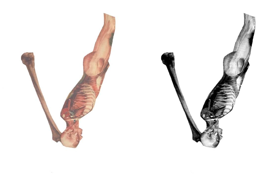
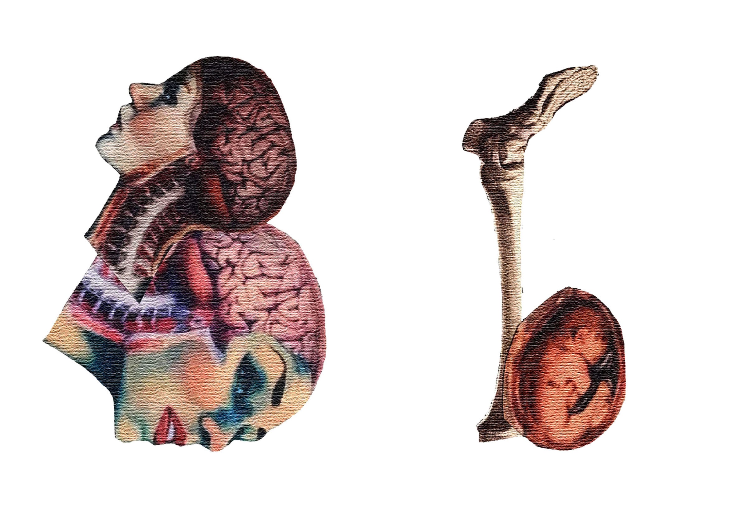
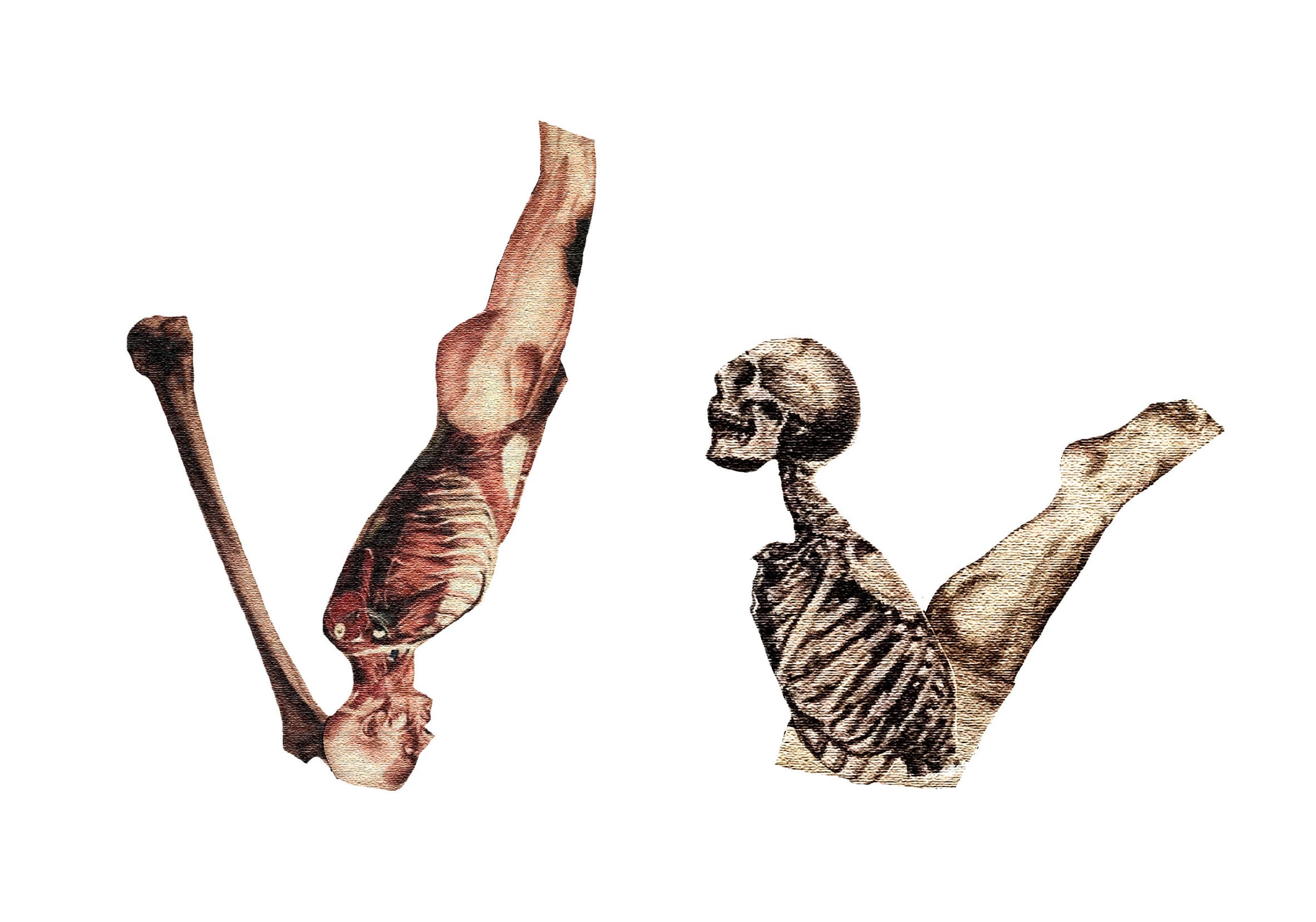
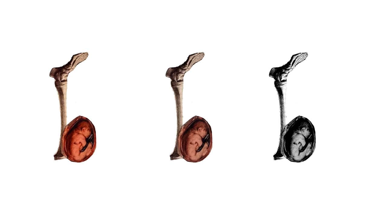
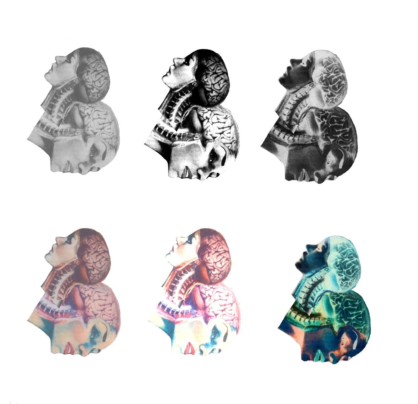
Below are some more examples of my experimentation. I particularly like the last upper case B where I inverted the colors. The bright lines on the brain look like neurons traveling across the brain. However I tried to invert the color on the other letters and sadly it didn’t have the same effect as the images used for the collage didn’t have much color in them.
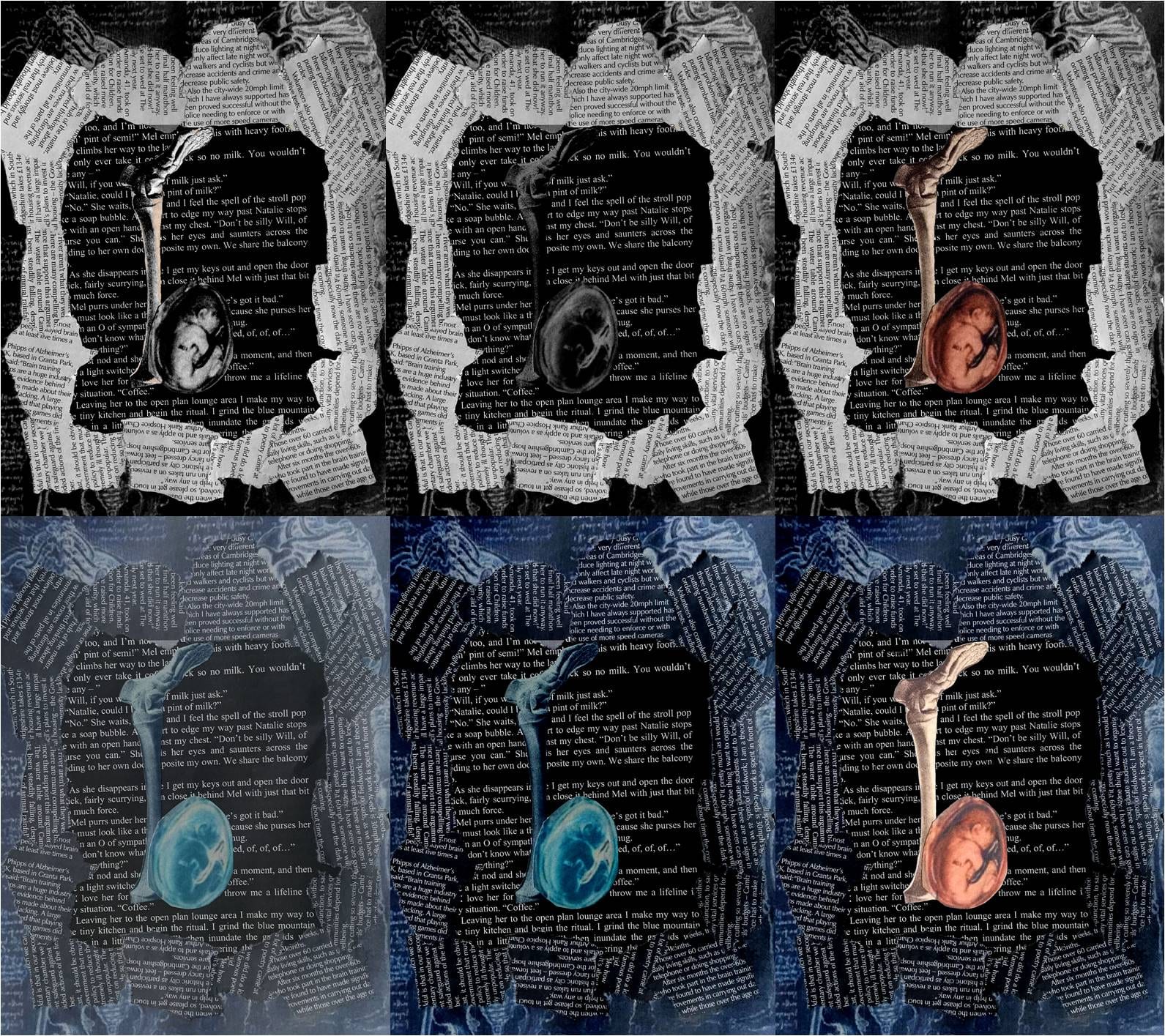
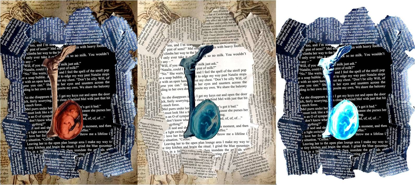
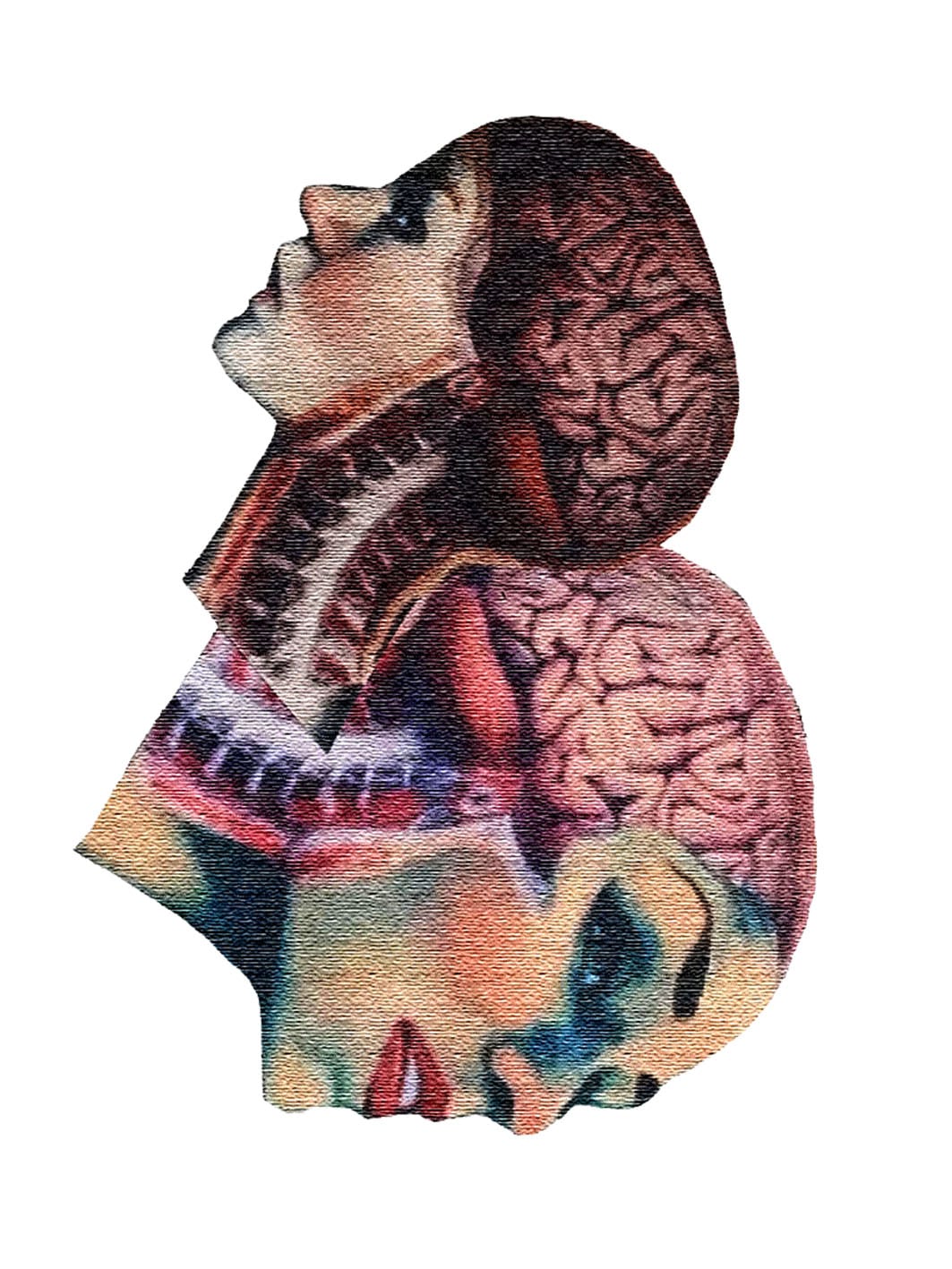
The last problem I had to face was the low quality of some of the images I used for the collages. Some of them were very pixelated after I printed them out. I covered it up by adding a texture to the letters which works quite nicely with the underlying theme driving this project: texture. Below is an example of my final letter form:
The purpose of my inforgraphic, app and the website is to inform the general public of the not-so-well know story of how Albert Einstein’s Brain got stolen. My target audience are people aged 16+ due to the graphic content of the story. I’m hoping that the design for these will come across as elegant and even though I want the overall design to be quite plain and simple I hope that the sophistication of the thinking and planning behind it will be evident. Because of it’s simplicity the app and website navigation should prove to be easy to grasp which will be helpful for older generations. The clean and minimalist appearance will hopefully give a sense of credibility to my project and appeal to my target audience.
Below are some exemplar App designs which I found interesting. They match the clean style on the websites I have researched. I like the blurry image as the background and the pale color palette some of these are using. Simplistic vector graphics make these apps easy to understand and navigate which is something I would like to include in my final app design. Because it is such a complex app with a lot of information I want its appearance to contrast that and make it look simple. I want to apply the same approach to my website.
