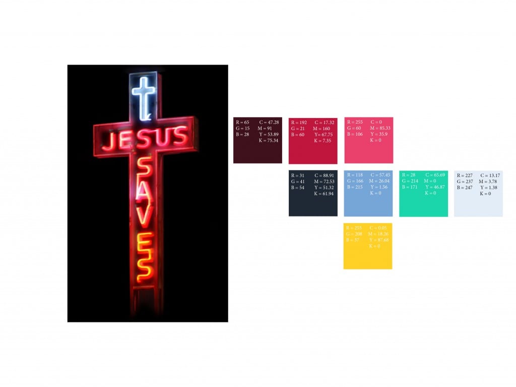
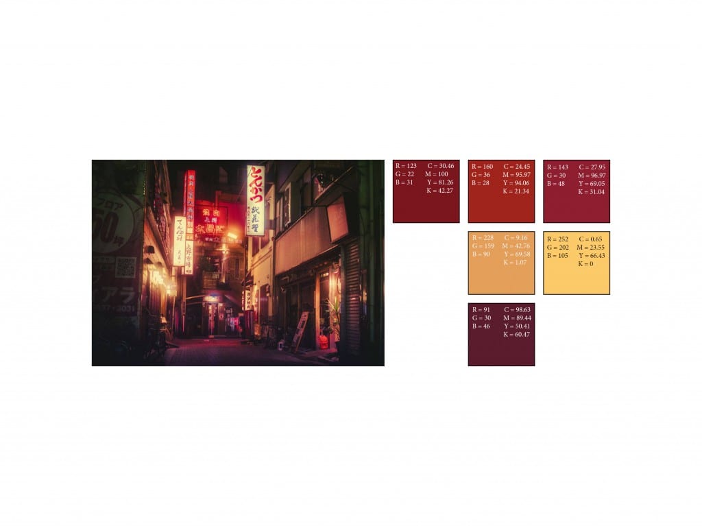
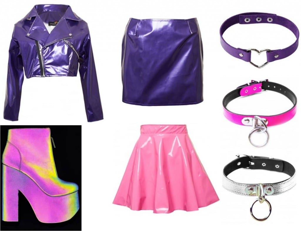
The neon based logo idea came from a poster I’ve seen of a game called Void & Meddler. I was also inspired by the cyberpunk genre itself and films such as Blade Runner which use a lot of neons in their set design. My first sketches of the logo focused on curves based off of alcohol/club neon signs. As the below sketches show I wanted the neon font to break at points so that the neon liquid spills out. This would be reminiscent of blood being spilled which goes well with the title of Bloodletting. I wanted the font to be red as well but this changed later on as I preferred bright pinks and violets.

Below is the first stage of experimentation with this logo. I decided to experiment with the positioning, colour and most importantly the neon effect. The font used to create this logo is called Fangtasia. I felt it was most appropriate for the logo because it looked the most like the fonts used to make neon signs, especially the alcohol or club ones. I made the neon effect by creating an offset path of the text which was a bit bigger than the original and used a darker shade color swatch on it. I then arranged that behind the original text. Then I added Gaussian Blur to it to make it appear as though it’s glowing. I like the angled positioning of the logo more because it is more reminiscent of a neon sign.

I felt that the above designs were too flat and didn’t have a strong neon feel to them. This is why I continued my experimentation. I decided to make another offset path, this time smaller than the original text and place it in the center of said text. I used a white colour swatch on it to make the glow more intense and to emphasize that I also applied Gaussian Blur but on a smaller scale than the outside offset path. I also experimented with more blue and pink colours. From the above designs I found the ones with two contrasting colours more interesting and decided to continue exploring this with different variations of blues and pinks. This is because white and light blue popped the most and the pink outline added a nightclub feel to it as well as emphasize the glow of the blue.

From the above designs I chose the two I felt were the strongest logos. These stood out to me because they complement the light blue the most. I don’t like the dark outlines as much because they don’t create as much of a glow whereas I want a neon-like design. I also preferred the designs with two contrasting colours more because they’re more interesting. More bright colours add to the club-like cyberpunk feel of the game.

I thought it would be a good idea to see these logos on a black background to see if they can be used in varied designs. The first one with the pale pink outline looks too blurry on a black background whereas the other doesn’t. Even though I prefer the light pink because it complements the light blue more the darker outline seems to be more versatile.

Below is my final neon based logo design. I chose this one because of it’s practicality and the fact that, even though the outline is darker than the other design, it’s still bright and makes the light blue pop. It’s positioning, color and neon effect make it look like a neon sign which was my original aim. I feel that it conveys the atmosphere of Bloodletting well.


