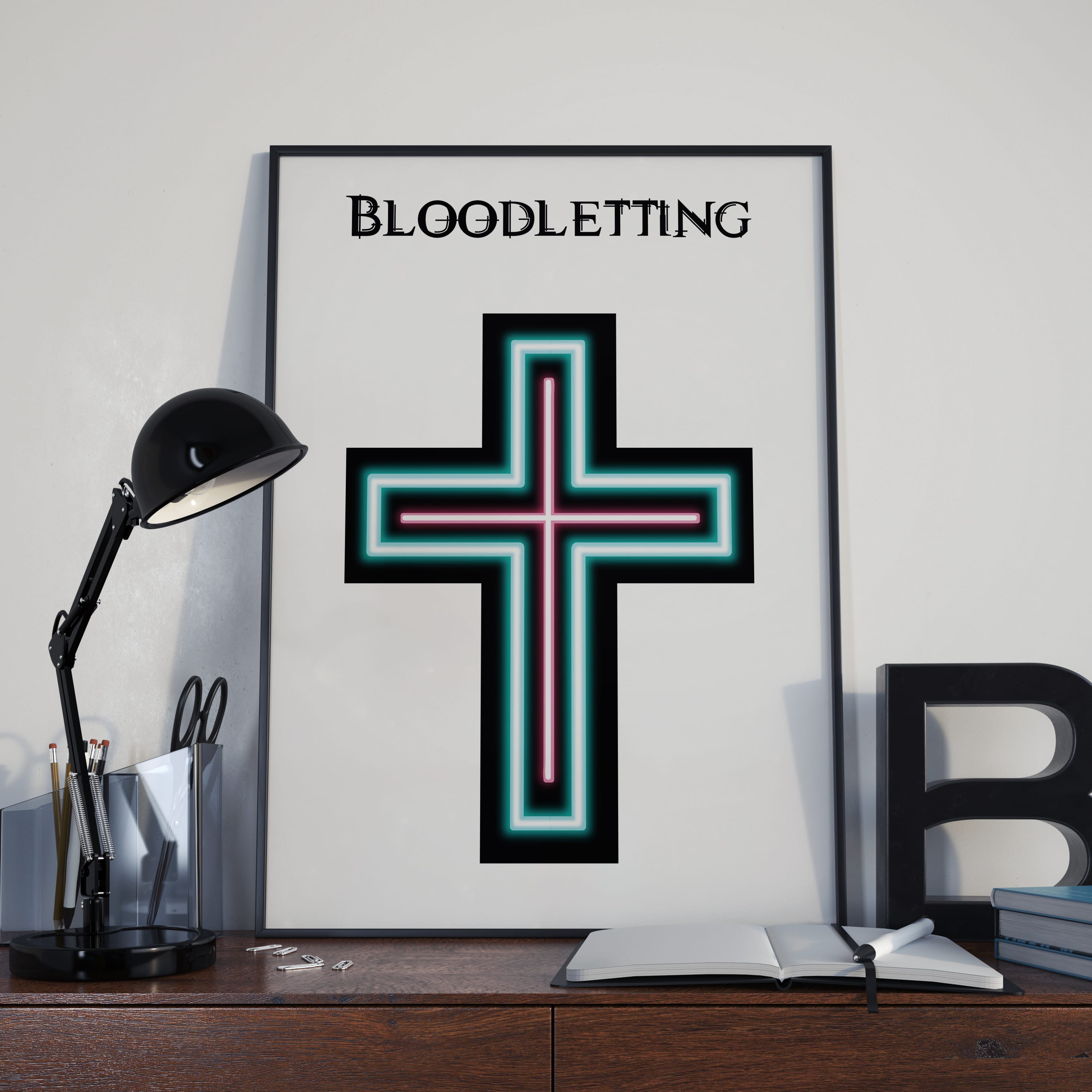
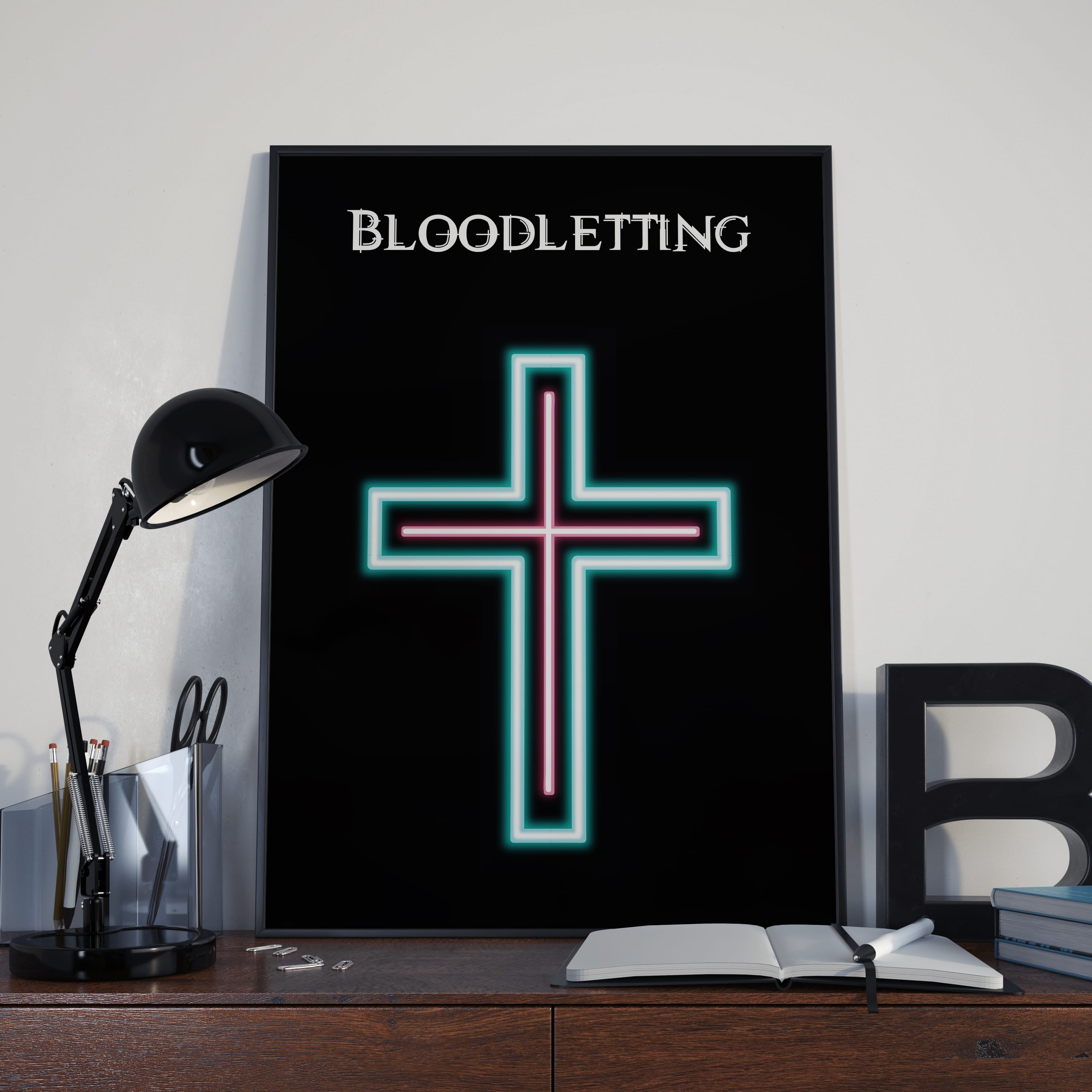


Below are examples of how the title for Bloodletting can be used in various situations. The colour of the title can be changed between pink and blue.


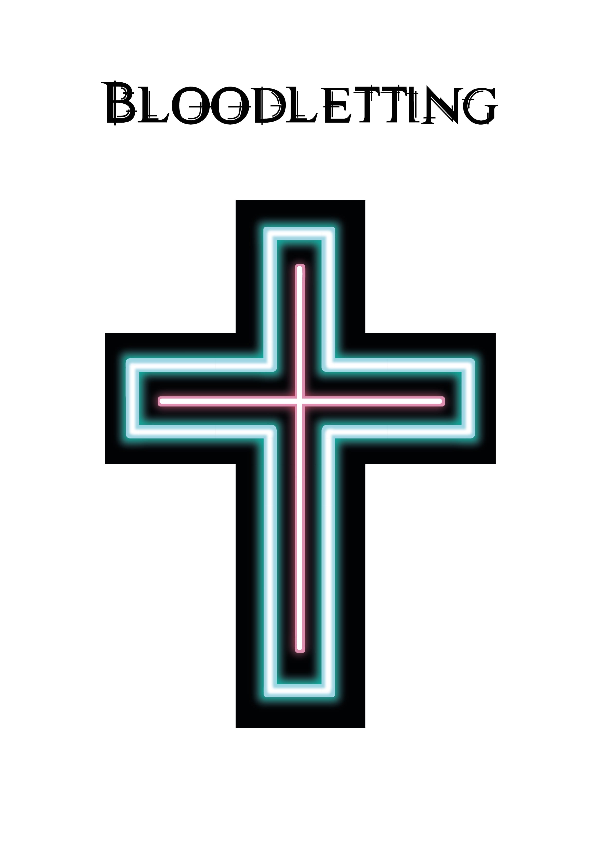
Below are the two fully developed logos, neon based and the cross based one. From these two logos I’m going to chose the cross based logo as my final one. This is because of both it’s practicality and aesthetic. The cross based logo can work well by itself and with text (as seen in my development). Aesthetically speaking I feel it conveys the cyberpunk genre better than the neon based logo which looks quite generic. The cross based logo also looks more professional.
