


Below are the two fully developed logos, neon based and the cross based one. From these two logos I’m going to chose the cross based logo as my final one. This is because of both it’s practicality and aesthetic. The cross based logo can work well by itself and with text (as seen in my development). Aesthetically speaking I feel it conveys the cyberpunk genre better than the neon based logo which looks quite generic. The cross based logo also looks more professional.

Below are the first deigns for my cross based logo and the process showcasing how I arrived at my first design.

After my first designs I decided to experiment more with the cross. I wanted it to be more detailed. I was heavily influenced by the neon crosses I have found during my research phases.

Following from the above designs the next step was to attempt to make the cross glow in a neon like fashion. This was the most time consuming part of development because I was attempting to make a vector graphic which glows. It was hard because of the potential pixelation of the glow. I got around this problem by layering colours on top of each other and adding Gaussian Blur to the darkest colours and the inner whites. After a lot of attempts and research I managed to create below examples. There were a lot of issues with making the vector properly re-size but I eventually solved these.
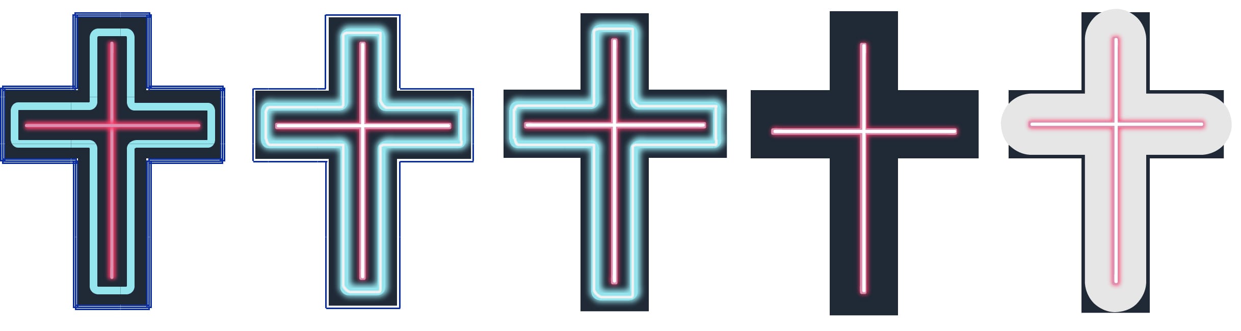
Another remaining problem was that the blue outline’s rounded corners didn’t stay in place after re-sizing. To solve this problem I created another outline but with the rectangle tool and rounded the edges with an effect tool. Below is the shape comparison of these outlines.

The next step was to experiment with different colour schemes. Below are two examples of the logo with and without the boarder.


From the above colour schemes my favorites are the first two because they’re more defined and work better than the others without the boarder. They also seem more cyberpunk in my opinion. The colours also blend better together to make a neon like appearance. I do prefer the black outline however rather than the dark blue one as it makes the colour pop more. For the final cross design I’m going to go with the first colour scheme but with a black outline because it’s more aesthetically pleasing.
Below are potential fonts which I could use for the title of the game.


The next step was to see which font works best with the cross logo. For this I used the fonts I researched above. From the first examples I like the bottom two the most because they incorporate the logo the best. However the font is too curvy and doesn’t match the square outline of the logo.
I decided to look at other more square and bolder fonts. These did in fact work better with the cross. The cyberpunk fonts however did have splatter around them and within the text itself which disturbed the uniformity of the logo. This is why I decided to add a torn up outline to the cross which worked well. I didn’t feel like this logo was suitable for a video game however or reflected the atmosphere of Bloodletting well however. I like the composition of the biggest logo, however it isn’t suitable for a video game logo. The title should be more prominent.
The appropriate thing was to look for another, more suitable font. I looked for a typeface with harsher edges. I felt that worked a lot better with the cross logo. For some of these fonts I decided to add a black, square outline which uniformed the text and logo well.

From the above fonts I chose the three best ones which I felt represented the atmosphere of the game. I added an outline with a blur to it to make it glow. I felt that creating a font which is in a similar style to the logo would unify the two even more which was true.

From the above three fonts I chose the best one (as it represented the character of the game the best and conveyed the cyberpunk genre) and added an inner white glow in order to make it even more neon like. I preferred that font.

Finally I decided to add a pale pink colour to the core text. This worked really well and incorporated two main colours used in the cross unifying the text and the logo even further. I do however feel that the colours can be changed when appropriate.

I decided to experiment with a few different typefaces which will be used throughout the branding package for Bloodletting. The neon fonts which aren’t used for the logo will be considered for headings, subheadings and the menu. This will help to unify the branding identity of Bloodletting.

From the above typefaces my favorites are Neon, Las Enter, Fangtasia and Beauty School Dropout II. This is because they look club like but are still readable. The menu is going to be in a small size and therefore these fonts are more practical. I’m still not sure which font I’m going to use for what aspect of the branding identity however.
Below are potential fonts for the body text both on the website and the company’s documents and/or business cards. These are a lot plainer and readable than the fonts used for headings and subtitles.

From the above typefaces my favorites are Century Gothic, Microsoft PhagsPa, Neon Pixel-7, AR Darling and Source Sans Pro. For Bloodletting‘s branding identity I’m going to use Source Sans Pro for body text, AR Darling and Neon Pixel-7 for either the menu and/or subheadings. This is because these two fonts stand out from the rest and match the feel of the game especially since AR Darling has crosses as Ts.
To create these typefaces I used Intuos drawing tablet & Photoshop. I wanted these typefaces to have a hand drawn feel to them because most of the children’s picture books I have researched used this type of designs. I also think that these types of lettering appeal to children more and have a more playful side to them. This style of lettering goes well with the style of my illustrations which will be line based and hand drawn. Below are the seven typefaces I designed.

From the above typefaces my favorites are the three first ones and the last one. I think the most applicable typeface for my picture book is either the first one or the third one. This is because of their simplicity and readability. From these two I think I’m going to use the first one in my picture book because I prefer it aesthetically. There are going to be pages which only include text and a chunkier typeface will fill up the space better.