The first assignment for design this year is to create an original letter form and produce an example of how said letter form could be used in context. Being a massive horror fan I rushed into thinking about a brand new typeface for the next Guillermo del Toro film, however as an aspiring designer I don’t want to limit myself to just one genre. I’ve decided to start my research from scratch hoping to discover another area of interest which I could develop throughout this project.
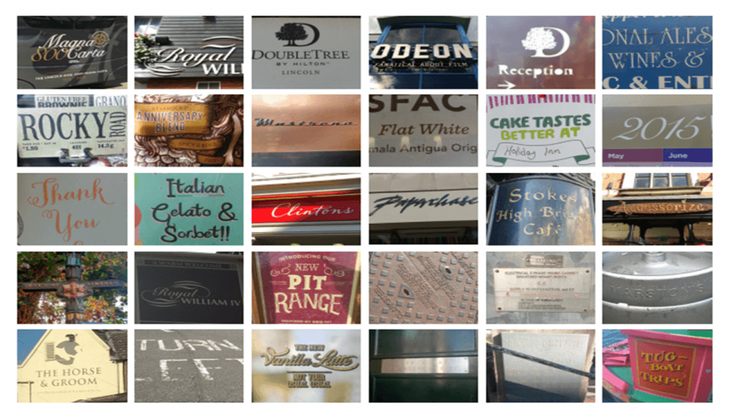
Our first design workshop has provided me with the opportunity to appreciate a wide variety of typefaces via a simple exercise. We were asked to walk around Lincoln and photograph typefaces which interested us. Then we were tasked with producing a grid to show off our findings.

From the grid I noticed that a lot of the lettering which I thought were quite unique had a lot of texture to them. The ones I found particularly intriguing were heavily ornamented such as the City of Lincoln sign or the Accessorize logo. I like the idea of an ornamented typeface because it gives me the opportunity to create a typeface which tells a specific story and therefore could be customized for a refined context. Texture on the other hand would allow me to experiment with a wider variety of processes through which a typeface could be created. Therefore I think that texture and ornament could potentially become an underlying theme of this project.