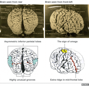
Here are some images I’m considering to Photoshop and use for my infographics:
All of the above images I found using Google Image Search.
Instead of focusing on Einstein’s theory of relativity I wan to focus this project on the story of Einstein’s Brain. After conducting some research I found out that Einstein’s brain was stolen by a pathologist called Tom Hardy who was performing Einstein’s autopsy. Links in the bibliography explore this story in more depth.

The reason I’m deviating from the set brief of creating an infographic explaining The Theory of Relativity is because I want to establish my self within the horror genre. This story is more creepy and captured my attention. I still want to stick to a topic which is to do with Albert Einstein and this one seems to be the craziest one I found so far.
http://www.bbc.co.uk/news/magazine-32354300
Here are a few websites I got inspired by:
http://www.awwwards.com/websites/clean/?page=3
I particularly liked these two:
The 62 models website’s homepage has a very clean and uniformed feel about it. A tidy, well ordered website using the grid system and a plain background would give a science based content a sense of credibility. This style is usually associated with logical content as well therefore it is appropriate to consider. I also like how the images on the homepage turn blurry when they’re in the background. It looks professional, elegant and sophisticated. I’m hoping to be able to create my website to the same high standard.