Infographics Examples

Here are some examples of infographics I found on the internet:
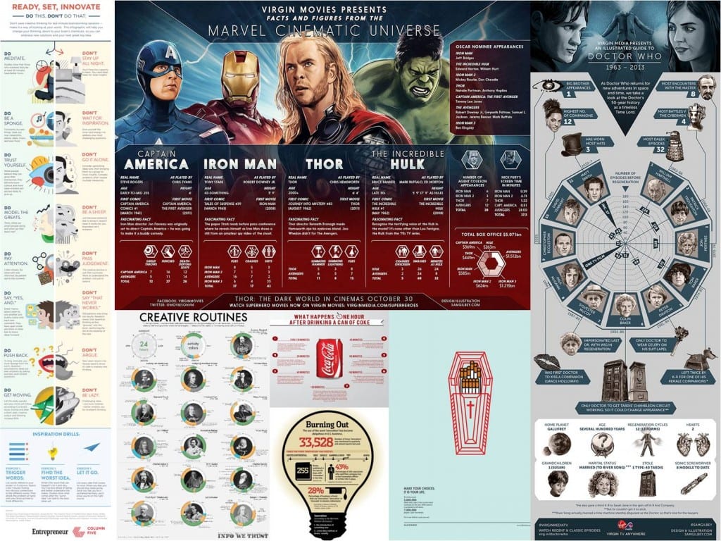
Example 1
Example 1

From the research I did on infographic I found out that they’re supposed to convey information clearly using both words and images. Some use colour and graphs to communicate with the audience visually rather than through words which are only there to explain or support the image. They should be easy to follow, readable and engaging. Most use the grid system to keep the icons/images in order to preserve the clarity of the infographic. I also learned that there are different types of infographics such as: static, animated, interactive and responsive. More information and examples of these can be found here: http://blog.hubspot.com/marketing/extraordinary-infographic-examples  For the website design I though of attempting to make the infographic interactive or responsive, something that the audience can engage with in order to further explore the topic. The website would be the final stop on my transmedia story telling experience of the Einstein’s Theory or relativity and therefore it should provide more in depth information.
Example 2
Example 2

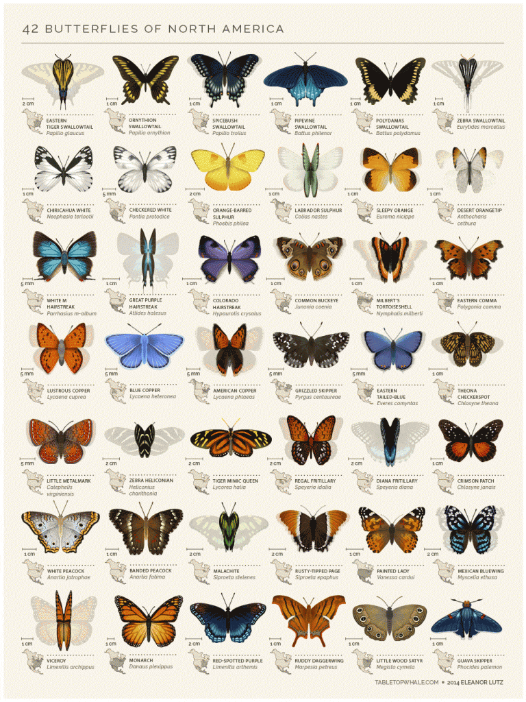
I found an animated infographic where the butterflies move their wings. For the infographic designed for a portable device I’m considering making one of these explaining an aspect of the theory of relativity. I could inmate it in After Effects.
Example 3
Example 3

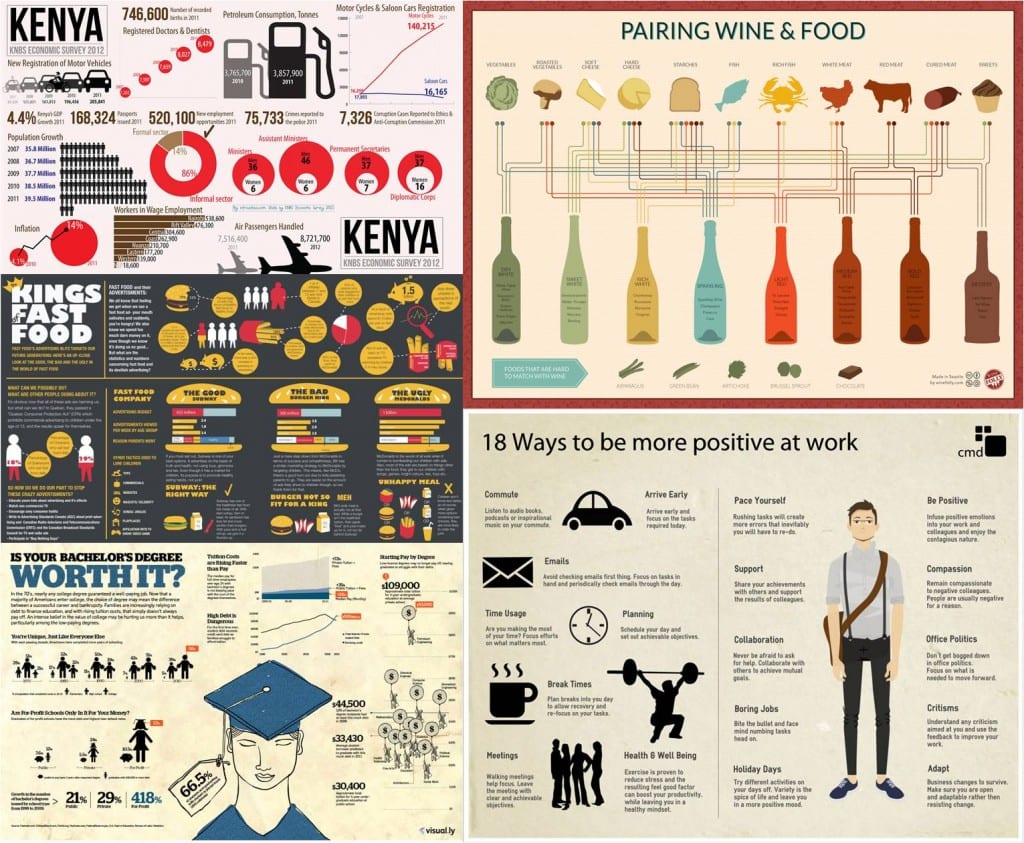
The above infographics represent some of the examples of the style I’m thinking of designing my infographic in. I like the paper-like feel they have and simple shadow-like or cut out-like icons. I’m inspired by the icons that look as though they have been doodled or sketched. I also find the simple, dulled down colour palette appealing as it doesn’t distract or confuse the audience from the information the infographic is trying to convey.

Bibliography:

http://www.creativebloq.com/graphic-design-tips/information-graphics-1232836

http://blog.hubspot.com/marketing/best-infographics-2015

Einstein’s Theory of Relativity

I found this infographic explaining Einstein’s Theory of Relativity:

Einstein's Theory of Relativity Infographic
Einstein’s Theory of Relativity Infographic

This is a good starting point for my project as it provides me with an example of the Theory of Relativity presented in an infographic. I’ll have to do a bit more research when I decide what aspect of the theory I want to focus on for my infographic. I’m not sure yet if I want to convey the same information in all three platforms or whether I want to create a more immersive, transmedia experience explaining the life and work of Albert Einstein.

Bibliography:

http://www.space.com/28738-einstein-theory-of-relativity-explained-infgraphic.html

Illustrator

I finally learned how to use Illustrator to create vector graphics, use the grid system and design infographics. I also learned how to export the vector graphic in different sizes. Below is the finished attempt at an exercise we did in one of our design workshops.

A4:

LincolnInfographicA4

 A3:

LincolnInfographicA3

In our workshop we were also introduced to a useful icons website called the Noun Project: https://thenounproject.com I like the simple, black and white style of the icons. The design is not cluttered with unnecessary information which in turn doesn’t distract the audience.

Ideas

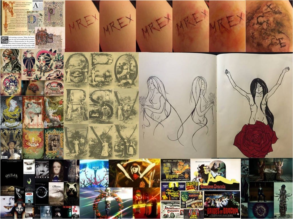
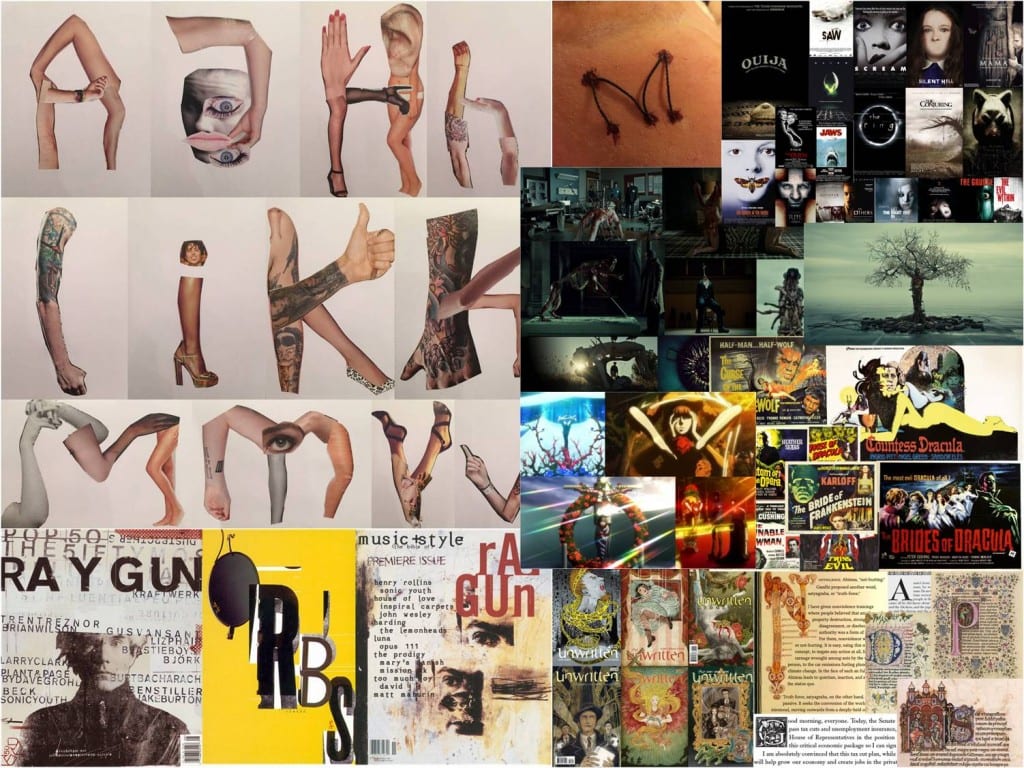
Idea 1: Dismembered Letters

Idea 1 is based around letters tableaux and Hannibal‘s sculptures made out of dismembered bodies. This idea was also heavily influenced by ornament and letters being incorporated into the image itself. This is why I came up with the idea of using images and/or negative spaces to create letter shapes. I’m going to experiment with color and different techniques of producing the letter form such as drawing the design with ink and then adding color in Photoshop.

Idea 1
Idea 1

Idea 2: Anatomy Collage

Idea 2 is also inspired by Hannibal however it focuses more on the concept of bodies being rearranged hence the idea of making a collage emerged. This idea was also influenced by one of the underlying themes of this project; texture. I’m going to experiment with human anatomy artists and sketches rather than simple magazine cut outs which I’ve used for my first collage. I’m also going to experiment with Photoshop to further manipulate and develop my letter form.

Idea 2
Idea 2

Audience & Purpose

Because of the low readability of my letter form design I don’t think it could be used as a widely commercial typeface. This is why I decided to look outside the box for the purpose and audience for my design. My desired audience are people interested in ornate design and horror or body horror at least although I’m willing to keep the audience quite broad. People who are interested in the following ‘purposes’ for my letterform will probably be also intrigued. Here’s a list of some of the ways I think my letter forms could be used for. Because I’m developing two letter forms at the moment some purposes only apply to one typeface.

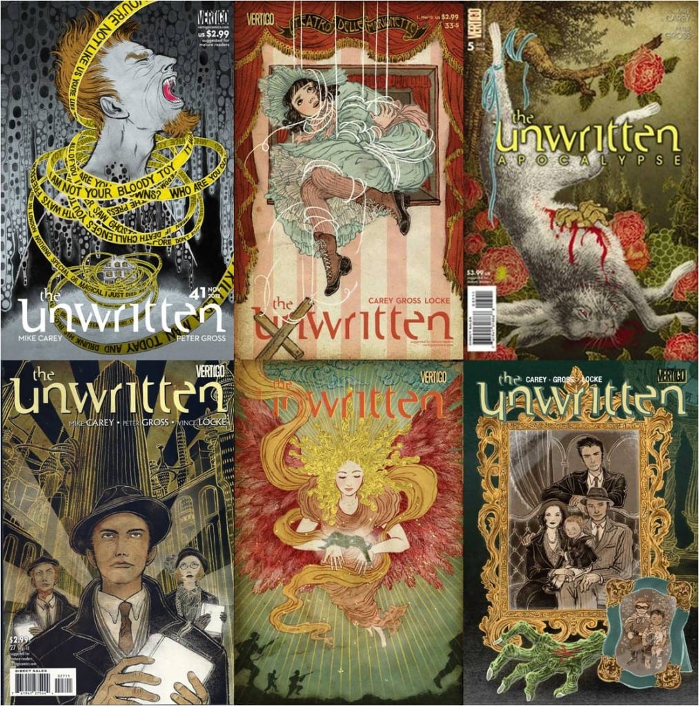
Both of my designs can be used for a cover page of a comic book such as The Unwritten:

Unwritten comic published by DC Vertigo, artwork by Yuko Shimizu

http://yukoart.com/

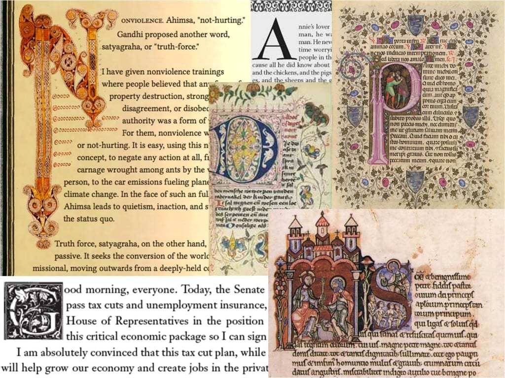
Both of my letter form designs can be used as Drop Caps:

Drop Cap
Drop Cap

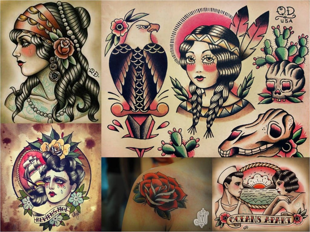
The Dismembered Letters design can be used as a tattoo flash:

Tattoo Flash
Tattoo Flash

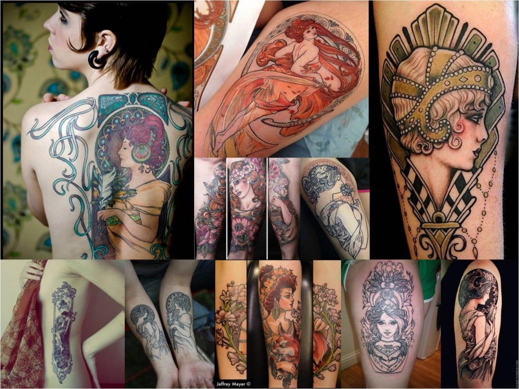
Or an Art Deco tattoo flash:

Art Nouveau tattoo
Art Nouveau tattoo

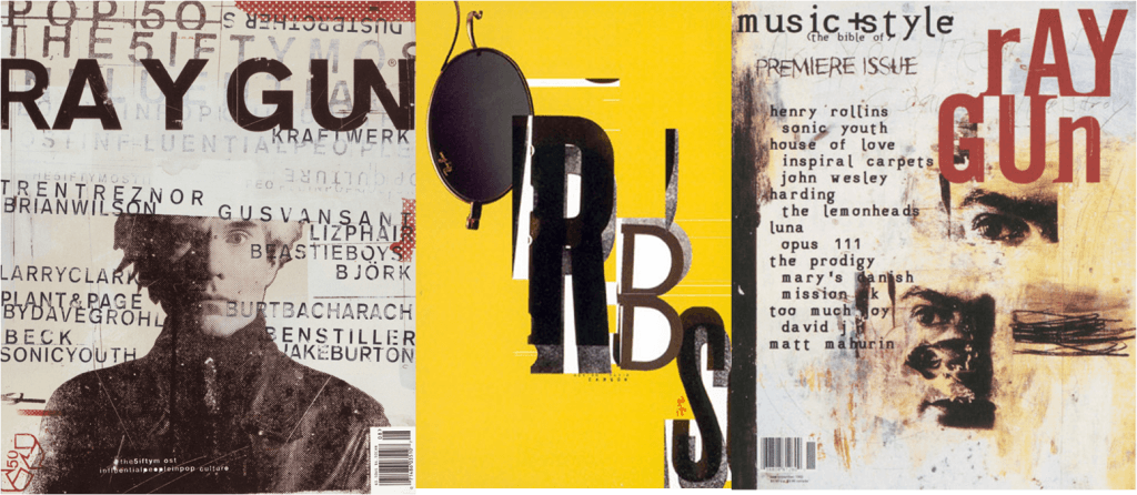
My collage can be used for creative magazines in the style of Ray Gun:

Magazine covers by David Carson

http://www.davidcarsondesign.com/