I thought that the previous post was quite lengthy and decided to make a separate one to accommodate various sources of inspiration for my FX designs.
FX YouTube Tutorials:
Scarification:

Typography
I thought that the previous post was quite lengthy and decided to make a separate one to accommodate various sources of inspiration for my FX designs.
Recently I have watched The Haunting in Connecticut which made me think about different canvases I could use to create my letter form on. The right canvas can bring more texture to my design. In the film the corpses have letters cut into their skin which I thought was an interesting and unique way to create a letter form.
Here is the screen shot from the film which I used as inspiration for my first FX typography design:
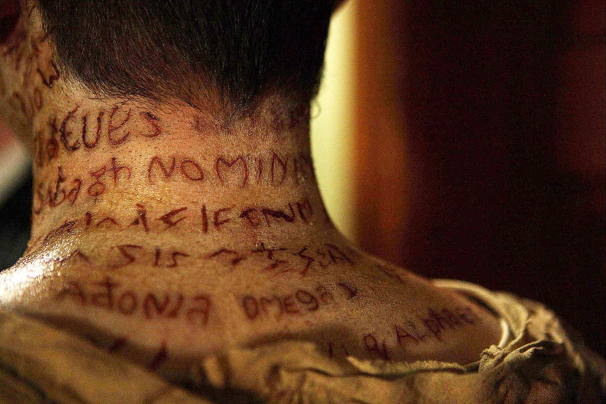

My first design was directly influenced by the letters cut into the corpses’ bodies. In the film the letters were being cut in with a scalpel therefore in the above screenshot they look like a clean cut. With this design however I went with a different type of a cut, one that has been scratched onto the skin rather than cut into it. That’s why I also decided that the skin around the cut should look irritated or infected even. I wanted the design to look fairly realistic. I started with painting the basic design onto my model’s skin with a very thin brush. Then I went in with a darker brownish color to add shadows. With a red watercolor diluted generously with water I painted on light irregular lines which emphasize the idea of the letters being scratched onto the skin. Using a cotton pad I gently dabbed the skin to create an irritated skin effect. Finally with the same cotton pad I dabbed dirty yellow water color onto the skin to make it look infected and then after the paint has dried used the back of my paintbrush to scratch away some of the paint to achieve the dry blood effect.

Overall I’m happy with how the design turned out. I’m not an expert at using FX makeup therefore I’m quite pleased with the outcome as I was able to achieve a bloody, rough letter form reminiscent of a cut. I do however have one criticism. I think that I added too much yellow to the design which ruined the realism aspect of it. If I had to do it again I much prefer the before design which only features red paint.

For this design I decided to move away from creating letter forms reminiscent of cuts and instead thought about using FX to create a more zombiefied or tree-like look. I started off by mixing a few different greens from my water color palette to achieve rustic or rotten green. Then I applied it with a cotton pad and proceeded to add very diluted brown tone to the design. With a cotton pad soaked in water I created three areas lighter than the rest of the design. Using water colors is good for this because you can easily bled it out with water without destroying the surrounding design. Then with a fine brush I applied brown acrylic paint to refine the edges. I followed this with adding dark acrylic paint with a cotton pad onto the model’s skin to create a rotten effect. With a flat brush I painted on shadows on the inside of the edges to add dimension. Going back to the finer brush I traced out the letters in brown paint. Then I started to add small branches coming out of the letters to create a more tree-like effect. Finally I went over the design with a wet cotton pad to make the design look old as though it’s close to disintegration which linked in nicely with the theme of zombies and nature. The very last step was to add very tiny drops of red paint to the design in order to make it seem to grow out of someone’s flesh.

I’m very happy with this design. I definitely prefer it to the first one because it’s more original and imaginative. I like how the lettering is embedded in the skin, becoming a part of it and as the skin rots away so do the letters.

This is another example of my experimentation with FX and skin as a canvas. From all the FX make-up tutorials I’ve seen on YouTube the ‘sewn lips’ appeared to be very popular so I decided to see if I can make a typeface with this technique. First I cut pieces of thread and lay them out to see if they’re the desired length. I didn’t want them to be too perfect however because I wanted to keep the illusion of sewn flesh which I imagine would turn out irregular. Then I used liquid latex to keep the threads in place. After the latex dried I applied red paint to make it seem like dried blood from the woulds where the needle came through.

Same as with the previous design I like this letter form because it’s unique however I find it too simplistic as it is now. I could create a more ornate design with more threads if I chose to continue working with this technique.

This letter form was inspired by scarification which is a form of body modification. I wanted this typeface to look more precise and pretty because unlike the other 3 designs scarification is a form of deliberate body ornamentation. First I painted the basic shape of the letter onto my model’s skin with a fine brush. Then I added a darker red color on the edges of the letter to create depth. Finally I added white paint on the inside of the letter in order to make it seem as though the scar has started to heal.
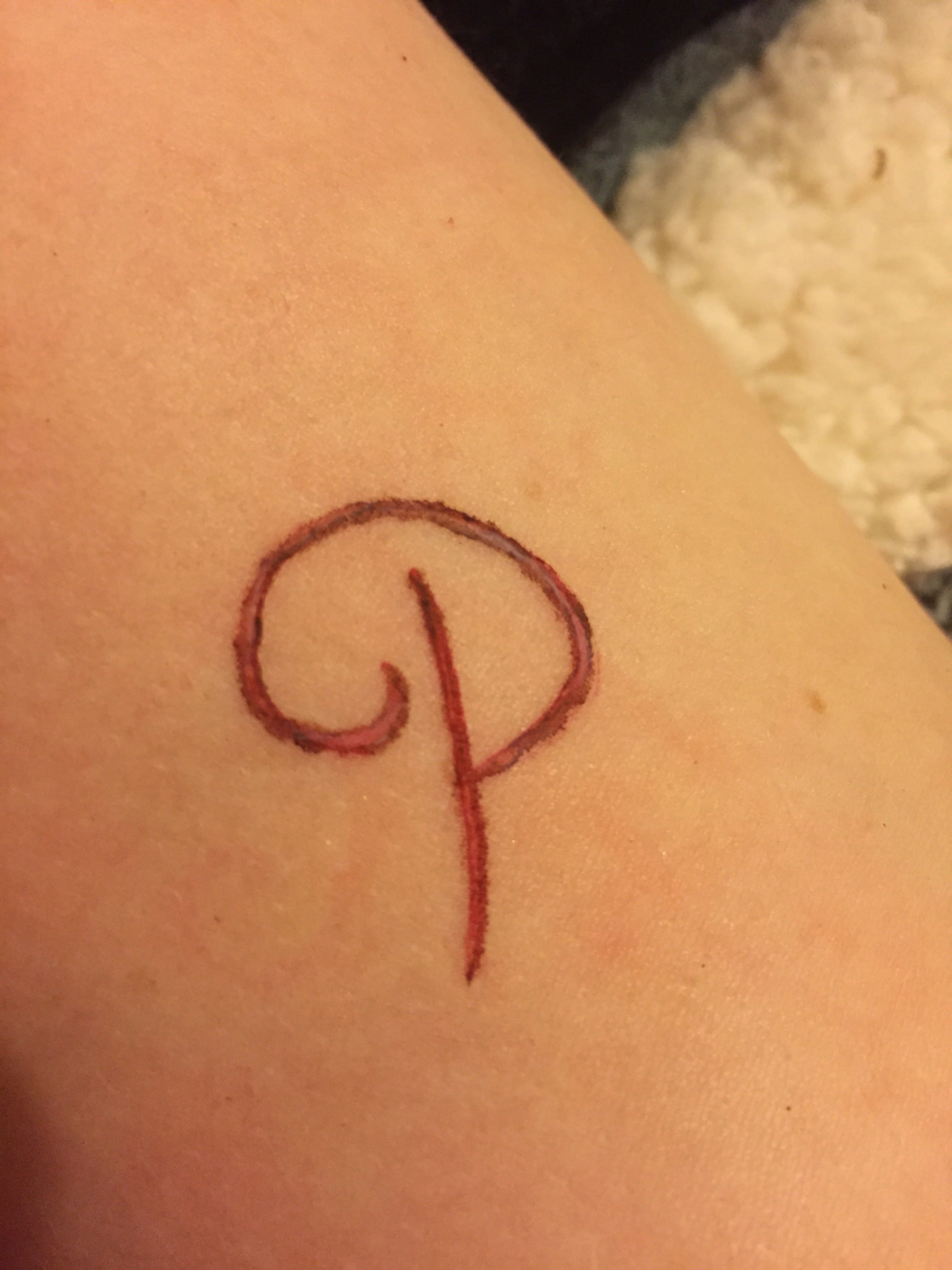
Although this letter form is similar to the first design this one is ‘prettier’. I like the idea of having a fancy typeface, like a handwritten posh letter form, but appearing to be carved into skin which contrasts common associations with the definition of ‘pretty’. I find representing horrid things in a beautiful way intriguing.

This letter form design was based on experimentation with latex. First of all I took pieces of tissue and rolled them to create long strips which I later soaked in liquid latex and placed on the model’s skin. I continued with this technique to achieve a rectangle and then painted the inside of it with dark red color. Then I used latex to attach more pieces of tissue to the inside of the would and painted these in the same color as the skin to make it blend in. This was done to create texture. With black paint I went over the edges of the inside of the rectangle to create dimension. I also painted under the loose pieces of tissue with dark brown and a fine brush. Then with a cotton pad I added white watercolor in the areas without the tissue. I also generously painted over the tissue with red water color hoping that it would imitate blood. With a bigger paint brush I painted over and around the latex to make the skin look irritated. Finally with water color I roughly painted letters on the inside of the rectangle.

When I first started this design I had no idea how it would end up looking because it was purely experimental. It looks like a robot’s arm or trash growing out of someone’s skin. I like the texture of the letters however I don’t like the overall design. One good thing that came out of this experimentation is that I learned that it’s better to start with the texture and then add the design on top of it.
From experimenting with FX make-up on skin to create letter forms I got inspired to design a typeface based around body horror genre. The next step would be to continue my research to broaden my understanding of the topic and proceed to create letter forms of my own which are influenced by that very research. I don’t think I’m going settle on using FX techniques to create my final typeface because I want to find more techniques to experiment with.
I’ve started this project with a promise of expanding my creative field. I promised my self that I will stay away from horror or occult genres however I have officially cracked. It’s week 4 and I have done two posts both which don’t include any of my work, just research. I found myself bored and uninterested with this project and have no motivation to complete it. I keep dancing around the idea of incorporating body horror and mystical wooden carvings of a haunted forest. All ideas that pop to my head are to do with horror. I feel that perhaps I already have established myself within a specific area that caters for a specific audience. I think of this as a good thing because I already possess a deep understanding of this audience and the genre therefore it wouldn’t be appropriate to ignore this. I will continue my project with the theme of texture and ornament however the lettering design will be produced with a specific audience and purpose in mind giving me a clearer direction to guide me through this project. So to start off my new concept here are a few horror movie and game posters.

According to Rafael Van Winkel, Art Director at Art Machine, Trajan is a go to typeface for horror movie poster because ‘the sharp edges of thin serif typefaces convey that creepy feeling, specially when you make it bloody red and add some texture to it’. (Winkel, 2015) Nowadays Trajan has become associated with horror and therefore it’s heavily used for poster design. Trajan is a serif typeface designed by Carol Twombly and released in 1989 by Adobe Systems Inc. It has it’s origins in Rome and is named after the 13th Emperor of Rome who was interested in architecture. The Trajan’s Column is dedicated to him. It has an inscription in a distinctive style of Roman square capitals. A Roman-Catholic priest and a calligrapher, Edward Caitch, found that instead of that inscription being a product of chiseling techniques it was in fact a product of painted calligraphy and was then chiseled in. Carol Twombly later turn this inscription into a typeface we know today, Trajan. More information – http://www.fonts.com/font/adobe/trajan

Personally I find this boring and lazy. There are some posters however which are more creative with their typeface choice. For example The Ring uses an ambiguous typeface with a white glowing outline. The letters are unevenly spread apart and the shapes of the letters are vaguely irregular. This is typically associated with static or messages being transmitted in static causing the message to become bend out of shape. Another example is the You’re Next poster which uses typeface which has been scratched into the metal.

Hammer Horror Film posters are a further example of more creative uses of typography to convey the genre of a film. The typeface is usually bold and big in order to catch the audiences’ attention, it’s use is purely commercial. The Phantom of the Opera poster features a typeface which seems to be curving, reminiscent of the movement of a ghostly figure or smoke. The typeface has clear edges and uses serifs which connotes elegance of the opera however the bent lettering and bright yellow block colour of it dilutes this. On the other hand The Bride of Frankenstein is a sans serif typeface which implies modernity and development. Both of these are associated with science. The lettering is also glowing and ridged at the outlines which infers electricity therefore referring to the Frankenstein’s monster being brought to life with the use of it. Finally the Countess Dracula poster uses a very different letter type than the two previous posters. This one isn’t curved and is positioned on a straight baseline making this movie appear more sophisticated than the other two which were advertised as fun spinoffs. The typeface is mimicking old, ornate lettering used for writing manuscripts. This in turn pays homage to Bram Stoker’s Dracula. The choice of red for the typeface represents blood, heavily associated with vampirism. The lettering is embedded within the image as the blood dripping off of the chalice is forming the letters. I like the concept of combining images and lettering and I’m keen on developing my final design around this idea along with the themes of ornament and texture. I think these three aspects of design combined would merge into a visually intriguing and unique typeface.

I have noticed that a lot of horror poster designs use occult symbols incorporated into the letter type design such as the House of the dead or Rite. These symbols further reinforce the ambience of the typeface. I like the concept of images or symbols being incorporated into the typeface it self.

From the research I’ve conducted for this post I’ve been inspired to create a letter form which incorporates images into the letters themselves. So far I’m thinking about real life design, using objects to create letters and then photographing them. I’m also going to make a collage out of cut out magazines to experiment with form and texture.
Winkel, R. (2015) Building on Typography Trends in Movie Poster Design. [online] Print Mag. Available from:http://www.printmag.com/typography/typography-movie-poster-design/ [Accessed 05/10/2015]
Before starting this project I wanted to learn more about the history of typography as well as gaining some insight into typographic terminology. There’s a lot of things a designer can learn from history which can aid their designs. ‘History also allows designers to learn from the past mistakes, understand common threads, reinvent classic letterforms and develop innovative typographic styles, which they can proudly add to an existing portfolio or body of work.’ (Siebert, 2015)

In the past I was guilty of not paying much attention to typography. Truthfully I wasn’t very interested in it but now, the more I learn about it, the more I start to appreciate the complexity of it. When I first started to research typography I came across some terms that I never heard of before so to better my understanding of what it is I’m reading I thought I’ll create a small cheat list of most useful terms.
arm: a secondary stroke that extends horizontally or diagonally from a stroke at the top and does not connect to another stroke
ascender: the part of a lowercase letter that extends above the x-height
baseline: the horizon on which letters sit
bowl: a curved stroke that connects to either a vertical stroke or to itself
cross bar: a stroke that horizontally connects two strokes
descender: the part of a lowercase letter that extends below the baseline
drop cap: a larger letter at the beginning of a paragraph that drops down into the lines of text below it
font family: all the variations in weight, width and angle of a typeface
graphic text: text formatted to output as an image file
kerning: a manual adjustment of the space between two letters
monogram: a design that contains overlapping letters, usually the first, middle and last initials of a person’s name
sans serif: typeface with no extra structural extensions coming from the horizontal and vertical strokes. Sans is a French word meaning “without”—hence the phrase sans serif means “without serif”
serif: small structural extensions that are at the end of a letter’s horizontal and vertical strokes. Serifs come in a variety of shapes and sizes. Serif also refers to the category name of a font that has serif extensions.
spine: the curved stroke through the middle of an s
standup cap: a letter at the beginning of a paragraph that is several times larger than that of the surrounding text but shares the same baseline as the body copy
stroke: a straight or curved line that creates the principal part of a letter
(Petit, 2014)
Ideograms were one of the first form of written communication. Used by Egyptians as hieroglyphs. These didn’t indicate the sounds used to say the words unlike phonographs developed by Phoenicians in 1600 B.C. Phoenicians are also credited for creating the first alphabet later used by the Greeks which would in turn inspire the Roman alphabet.
In the Middle ages unicals and half unicals were popularized and calligraphy was on the rise. Handwritten manuscripts featured ornamented lettering. A good examples of this is the book of Kells.
The 15th century saw the introduction of movable type and printing press developed by Johannes Gutenberg. During the Industrial Revolution typography was used to communicate with the larger population and therefore became more bolder and experimented with serif and sans serif. ‘ Ornamental typography was another major highlight in this era. In the 1800’s, medieval art and hand crafted individual art has become commonplace, and international artistic styles developed considerably.’ (Siebert, 2015)
During this weeks lecture we learned about the modernist style and although it is fascinating (or at least I think so) I want my typeface to focus on texture and ornament. That’s why I found early history of typography a bit more useful. In future post I will explore different typefaces which inspire me from more recent history such as the 19th century Letters Tableaux.
I like the idea of ideograms conveying meanings through symbols. I’m thinking about incorporating that into one of my lettering designs. The concept of images bursting out of the lettering would go nicely with the theme of ornament and texture.
Sierbert, J. (2015) The Evolution of Typography: A Brief History [online] Print Mag. Available from: http://www.printmag.com/typography/evolution-typography-history/ [Accessed 03/10/2015]
Petit, Z. (2014) Typography Terms 101: Everything You Need to Know [online] Print Mag. Available from: http://www.printmag.com/imprint/typography-terms/ [Accessed 03/10/2015]
The first assignment for design this year is to create an original letter form and produce an example of how said letter form could be used in context. Being a massive horror fan I rushed into thinking about a brand new typeface for the next Guillermo del Toro film, however as an aspiring designer I don’t want to limit myself to just one genre. I’ve decided to start my research from scratch hoping to discover another area of interest which I could develop throughout this project.
Our first design workshop has provided me with the opportunity to appreciate a wide variety of typefaces via a simple exercise. We were asked to walk around Lincoln and photograph typefaces which interested us. Then we were tasked with producing a grid to show off our findings.

From the grid I noticed that a lot of the lettering which I thought were quite unique had a lot of texture to them. The ones I found particularly intriguing were heavily ornamented such as the City of Lincoln sign or the Accessorize logo. I like the idea of an ornamented typeface because it gives me the opportunity to create a typeface which tells a specific story and therefore could be customized for a refined context. Texture on the other hand would allow me to experiment with a wider variety of processes through which a typeface could be created. Therefore I think that texture and ornament could potentially become an underlying theme of this project.