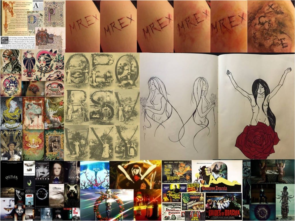
All images I found online through google image search.
Leonardo da Vinci:
Fernando Vicente:
Other images I found online:
Typography
Idea 1 is based around letters tableaux and Hannibal‘s sculptures made out of dismembered bodies. This idea was also heavily influenced by ornament and letters being incorporated into the image itself. This is why I came up with the idea of using images and/or negative spaces to create letter shapes. I’m going to experiment with color and different techniques of producing the letter form such as drawing the design with ink and then adding color in Photoshop.
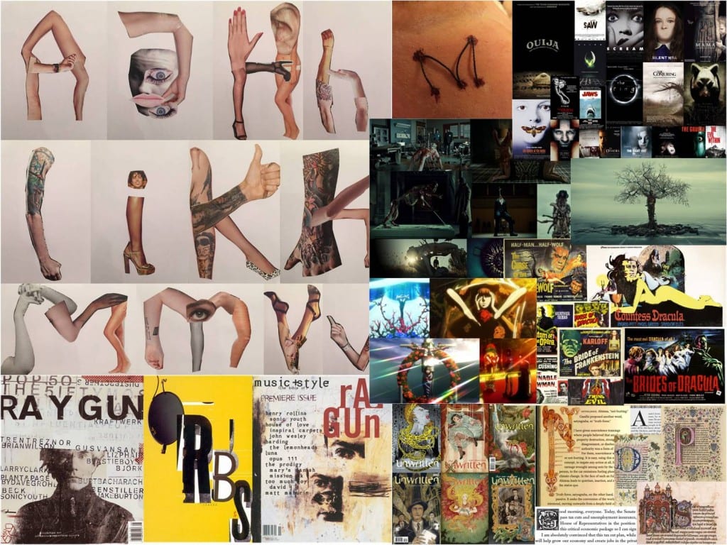
Idea 2 is also inspired by Hannibal however it focuses more on the concept of bodies being rearranged hence the idea of making a collage emerged. This idea was also influenced by one of the underlying themes of this project; texture. I’m going to experiment with human anatomy artists and sketches rather than simple magazine cut outs which I’ve used for my first collage. I’m also going to experiment with Photoshop to further manipulate and develop my letter form.
Because of the low readability of my letter form design I don’t think it could be used as a widely commercial typeface. This is why I decided to look outside the box for the purpose and audience for my design. My desired audience are people interested in ornate design and horror or body horror at least although I’m willing to keep the audience quite broad. People who are interested in the following ‘purposes’ for my letterform will probably be also intrigued. Here’s a list of some of the ways I think my letter forms could be used for. Because I’m developing two letter forms at the moment some purposes only apply to one typeface.
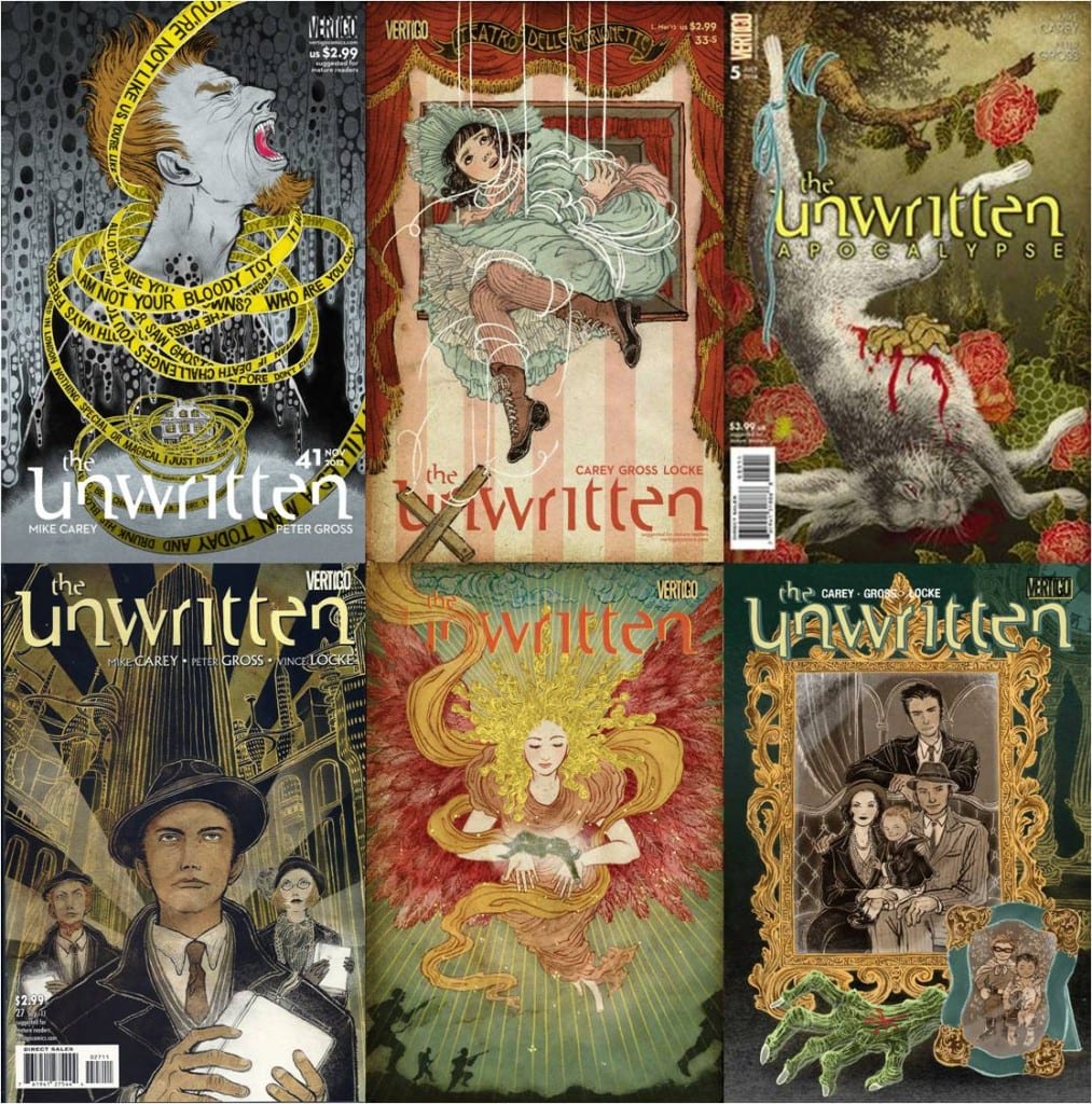
Both of my designs can be used for a cover page of a comic book such as The Unwritten:
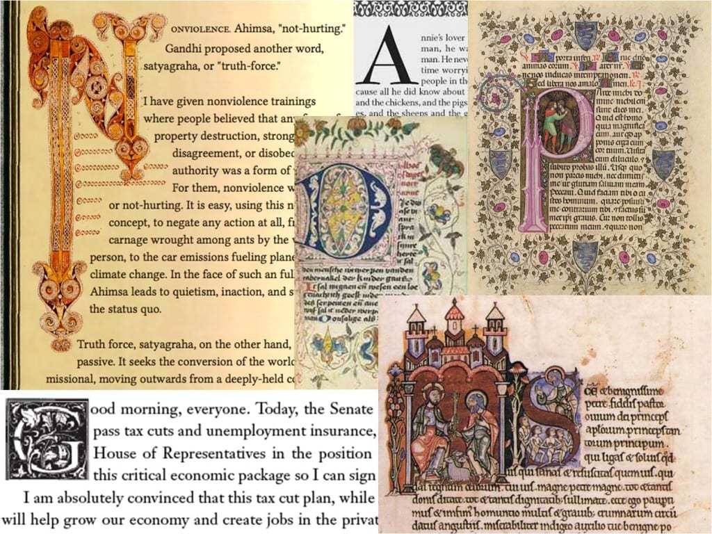
Both of my letter form designs can be used as Drop Caps:
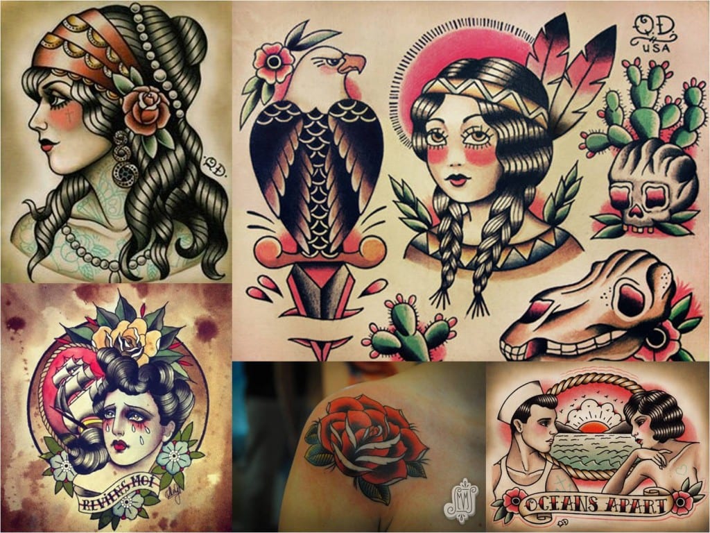
The Dismembered Letters design can be used as a tattoo flash:
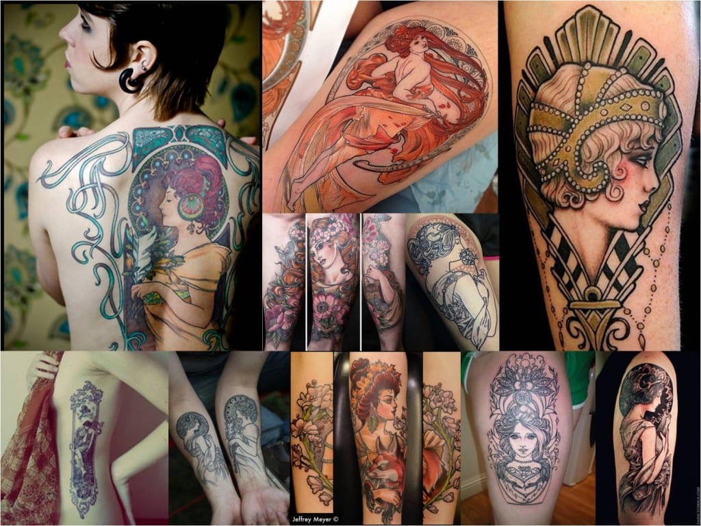
Or an Art Deco tattoo flash:
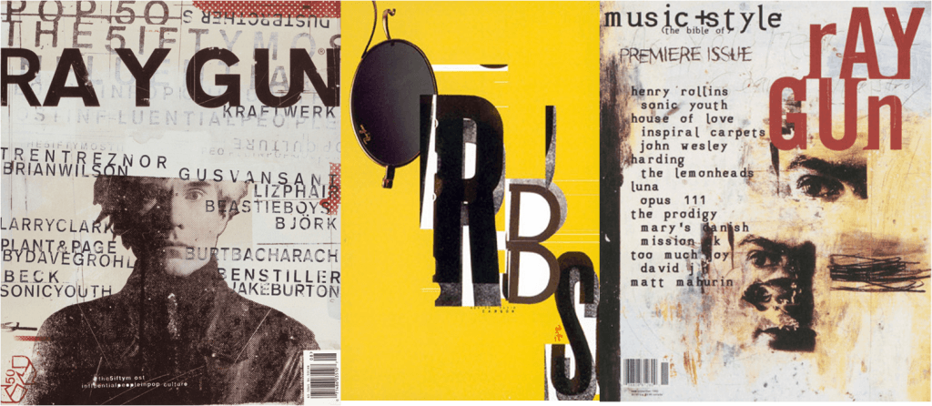
My collage can be used for creative magazines in the style of Ray Gun:
‘Intricate tableaux framed by letters was one of those curious 19th century eccentricities. Collage and montage were novel techniques and the public couldn’t get enough novelty. Here is an odd alphabet that is both beauteous and disturbing. The former for its eclecticism, the latter for what it says about the nature and perfection. The idyllic scenes suggest a kind of perfect (eugenic) breeding. What society should be, not what it really was.’ (Heller, 2013)
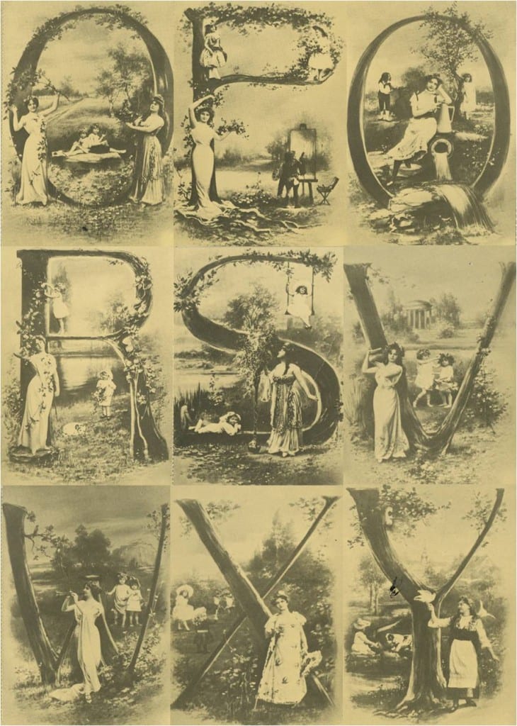
Letters Tableaux are 19th century collages which combine images and letter forms. I really like how floral designs are incorporated into the letter form. I’m going to try to include that in my typeface as it would romanticize the tragic imagery of death. I also appreciate how the letters are complemented by images which is a concept I’ve been heavily influenced by for a while now.
Heller, S. (2013) Letters Tableaux [online] Print Mag. Available from http://www.printmag.com/daily-heller/letters-tableaux/[Accessed on 16/10/2015]
Following up from my two previous posts on body horror I decided to conduct further research on how bodies can be used to create typefaces. I was particularly inspired by the TV series Hannibal and anime called Psycho-Pass.
Hannibal features some very imaginative crime scenes. I like how the show takes something as morbid and tragic as murder and turns it into art. For me beauty can be found in all places and it doesn’t necessarily have to be ‘pretty’. I appreciate designs which find beauty in the most unusual places such as Hannibal.
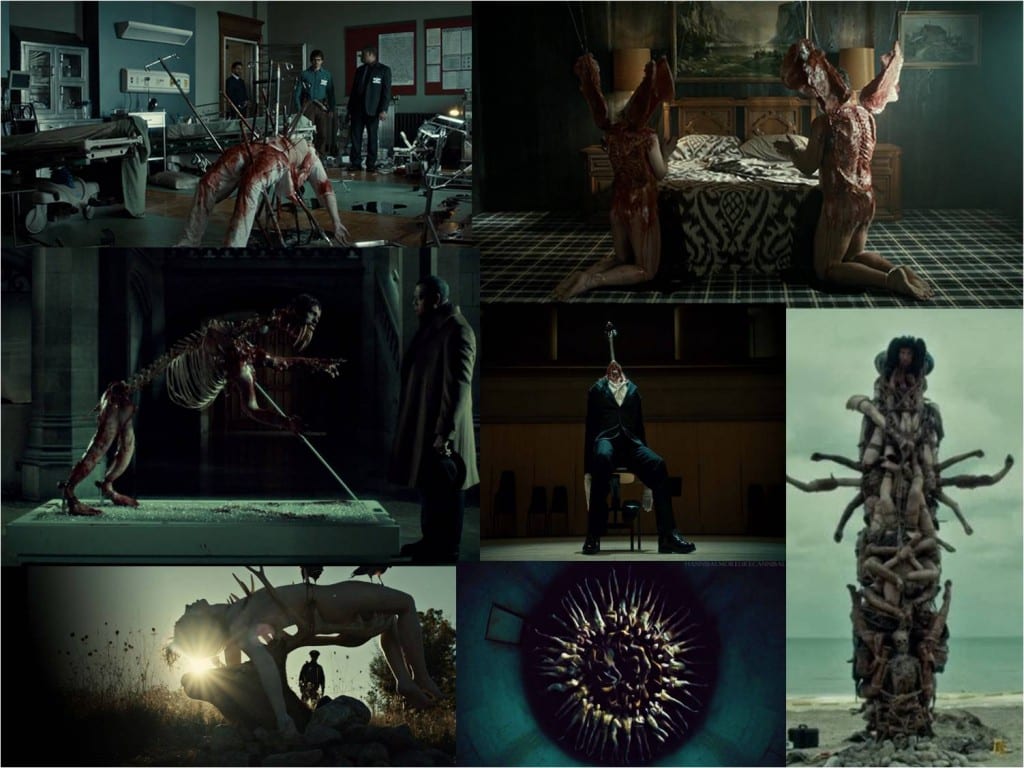
Murders depicted in Hannibal have inspired me to experiment with dismembered bodies and attempt to rearrange them into letters. I’ve singled out the still below because I like how the dead body has been turned into a tree, merging with nature and therefore representing a cycle of life. I also like the juxtaposition between the nature aspects of the design and an empty, concrete parking lot.

I also found an anime called Psycho-Pass with similar take on representing murders. Below is the link to episode 7 of series 1 which includes these artistic crime scenes.
http://www.watchcartoononline.com/psycho-pass-episode-7-english-dubbed
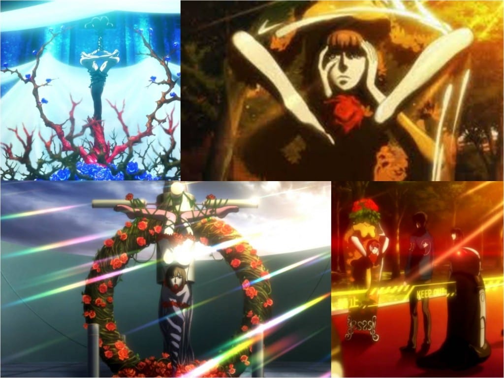
I like the use of roses in these crime scenes and how they complement a tragic death. The designs are also less gory and anatomically correct than hannibal which focuses more on the accuracy of he murder. This design also seems more gentle and flowing. I think I might base my final design on a similar aspect.
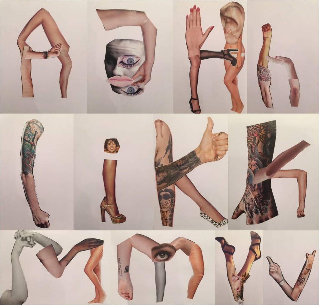
Because I can’t (nor do I want to) rearrange some dead bodies, or mannequins even, I decided that the next best thing would be to cut out images from magazines. The above collage is me attempting this. I really like how the letters turned out and how they’re lay out on the grid. However I don’t want this as my final design because I want to incorporate letters into an image rather than images being crammed into a letter. I will use this collage as a base for my final design.