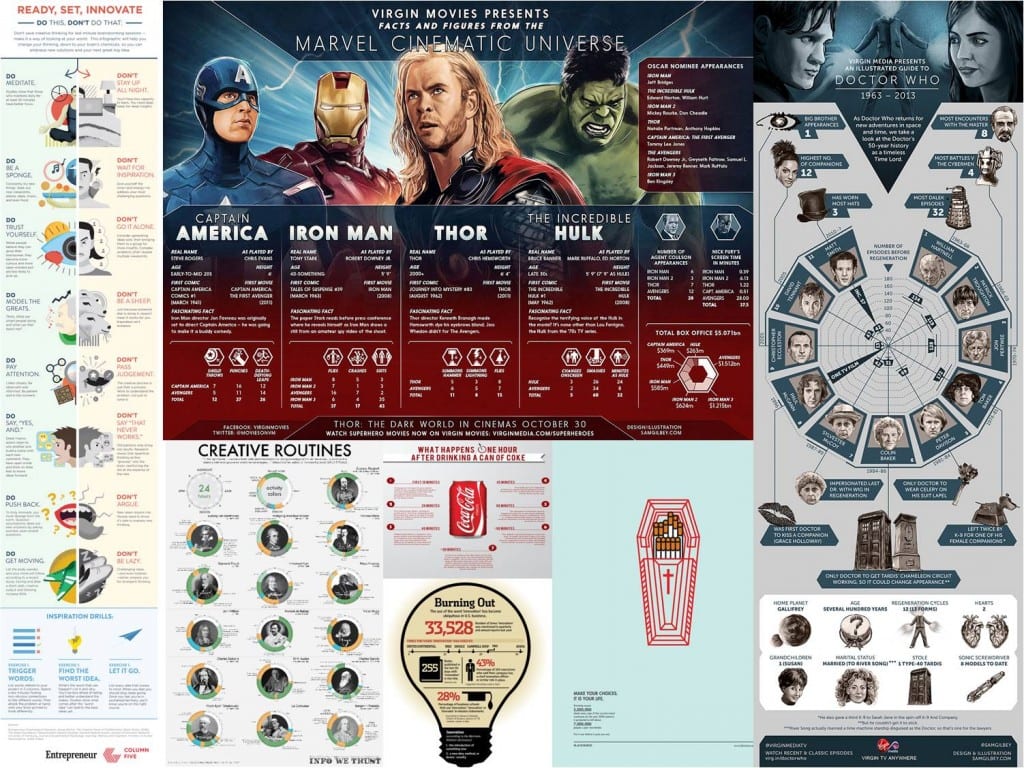
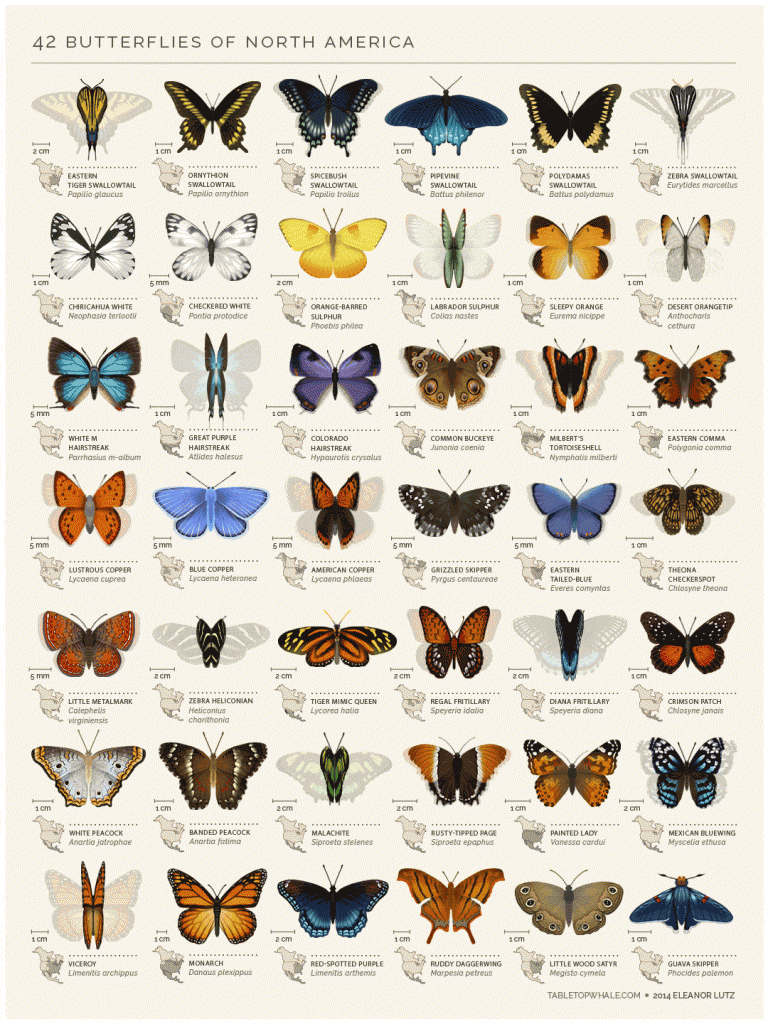
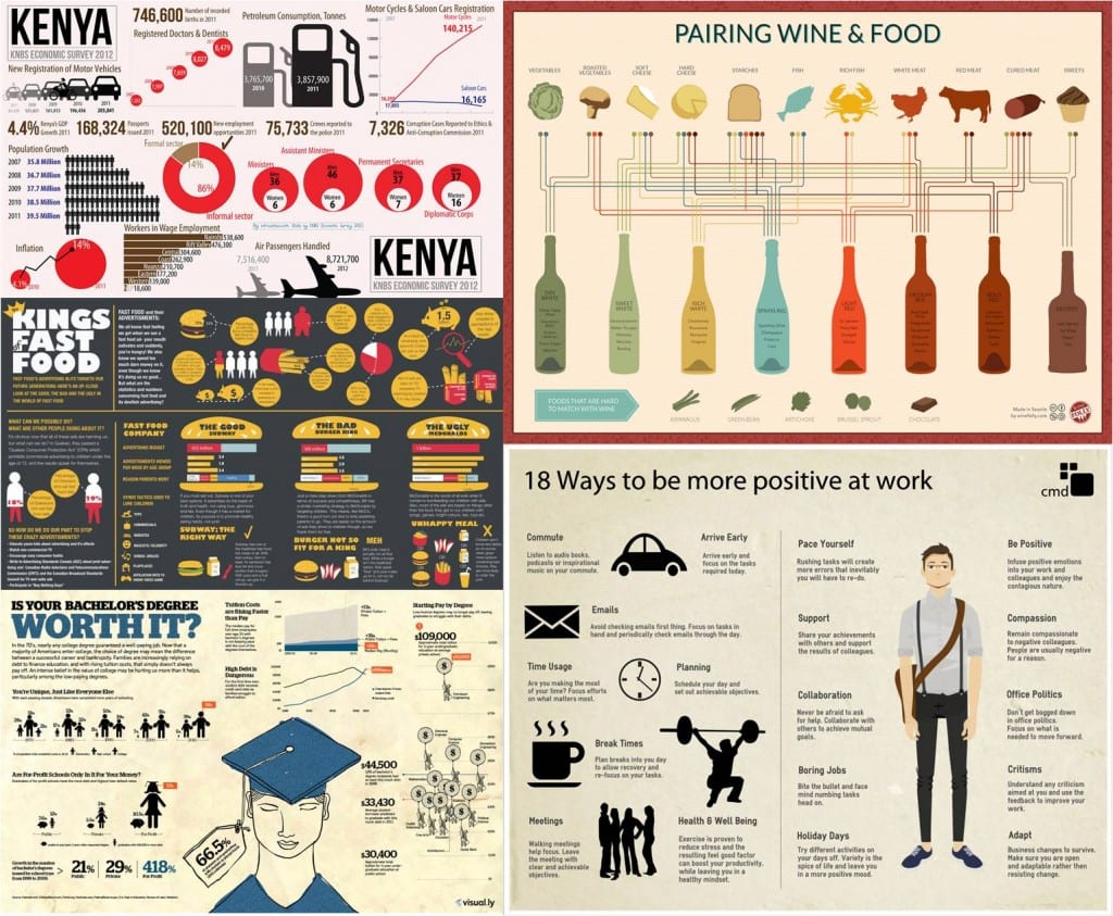
Here are some images I’m considering to Photoshop and use for my infographics:
All of the above images I found using Google Image Search.
Multi Format Data Visualisation
Instead of focusing on Einstein’s theory of relativity I wan to focus this project on the story of Einstein’s Brain. After conducting some research I found out that Einstein’s brain was stolen by a pathologist called Tom Hardy who was performing Einstein’s autopsy. Links in the bibliography explore this story in more depth.

The reason I’m deviating from the set brief of creating an infographic explaining The Theory of Relativity is because I want to establish my self within the horror genre. This story is more creepy and captured my attention. I still want to stick to a topic which is to do with Albert Einstein and this one seems to be the craziest one I found so far.
http://www.bbc.co.uk/news/magazine-32354300
Here are a few websites I got inspired by:
http://www.awwwards.com/websites/clean/?page=3
I particularly liked these two:
The 62 models website’s homepage has a very clean and uniformed feel about it. A tidy, well ordered website using the grid system and a plain background would give a science based content a sense of credibility. This style is usually associated with logical content as well therefore it is appropriate to consider. I also like how the images on the homepage turn blurry when they’re in the background. It looks professional, elegant and sophisticated. I’m hoping to be able to create my website to the same high standard.
Here are some examples of infographics I found on the internet:

From the research I did on infographic I found out that they’re supposed to convey information clearly using both words and images. Some use colour and graphs to communicate with the audience visually rather than through words which are only there to explain or support the image. They should be easy to follow, readable and engaging. Most use the grid system to keep the icons/images in order to preserve the clarity of the infographic. I also learned that there are different types of infographics such as: static, animated, interactive and responsive. More information and examples of these can be found here: http://blog.hubspot.com/marketing/extraordinary-infographic-examples For the website design I though of attempting to make the infographic interactive or responsive, something that the audience can engage with in order to further explore the topic. The website would be the final stop on my transmedia story telling experience of the Einstein’s Theory or relativity and therefore it should provide more in depth information.

I found an animated infographic where the butterflies move their wings. For the infographic designed for a portable device I’m considering making one of these explaining an aspect of the theory of relativity. I could inmate it in After Effects.

The above infographics represent some of the examples of the style I’m thinking of designing my infographic in. I like the paper-like feel they have and simple shadow-like or cut out-like icons. I’m inspired by the icons that look as though they have been doodled or sketched. I also find the simple, dulled down colour palette appealing as it doesn’t distract or confuse the audience from the information the infographic is trying to convey.
http://www.creativebloq.com/graphic-design-tips/information-graphics-1232836
I found this infographic explaining Einstein’s Theory of Relativity:

This is a good starting point for my project as it provides me with an example of the Theory of Relativity presented in an infographic. I’ll have to do a bit more research when I decide what aspect of the theory I want to focus on for my infographic. I’m not sure yet if I want to convey the same information in all three platforms or whether I want to create a more immersive, transmedia experience explaining the life and work of Albert Einstein.
http://www.space.com/28738-einstein-theory-of-relativity-explained-infgraphic.html