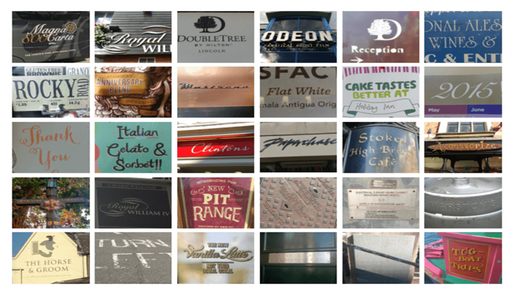
Before starting this project I wanted to learn more about the history of typography as well as gaining some insight into typographic terminology. There’s a lot of things a designer can learn from history which can aid their designs. ‘History also allows designers to learn from the past mistakes, understand common threads, reinvent classic letterforms and develop innovative typographic styles, which they can proudly add to an existing portfolio or body of work.’ (Siebert, 2015)
Typographic Terminology
In the past I was guilty of not paying much attention to typography. Truthfully I wasn’t very interested in it but now, the more I learn about it, the more I start to appreciate the complexity of it. When I first started to research typography I came across some terms that I never heard of before so to better my understanding of what it is I’m reading I thought I’ll create a small cheat list of most useful terms.
arm: a secondary stroke that extends horizontally or diagonally from a stroke at the top and does not connect to another stroke
ascender: the part of a lowercase letter that extends above the x-height
baseline: the horizon on which letters sit
bowl: a curved stroke that connects to either a vertical stroke or to itself
cross bar: a stroke that horizontally connects two strokes
descender: the part of a lowercase letter that extends below the baseline
drop cap: a larger letter at the beginning of a paragraph that drops down into the lines of text below it
font family: all the variations in weight, width and angle of a typeface
graphic text: text formatted to output as an image file
kerning: a manual adjustment of the space between two letters
monogram: a design that contains overlapping letters, usually the first, middle and last initials of a person’s name
sans serif: typeface with no extra structural extensions coming from the horizontal and vertical strokes. Sans is a French word meaning “without”—hence the phrase sans serif means “without serif”
serif: small structural extensions that are at the end of a letter’s horizontal and vertical strokes. Serifs come in a variety of shapes and sizes. Serif also refers to the category name of a font that has serif extensions.
spine: the curved stroke through the middle of an s
standup cap: a letter at the beginning of a paragraph that is several times larger than that of the surrounding text but shares the same baseline as the body copy
stroke: a straight or curved line that creates the principal part of a letter
(Petit, 2014)
Early History
Ideograms were one of the first form of written communication. Used by Egyptians as hieroglyphs. These didn’t indicate the sounds used to say the words unlike phonographs developed by Phoenicians in 1600 B.C. Phoenicians are also credited for creating the first alphabet later used by the Greeks which would in turn inspire the Roman alphabet.
In the Middle ages unicals and half unicals were popularized and calligraphy was on the rise. Handwritten manuscripts featured ornamented lettering. A good examples of this is the book of Kells.
The 15th century saw the introduction of movable type and printing press developed by Johannes Gutenberg. During the Industrial Revolution typography was used to communicate with the larger population and therefore became more bolder and experimented with serif and sans serif. ‘ Ornamental typography was another major highlight in this era. In the 1800’s, medieval art and hand crafted individual art has become commonplace, and international artistic styles developed considerably.’ (Siebert, 2015)
During this weeks lecture we learned about the modernist style and although it is fascinating (or at least I think so) I want my typeface to focus on texture and ornament. That’s why I found early history of typography a bit more useful. In future post I will explore different typefaces which inspire me from more recent history such as the 19th century Letters Tableaux.
I like the idea of ideograms conveying meanings through symbols. I’m thinking about incorporating that into one of my lettering designs. The concept of images bursting out of the lettering would go nicely with the theme of ornament and texture.
Bibliography:
Sierbert, J. (2015) The Evolution of Typography: A Brief History [online] Print Mag. Available from: http://www.printmag.com/typography/evolution-typography-history/ [Accessed 03/10/2015]
Petit, Z. (2014) Typography Terms 101: Everything You Need to Know [online] Print Mag. Available from: http://www.printmag.com/imprint/typography-terms/ [Accessed 03/10/2015]

