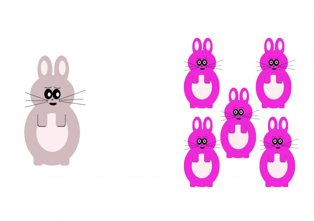
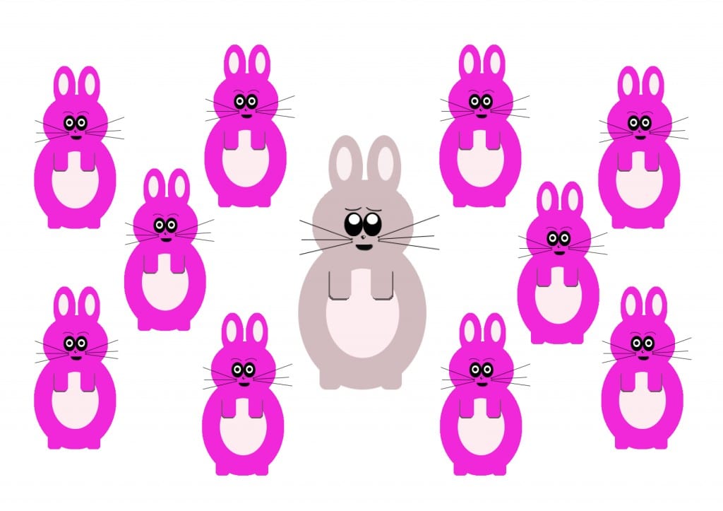
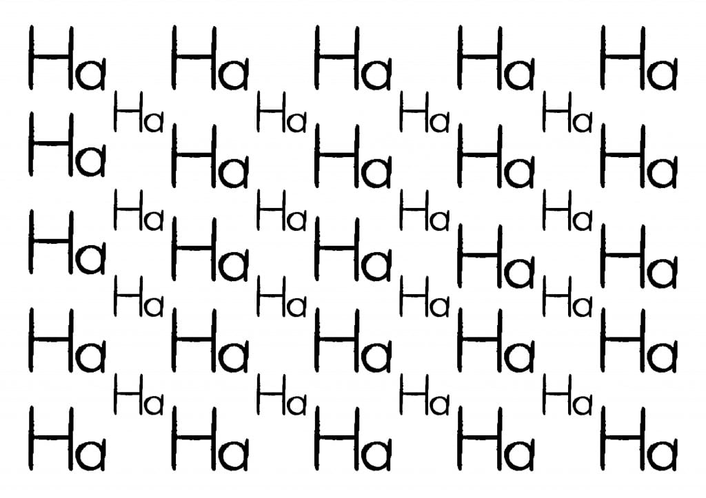
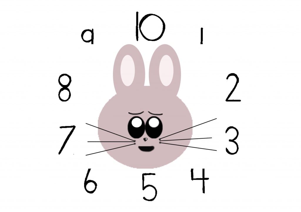
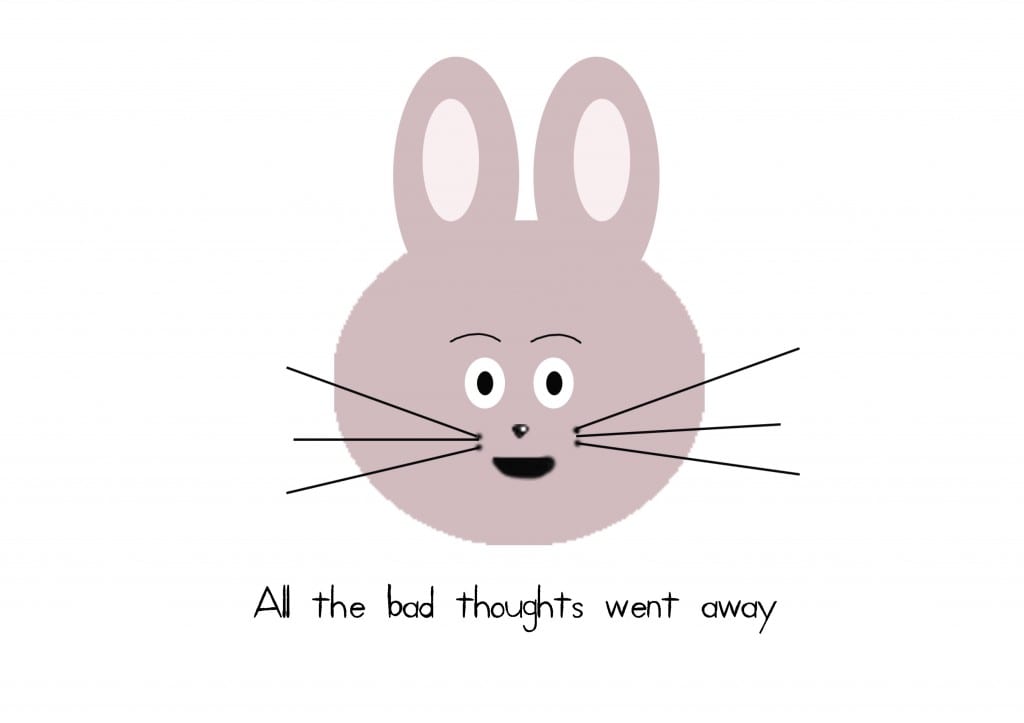
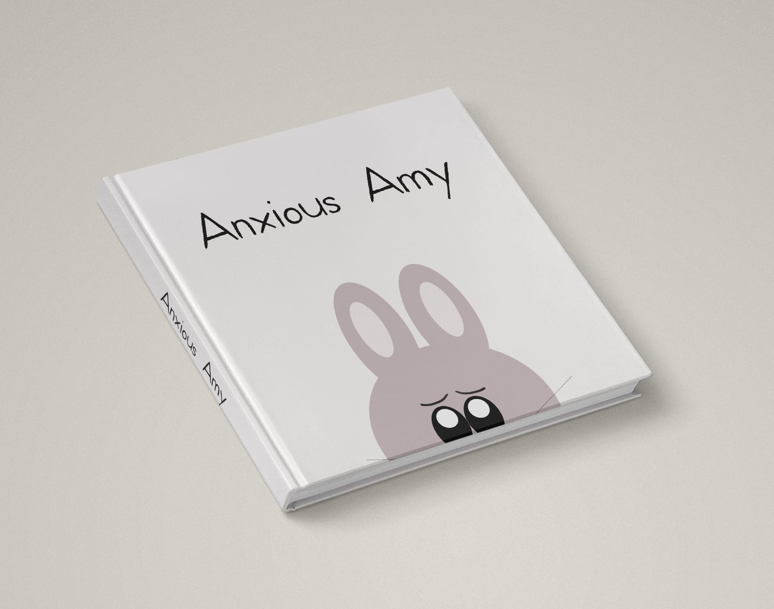
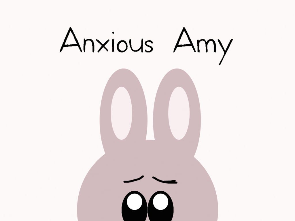
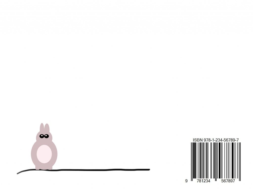
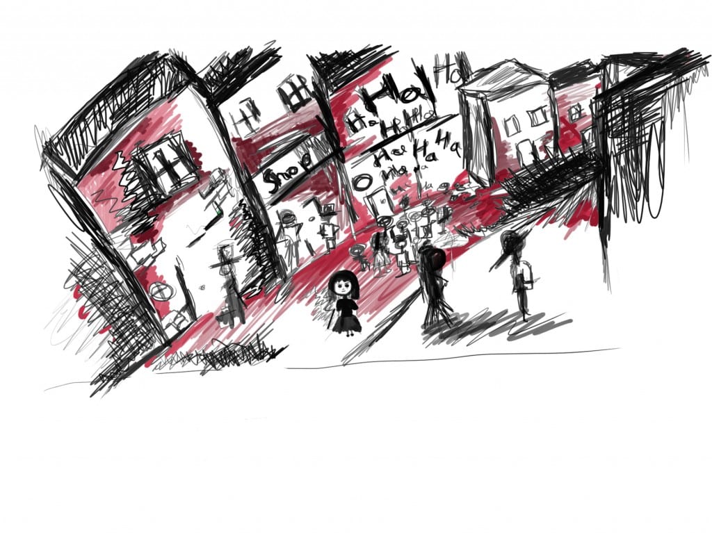
This is the first draft of my book. It still needs some work, mainly refining the illustrations. I also noticed that I have to add more text to the spreads because otherwise the book doesn’t make much sense. I decided to go with the KidPrint font rather than one of the ones I designed with intuos. This is because as the style of the illustration changed I felt this one was more fitting than the hand drawn one.
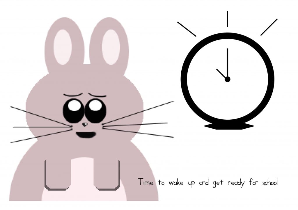
Anxious Amy: Mock-Up
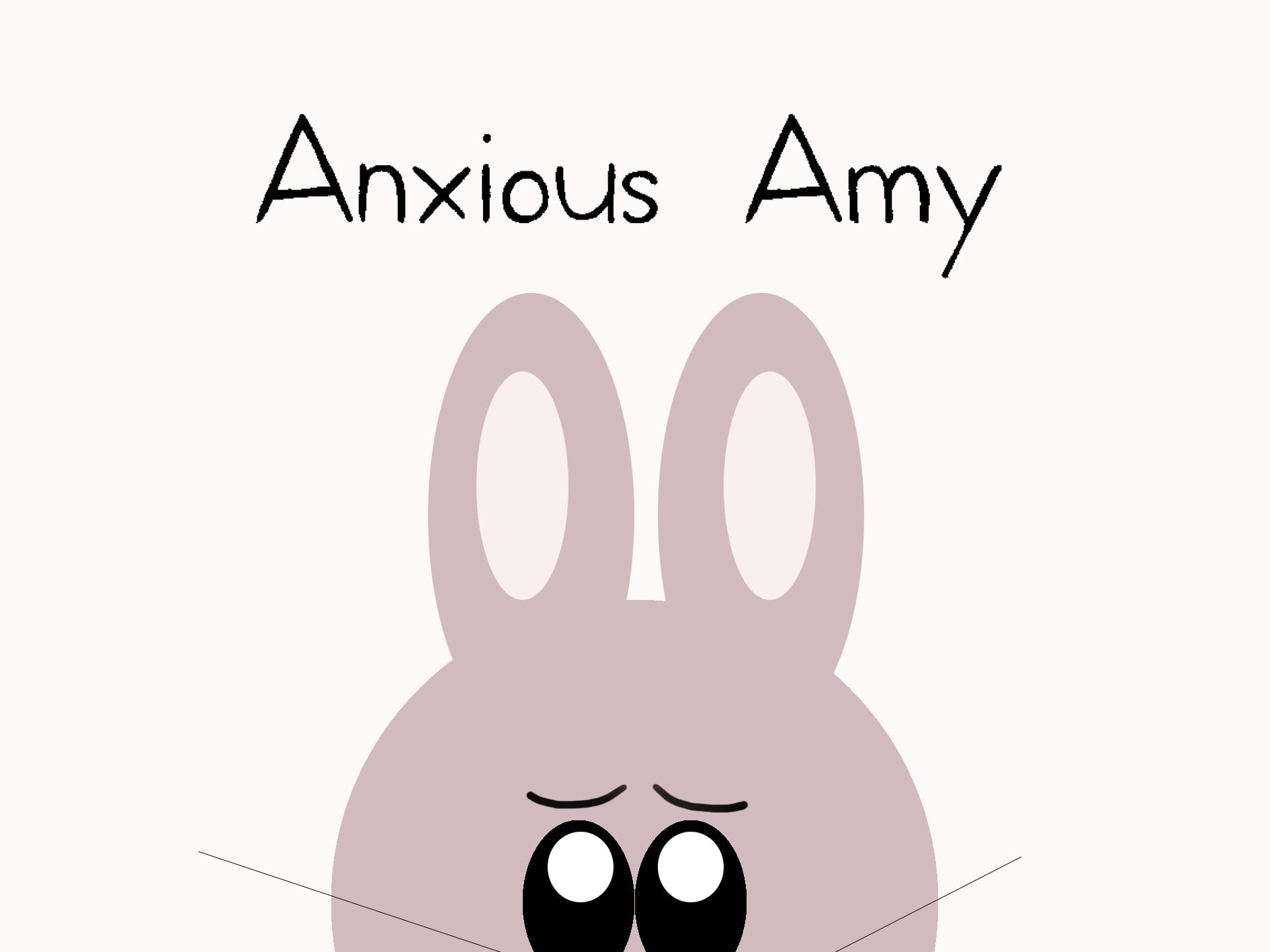
Anxious Amy: Final Book Cover Designs
Anxious Amy: Cover First Draft
I decided to change the style of my designs because this one seems more child friendly and playful. I’ve made the illustrations in Photoshop using intous drawing pad and assembled the pages in InDesign. I’m not sure if I’m going to keep the pink colour palette or if I’m going to return to blue. I also changed the main character into an bunny because I think the other illustration looked too scary and serious whereas animals and simple illustration appeal more to kids.
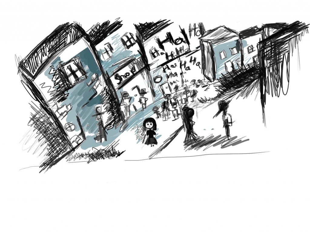
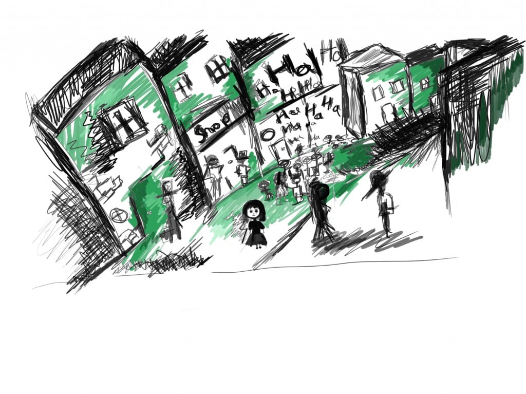
Anxious Amy: Colour Experimentation
I decided to experiment with colour for my picture book. I want to keep the lines black and add colours to only a few areas of the image. These images were made with Intuos drawing tablet because it allows for an easier experimentation with colour as I don’t have to redraw the image.
I still maintain that blue is the best colour for this picture book. It conveys the atmosphere of the book well and works well with simple line drawings.